Private oasis: Carrie Street House
A young family commissioned their best friend as ‘the architect’ and the wife’s brother as ‘the builder’ to create a 1970s’ Brazilian jungle pad in the Auckland suburb of Sandringham.
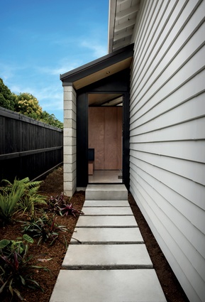
Four years ago Georgia Sigglekow and Alex Sutherland and their three young children bought a ramshackle bungalow in Sandringham, just a short stroll from some of Auckland’s best curry houses, and set about transforming it. The double-fronted 1930s’ home has a verandah between its curved protrusions and, while this older front part of the house awaits renovation, if you walk through the new front door, sited alongside the house, it opens up into what the owners describe as their own private oasis.
Here, architect Sam Atcheson of Dorrington Atcheson Architects has designed a new pavilion addition, as well as a refurbishment to the back part of the bungalow. “Sam is our best friend and he’s just amazing,” says Sigglekow. “We love his work and he knows us so well. Our brief to him was inspired by a lot of places that we’ve visited together and enjoyed, places perfect for relaxed comfortable living; the feel of the Samoan fale and, also, a family property – a big old villa up north in Kaiwaka that had a big expanse opening into the living area.” The family sold it to fund this build but used it as inspiration.

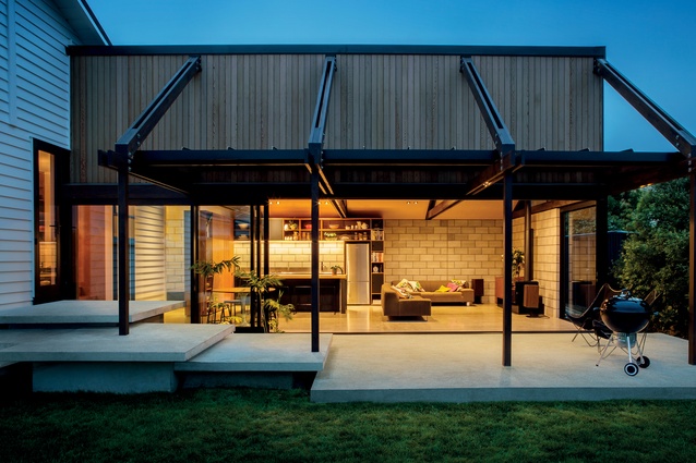
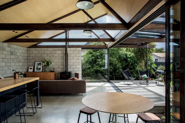
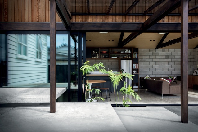
“The brief was a little tongue-in-cheek but Alex was like, ‘What we want is a 1970s’ Brazilian jungle pad with that relaxed feeling and the garden coming inside – our own subtropical native zone’,” she explains. Indeed, birdsong can already be heard through the floor-to-ceiling sliding doors that open up the entire living and dining area into the garden. You can imagine how this space might feel when it’s surrounded by fully-grown greenery.
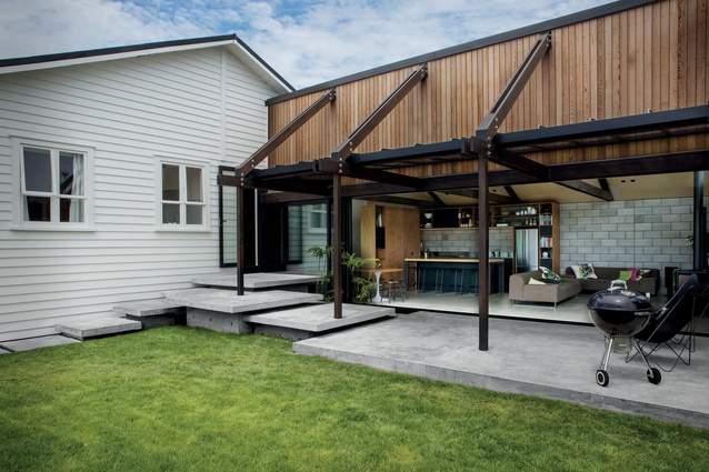
The pavilion has been configured to face north for maximum light, forming an L-shape with the original house. “The roofline of the new addition mimics the pitch of the old roof, so it has the same kind of rhythm but breaks the extremity, as the old house sits up high off the ground. But the nice thing is that the original roofline enables the pavilion to also have a high stud, without going against the current zoning,” remarks Sigglekow. “It tucks underneath the existing building so, from the street, you don’t even know it’s here. People come and say, ‘Wow, I didn’t expect that.’”
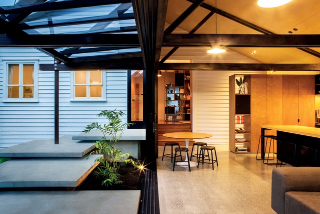
Where the old and new buildings merge, stepped concrete platforms form perfect spaces for sitting, especially good for entertaining. “We got rid of our outdoor table because once you have the doors open, the space is so indoor-outdoor anyway,” says Sigglekow. “Sam is designing us a really cool, really long and narrow table to replace the round table; it’s similar to the kitchen island but leaner, so it will really maximise the space.”
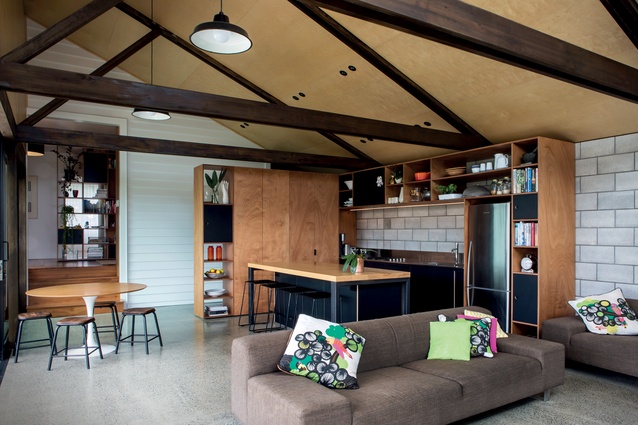
The weatherboard cladding on the original house forms the backdrop to the dining area and entrance corridor, before stepping up into a space that used to be the old kitchen. “Sam came up with this idea to create a kids’ zone/media area. It’s total genius,” she states. “This is a bonus space that we didn’t anticipate at all but we use it so much. When we had friends over recently, we took a photo of about 10 kids in here on the sofa and all the adults were next door in the kitchen/living area.”

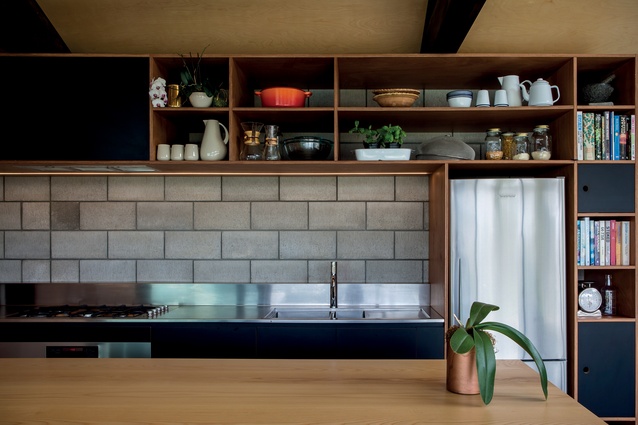
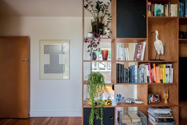
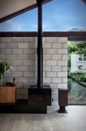
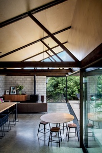
The architect has found an effective way to marry the different architectural styles. “Sam was really conscious of softening the line between the two, creating a cohesive idea that flows through the entire house,” explains Sigglekow. “The repetition of the cabinetry ties everything together; it combines the old and new spaces. The idea is to be quite timeless. The warmth of wood offsets the harder surfaces, like concrete breeze-block and stainless steel, which are both functional and relatively inexpensive.”
The cabinetry was designed by Atcheson and constructed by Cavalera. Cupboard doors are faced with Gaboon plywood, which has a rich red hue and ties in well with the existing rimu floor and doors, adding depth to contrast the grey of the new polished-concrete floor.

“Cavalera were total perfectionists with that craftsperson edge, and because my brother [Habitat Building Company] is a total perfectionist too, he did the building. Initially we were like ‘Ooh, working with our best friend and our brother – it could have gone wrong but it was really awesome. It worked out well for us and was a very enjoyable process; I’d definitely do it again.”
MATERIAL SELECTOR
Architect Sam Atcheson discusses the design and materials used in Carrie Street House.
How did you approach your designs for the cabinetry?
The timber adds warmth, texture and detail against the concrete, as well as the patterning of the cabinetry itself. Also, they create dividers within the rooms themselves.
How did you tie together the old and the new?
The timber is a marrying element both inside and on the exterior cladding, although really we were trying to create something different between the two structures.
You’ve focused on getting the bones of the project right, then planning for other elements to be built as the budget allows and the family’s needs change.
Yes, Georgia and Alex were very flexible about what they wanted at the start and right the way through the process. We were thinking of how spaces can change as the family evolves and have planned for an office at the end of the living space and a kids’ rumpus room attached to a carport in the driveway on the other side of the house.

