Polished professionalism
The design and fit-out of this new-build orthodontist practice in Papamoa, Tauranga was a first for the client and design studio KKID, both embracing an opportunity to break with convention.
The brief required a design that would appeal to parents as well as their children but the practice also wanted to create a quality working environment for its employees, reflecting the high level of service and professionalism provided.
Each space needed to be elevated above the conventional healthcare environment – “avoiding the starkly clinical” – which resulted in, amongst other things, a waiting room experience offering more luxury than most typical dentists’ clinics.
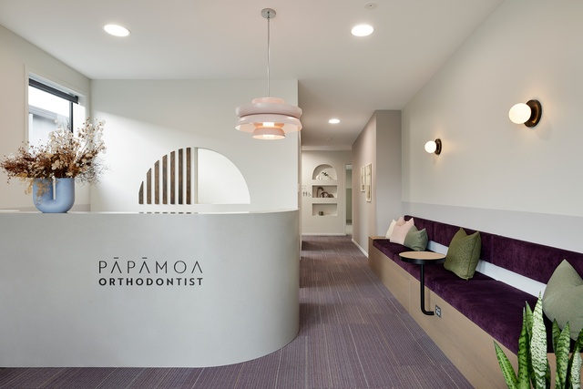

The starting point for the design of this project was the client’s branding palette, which is consciously inviting, warm and personal — the antithesis of a clinical environment. The palette of aubergines and greens was informed by a dress belonging to the client, which Karen Kelly of KKID together with Michaela James, Creative Director of Design Juice, developed the colour scheme from.
Kelly explains their decision to move forward with a green and aubergine palette: “It was tempting at the start to go for natural/netural colours with a more residential feel, however, we’re pleased we didn’t as we love the way the bold flooring has provided a really strong basis for our material and colour development.”
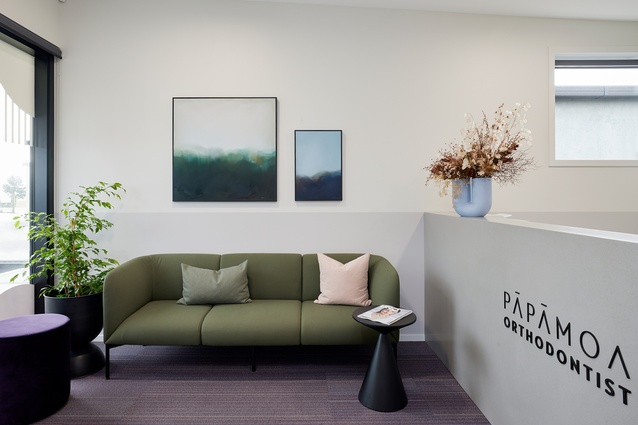
A welcoming, soothing environment is established on entering the reception, with an immediate sense of calm communicated through the harmonious colour palette, soft curves, quality furniture, lighting and artwork. A curved Corian reception, fluted glass window and arc shelving niches complement the brand’s logo.
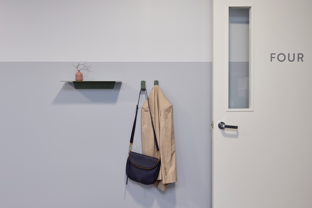
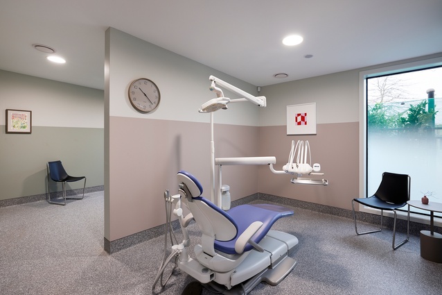
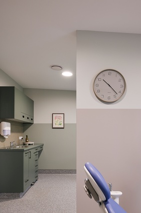
From the reception, flooring works as a subtle wayfinder, its linear print leading to clinician rooms. Consistency is maintained throughout all spaces with colour blocking, quality furnishing and materials. Every area and room has been designed to feel unique yet be cohesive with the rest of the programme.

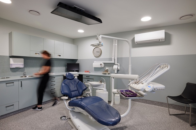
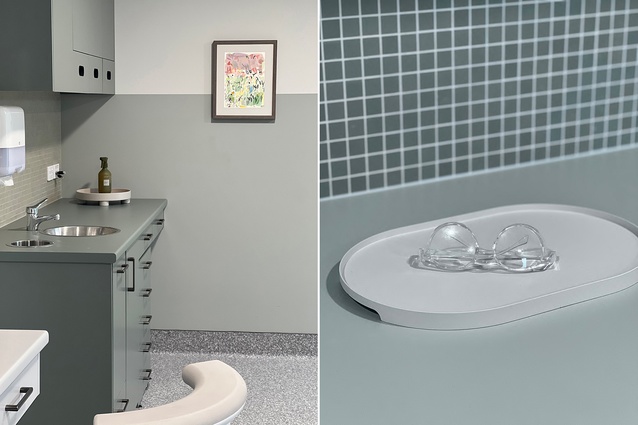
Due to the healthcare environment, durable, easy-to-clean and sterilise surfaces were a priority. “We had to avoid any unnecessary textures or surfaces where dirt might settle,” says Kelly. “Coved vinyl flooring for the clinics and carpet tiles for the shared spaces provided the most hardwearing flooring solution and we decided early on to embrace both materials and go bold with these choices.”
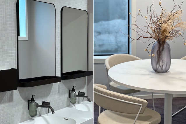
In a post-Covid period when demands on staff are greater than ever, the working environment needed to enhance employee wellbeing and support efficiency. “The design considers their needs and comfort, with investment in quality lighting and furniture, and balances the requirement for hard surfaces with the application of soft curves, materials and colours,” explains Kelly.
This project builds on the success of KKID’s other commercial projects, including a new-build early learning childcare centre and renovation of a law practice, both of which are in Auckland.
Project details:
- Type: Interior for a new-build clinic
- Completion: September 2022
- Size: 219.78m2
- Client: Rachel Farrar, Papamoa Orthodontist
- Builder/developer: Sanderson Group
Feature lighting and furnishings:
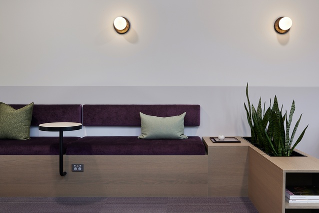
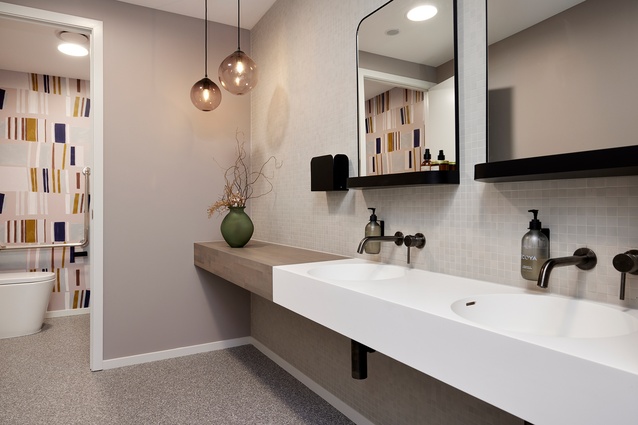
Feature lighting by Snelling Studio, including the statement Lens pendant over reception desk and Line wall lights above the fixed seating in reception. Luke Jacomb hand-blown glass lights in the bathroom
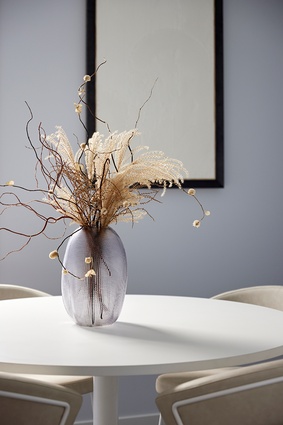
Apelle leather and chrome chairs by Midji, through Sarsfield Brooke, in reception and clinics
Umi sofa by Calligaris, through Aspect Furniture, in reception
Built-in seating and cabinetry by Inspace
Art by local artist Selena Kitchen in reception
Dulux block colours, Laminex melteca and HPL laminate surfaces, and Cinca mosaic tiles, through Artedomus
KKID project team:
Karen Kelly, Amanda Bosch, Biddy Mackenzie


