Perfect chemistry: Warehouse wonder
This former factory has been transformed into a spacious family home, a sports car repository and an equine genetics laboratory. Leanne Amodeo explores this unique and somewhat puzzling alchemy.
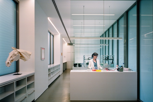
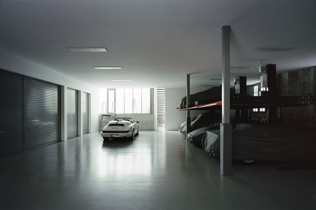
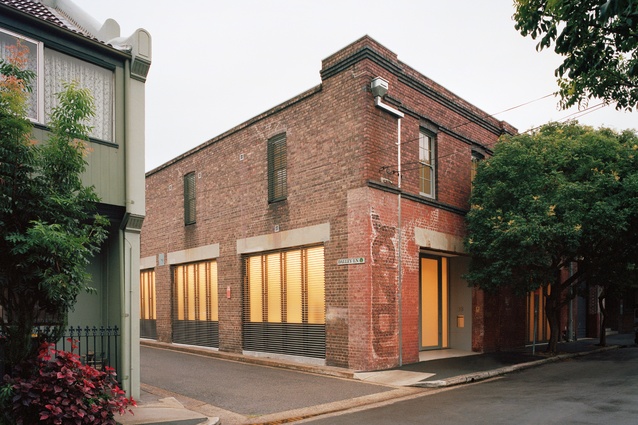
The clients of Australian architect Ian Moore (an equine geneticist, a patent attorney and their two young sons) had always wanted to live in a warehouse. So, when they recently purchased one in the Sydney suburb of Redfern, it was a bit of a dream come true. From the outside, the two-storeyed brick building has that industrial aesthetic currently very popular and all the gritty appeal associated with inner-city living. The brief called for a four-bedroomed house with a home office for use as an equine genetics laboratory and a workshop area big enough to house a collection of classic Porsche sports cars.
It’s quite possibly the most surprising list of programmatic requirements Moore has ever received for a residential project. And, in relishing this rare opportunity, he delivered a home that’s not only hard-working but also incredibly inviting. Showing the utmost respect for the original structure, the New Zealand-born, Sydney-based director of Ian Moore Architects didn’t have far to look for inspiration.
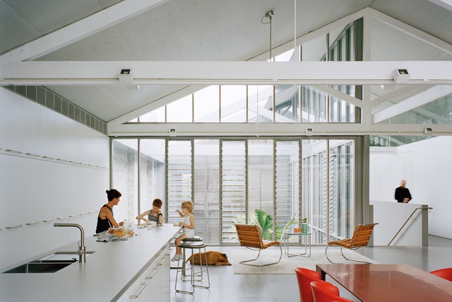
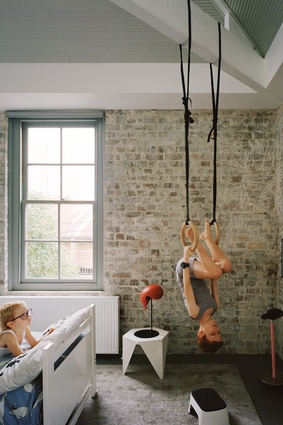
“It’s such a robust and dominant building that I simply had to work with it,” he says. “And the clients really wanted the renovation to retain the industrial character of the warehouse. They wanted it to feel like a warehouse rather than have me convert it into a ‘regular’ house.”
The building itself was constructed in the early 1900s and was used as a Vegemite factory for a period and, most recently, as an advertising agency. An early 1990s’ renovation best described as ‘illogical’ radically altered the interior, presenting Moore with his greatest challenge.
While he initially tried to recycle as much as possible from that refurbishment, he ended up disposing of most of it. A major structural upgrade would have been required in any case to ensure the building complied with changes to the Australian earthquake loading code following the 1989 Newcastle earthquake.
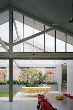
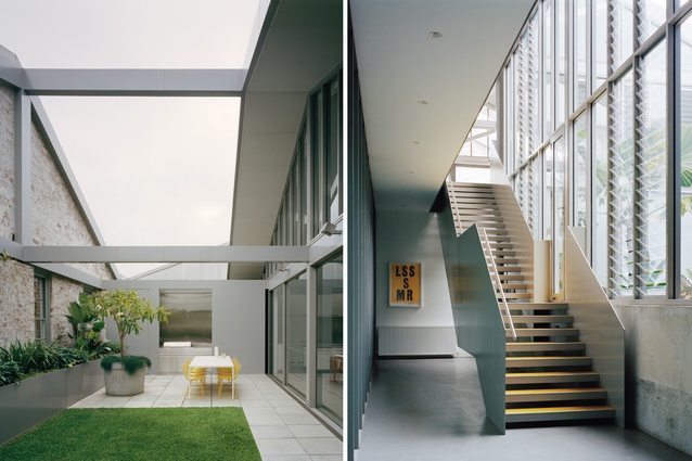
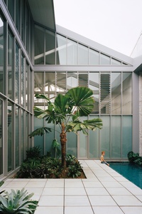
Fortunately, the double-height space in the centre of the warehouse had been retained and so Moore removed the area of existing roof directly above it to form the new internal courtyard. “The greatest shame in Australia is that we haven’t embraced the courtyard house that’s built boundary to boundary, particularly in the inner city,” he proposes.
“We see the model work well in parts of Mexico and Spain because it gives you privacy and also means the land can be used much more efficiently. In the case of this home, it’s allowed me to create outdoor space within the actual warehouse, which proves you can use the whole of a building without needing anything more.”
The courtyard is the anchor around which the entire scheme is arranged, with the majority of the ground level housing the laboratory and a garage for the cars. Meanwhile, three of the bedrooms and the kitchen, dining area and lounge, along with a roof terrace, occupy the upper level.
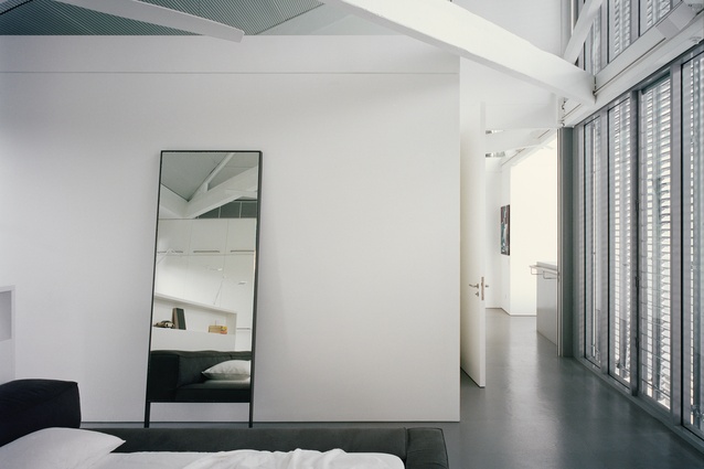
The void facilitates cross-ventilation and has introduced plenty of natural light into the interior’s core, so even the main bedroom and downstairs guest bedroom, both at the southern end of the home, have access to northern sun. More importantly, the main bedroom has views into the living spaces and roof terrace, providing a sense of connectivity often lacking in warehouse conversions of this scale.
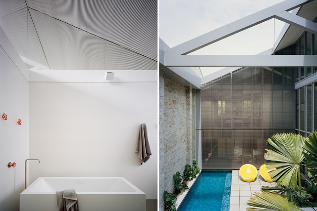
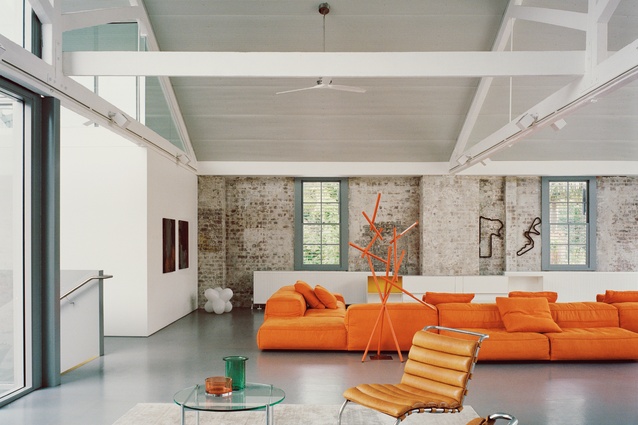
These visual relationships between rooms are further reiterated in Moore’s spatial planning, with all newly inserted plasterboard walls installed at three-quarter height. As he explains, “There’s distinct delineation between the textured, worn surfaces of the original brick walls and the smooth finish of the plasterboard. So, the new is clearly perceived as sitting within the original shell. And I’ve stopped them at the undersides of the timber trusses to enable the space to be read in full, rather than breaking it down into small cells.”
It’s an effective device that balances openness and visibility with privacy and self-containment. In positioning the new walls in line with the oversized existing trusses, Moore brings order and logic to an interior that previously lacked both. The architectural rationale is exacting and, as a result, spaces are not uniform in size, which means that nothing new looks forced or as though it shouldn’t be there.

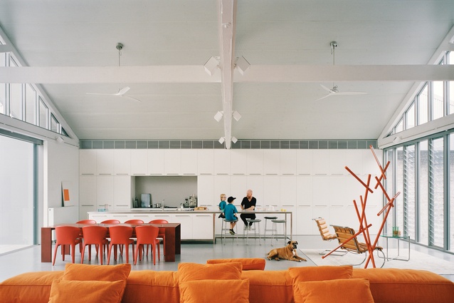
Without doubt, the most successful part of the whole scheme is the open-plan kitchen, dining area and lounge. These spaces are boldly expansive and their strong linearity and heavily industrial appeal make them simply compelling. Moore cleverly plays on this element of sublimity by heightening the spatiality through an understated material palette. In the first instance, the materiality is ‘honest’ and nothing is used that can’t be related to standard, non-customised warehouse construction; hence, the absence of timber and marble.
And, secondly, Moore has used relatively modest materials in unexpected ways, such as 10mm steel plate for the stair balustrade, perforated Mini Orb for the ceiling and environmentally sustainable cork tiling for the flooring.
These materials provide a neutral backdrop into which the clients’ key pieces of furniture have been curated, making a feature of the sofa and dining chairs (all in orange, their favourite colour). However, the Mini Orb and cork tiling aren’t to be underestimated. While they may blend into the background, they also improve the building’s acoustics by ‘cushioning’ the interior from both top and bottom.
Every element of this design has purpose and an intelligence that responds directly to issues of heritage and environment: typical of Moore’s well-considered approach. This is a stylish modern home, which embraces urban living in the best way possible.
This article first appeared in Urbis magazine.


