A fresh look for Papamoa College
ASC Architects designed the college with a radical re-thinking of the learning environment.
In these days of league tables and national standards we’ve seen colleges putting on fresh faces and striving to be cool schools, but the design of Papamoa College is something special – a radical re-thinking of the learning environment, a fresh look at how kids learn and what form of environment is going to assist them.
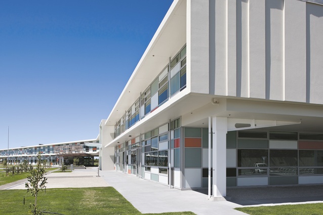
Papamoa is in the hinterland beyond Tauranga, a swelling suburb between State Highway 20 and the beach. The sandy meadows of this plain, a few hundred metres away from the shore, are slipping beneath a new tide of tarseal and housing developments of relentless uniformity, that still unfortunately characterise the typical New Zealand suburb. Driving down the main drag, Doncaster Drive, the side streets sound promising: Primrose, Lavender, Blossom, Summerland but the reality is a march of developer designed brown brick boxes, blank and banal as their garage doors. So as the new college hoves into view, it is rather astonishing: where a paddock was a year ago, a glass and steel structure crouches like a plane on a runway, ready to depart, its wings spread ready for adventure. Round here that’s already a pretty compelling reason to go to school.
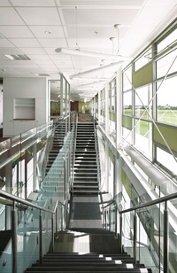
The building (and it is one big building) is laid out in a massive Y, to become an X once completed, as if to make its mark, reiterate its presence in the sea of averageness it rises above. But the wings don’t just orientate themselves in relation to sun and wind, they acknowledge on a larger scale the geological and cultural landmarks of the region like a mihi: the sea, moana. The maunga, Mauao. And that site of early conflict, Gate Pa. And around the building, a midden has been preserved, native salt-loving plants are being re-established, memories of earlier landscape and habitation before sheep and suburb and sprinklered lawn painted the place bland.
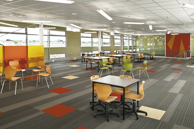
I see this big X as like a cultural intersection, a kind of knowledge cross-roads. That may sound over the top but there is not a traditional classroom in this school. There is no maths block, English block, science block like we are used to, with kids trundling back and forth on the bell, to get locked in a room for 45 minutes while Knowledge is poured through their ears. The wings accommodate long communal spaces of about a hundred students and five teachers each. These learning commons have various facilities, break-out rooms, meeting spots, a variety of table and desk forms for different tasks.
Even the teachers work in here, they don’t retreat to corner offices. Of course to us architects it all sounds very familiar: it’s like an architectural studio or office. Within the cohort of a hundred (the maximum size for good social functioning), kids work in smaller groups and individually on various tasks and are able to head off to the library or workshop when necessary. ASC did a lot of research with educational experts on best learning practices and developed this design with the Ministry, the school and various consultants. This new architectural form is the result of the new curriculum and new ideas about teaching and learning. What I like about it as well is it also reflects the form of the typical workplace, blurring the boundaries between learning and life.
In fact the school is laid out a bit like a little village in an agrarian landscape. Just as at their peripheries the wings strike out towards the horizon, at the centre they come together to form a little cluster of key places at the city gate: reception, staff lounge and library. Ahead a grand set of stairs to an elevated terrace like a promenade. Beyond this centre is a large plaza-like space, the town square, off which the theatre and gym open. The whole place offers a variety of spatial experience beyond the normal school, laid out block by dogged block.
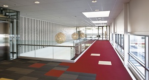
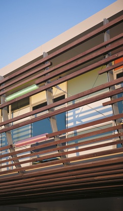
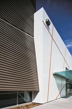
The wings are each about 12m wide, to maximise natural light and ventilation. The place is full of colour in strong contrast to the local streets where the dead hand of the developer or the dull command of the caveat have muted all individual expression. The school has a bit of a corporate look with its supergraphics and so on, but I don’t mind that: it’s lively and has a sense of mutually shared enterprise. And that is matched with a lot of diversity when you look carefully: little individual gardens, edible and native, a variety of footpath types and directions. Little labels are everywhere, on plants, on the walls, fostering a spirit of inquiry: what’s this plant? Why does it live here? Why is the building shaped like this? What could we do with rainwater? I get the sense that all involved in this design are doing their best to enhance real student achievement, as measured by learning, not just fudged statistics of exam results.
This building may seem like it’s in the middle of nowhere (I’m an Aucklander after all) but really my concern is how suburban development such as Papamoa and throughout the country, has erased any sense of place and contracted the inhabitants’ horizons to that path from the television in the lounge to the big box shopping centre. It may just be because the paint is still fresh on Papamoa College but I could smell a bit of teen spirit here that the lazy avenues lack. ASC have come a long way in developing their design: their first plans showed the repetitive teaching blocks we are used to, laid out in a grid. Now we have a bold and brave plan at work here. This design has been risky for the builders too as ASC and Hawkins won the job as a consortium: the project has needed buy in from everyone as they say. I am looking forward to seeing what the locals make of it.

