Out of the ordinary
Snøhetta simultaneously explores handicraft and cutting-edge technologies to create beautiful and experimental work that encompasses architecture, landscape, interiors and brand design.
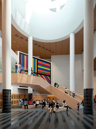
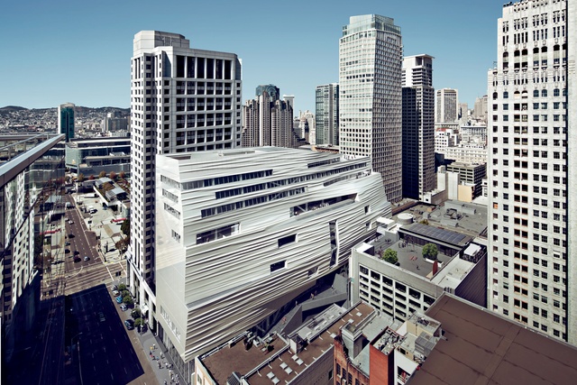
Snøhettaʼs latest built project, the extension to the San Francisco Museum of Modern Art, has proved highly controversial with some architecture critics, who likened it to a “baked Alaska” or a “cruise ship”.
However, there’s no doubting the incredible talents of this Norwegian practice. Its founder Kjetil Thorsen and representative for Australasia Kåre Krokene gave a lecture tour in New Zealand earlier this year and spoke with Justine Harvey.
Justine Harvey: Snøhetta has offices in Europe, America and, now, in Australia. When was it founded?
Kjetil Thorsen (KT): Snøhetta began as a collaborative in 1987 and we established the firm as a shareholding company in 1989.
JH: Did you form it with people you’d studied with?
KT: Partially; that actually happened in layers. I moved back to Norway when I finished my studies in Austria and worked freelance from 1985–1987 and, then, a group of architects and landscape architects came together to establish a more free-range collaborative, which we called Snøhetta. We were seven or eight people at that time.
JH: Was it part of your philosophy to combine architects and landscape architects right from the beginning – and to look at architecture from a holistic point of view?
KT: Yes; we recognised early on that there was something lacking in the profession of architecture, and that was the widespread collaboration between the different professions. They were cut off from each other, nobody was working together and you would normally see landscape as the result of whatever was left over from the architecture.
As a movement from the late ’70s to early ’80s, there really wasn’t much focus on public space and we thought it was about time: the idea that landscape might influence an architectural concept but, also, the other way around – that architecture may influence the way you look at the landscape.
So, collaboration was the obvious choice at the beginning, which was very successful as the two professions were merging in a way that we had not seen before; at least in northern Europe nobody else was working in that way. It also turned out to be a good business strategy because we had more opportunities.
In the late ’90s, we had more landscape work than architectural work and then, slowly, it turned into more architectural work – even now, it has evolved into collaborations with artists, work in interior design and brand design. So, we see it as an interactive base where you establish a creative hub; we call it ‘singular in the plural’, where it’s more about the individual people and less about the professions.
JH: Kåre, you’re Snøhetta’s representative in Australasia, working through JPE Design Studio in Adelaide. What are you currently working on in Australia?
Kåre Krokene (KK): We are working on a university project – University of South Australia’s Great Hall. It is not a ‘great hall’ in the old sense; it’s more of a sports facility/graduation hall/students’ space – a multi-purpose building. It’s been a great project with a lot of tricky parameters, including programme and cost, but for an open-minded client.
KT: The process for us has been to look at the building as a form for interactive relationships between the public, the user, the building and the space. So, in a way, Adelaide is now the first iteration of showing what we think is also possible in Australia and Asia in terms of bringing in a Nordic, democratic architecture, while still respecting the local traditions.
JH: I believe you are working on some graphic design projects, too. Can you give us an example?

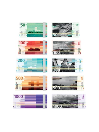
KT: We’ve designed the new Norwegian banknotes that are coming out next year. The design is based on the pixilation of wind speed; so, the 50 kroner note depicts a very slow wind speed with short pixels, while the 100 kroner has a faster wind speed, thus longer pixels; all the way up to the 1,000 kroner, which is a full storm. The design of money, per se, is conservative, so what we tried to do was to put some contextual issues into the design.
The whole brand design evolution of the company came out of the interest in three-dimensionality and the relationship is also embedded in the design process. Many of our designs have come from a three-dimensional or even four-dimensional way of thinking, so they’re not necessarily just plain two-dimensional graphic designs.
JH: You’re heading to Christchurch next, which I think you’ll find architecturally fascinating in the sense that many of the buildings have been destroyed, leaving numerous empty plots.
KT: I think it was French architect Jean Prouvé who said, “Architecture has nothing to resist but nature itself.” For a place like Christchurch, that would mean a hell of a lot because, whatever you do, you have to make it relate to the earthquake but, at the same time, reflect the evolution of the city.
With architecture, you’re always looking at the past, looking at the present and looking at the future – all at the same time. That comes from watching landscapes; my grandfather always said, “When you’re walking in nature, you have to look forward to see where you’re going, you have to look down to know where to place your foot so you don’t stumble, you have to look up to dream and, sometimes, you have to turn around and look back to where you’ve come from; and all these positions make you able to navigate the landscape.” I think this is quite a nice description for how to move forward into our unknown territories.

JH: That’s really nice in the way that it encapsulates the complexities of architecture, which can be incredibly complex, albeit seemingly simple. One of the challenges for Christchurch is the loss of much of the city’s heritage because it’s been cheaper to pull it all down and start again. This has been a big issue – you want to keep pushing forward for the new but there’s a fine balance involved.
KT: It is very, very difficult; on one hand you have to simplify things in order to progress, but you should never simplify things to the extent that the underlying complexity is lost. We’re not talking about banality as the popular definition of simplicity. We have a tendency to call it simplexity; so it’s a mix between the two. There can be a lot of complexity embedded within what appears to be the simplest design. I think it was [French mathematician and philosopher] Blaise Pascal, in correspondence to a friend about the length of his letter, who said, “If had had more time, I would have written a shorter letter.”
JH: That’s true; as a writer I totally ‘get’ that – the process of refinement takes time.
KT: Going back to Nordic design acceptance, I believe there are many related issues within this simplexity situation, which does not mean that forms cannot be complex; what it does mean is that when you simplify, you do so on its own terms. Again, that would mean honesty in the choice of materials for instance, or looking at light and weather conditions.
JH: The New Zealand Government has come under fire around the quality of the new built environment in Christchurch. I’m interested in your experiences of how the Norwegian Government values architecture and the built environment.
KT: It’s quite different to what occurs in many other countries in that we still have a governmental building agency, which is in charge of all the public buildings. It’s like a giant client body for the government and for the state. I guess it’s only Sweden and Norway that still have this type of organisation in Europe, which means the client body is more or less represented by different ministries.
So, historically, they’ve been the ones to set the default standard, even of private architecture, because Norway has always been of the opinion that public buildings should be the best examples of architecture for private developments to follow.

JH: One of the positives that has come out of Christchurch is the number of community projects being carried out. There has been quite a few overseas architects who have come over and worked with various community groups, and local organisations like Gap Filler are actually world leading in the types of participatory works they’re creating and now they’re looking at crowdsource-funded commercial development.
KT: You have to manage both processes: bottom up and top down, so you don’t leave out any type of process; you might even be in a situation where you have to deal with both – which, again, brings another level of complexity.
JH: That’s much more challenging but, also, much more rewarding, surely?
KT: Yes – in the long run. Architecture gets meaning through people; there is no such thing as architecture for the sake of architecture. There may be such a thing as ‘art for art’s sake’ but definitely not for architecture. There is a distinct difference between art and architecture.

