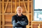
On the Rise: Jamie Howard
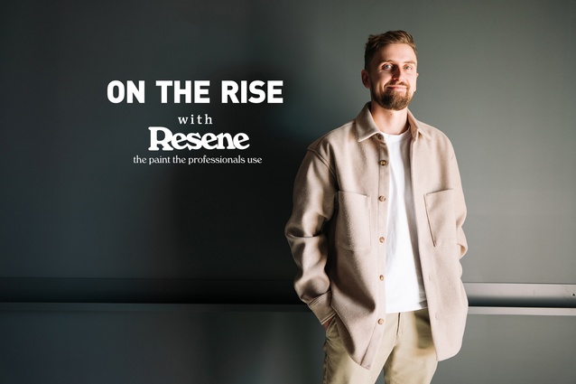
Jamie Howard is a Designer and Head of Visualisation at RCG in Auckland.
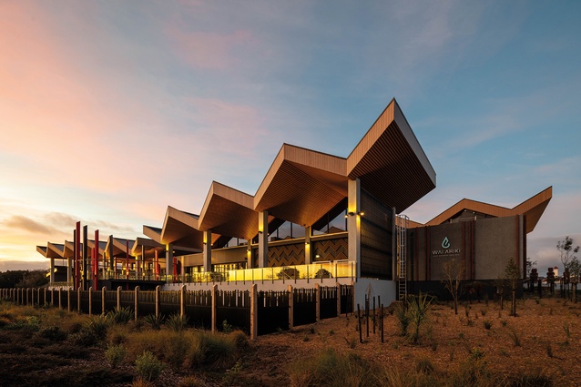
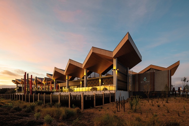
Jamie was the interiors consultant on the highly celebrated design of Wai Ariki Hot Springs & Spa by RCG (2023).
Both the interior and exterior of Wai Ariki Hot Springs & Spa express the legacy of Ngāti Whakaue and a uniquely Māori world view.
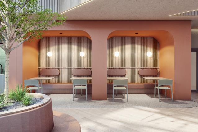
A render of a commercial atrium space by Jamie Howard for RCG.
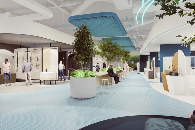
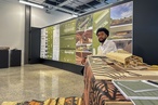
A render by Jamie Howard for RCG depicting a plumbing showroom interior.
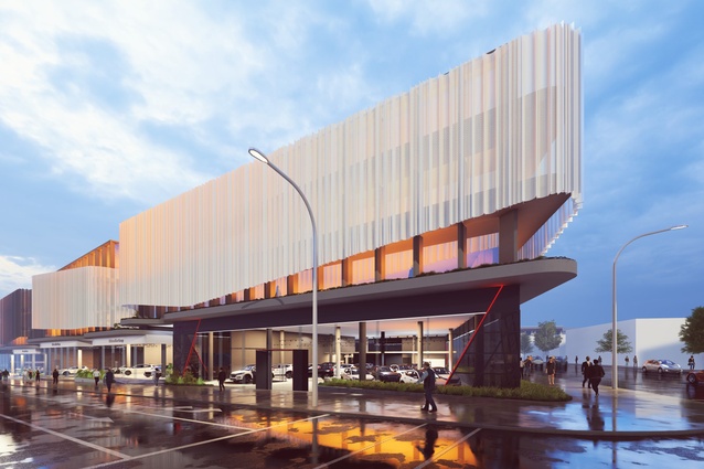
An exterior render of a commercial building by Jamie Howard for RCG.

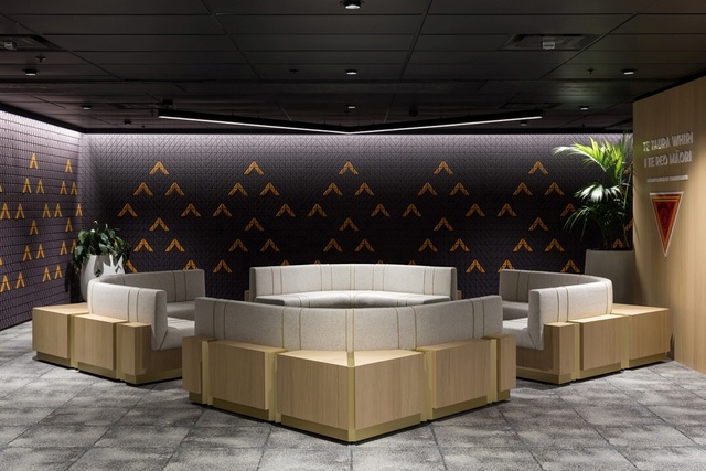
Jamie used his skills to communicate a strong cultural narrative in this commercial workplace interior for Te Taura Whiti by RCG.
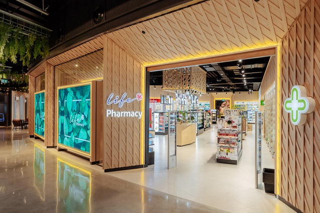
Jamie is the lead designer for the new Life Pharmacy store model. Pictured here is Life Pharmacy Newmarket by RCG.
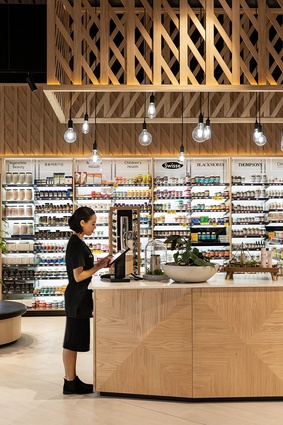
Jamie’s design for Life Pharmacy was the winner of the Supreme Award for retail design (RED Awards 2020).
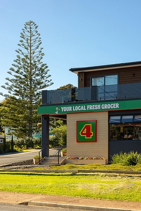
RCG’s ongoing work for 4 Square has resulted in new-look stores in multiple locations including Britomart, Eden Terrace, and St Heliers. Pictured here is 4 Square Onetangi.
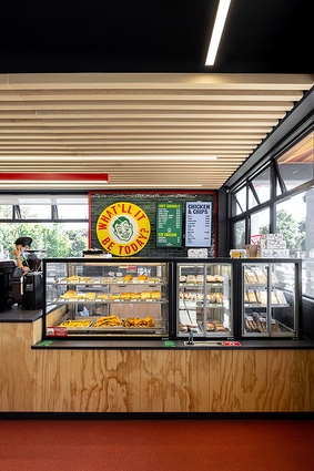
The renovated interior of 4 Square Onetangi by RCG where Jamie is part of the Foodstuffs design team.
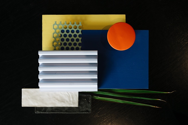
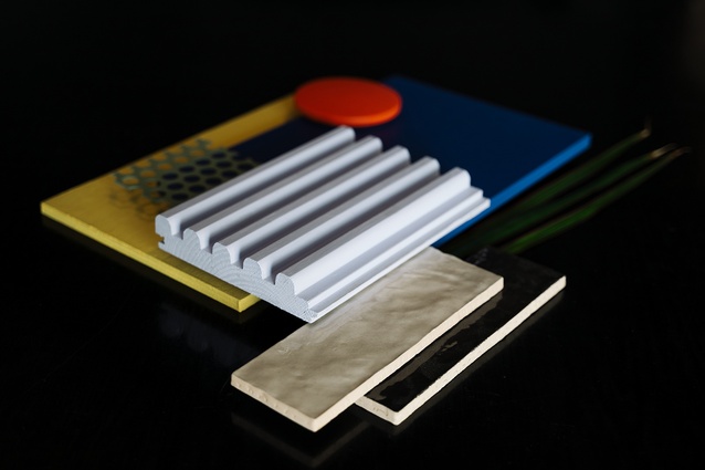
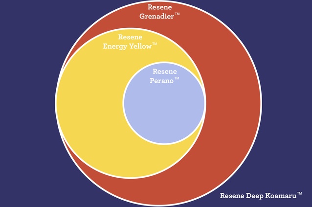
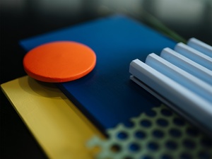
Jamie’s Resene mood board. Find Resene Deep Koamaru (deep violet blue), Resene Grenadier (blood orange), Resene Energy Yellow, and Resene Perano (watery violet) online and in store at Resene.
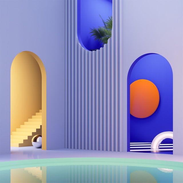
The Postmodern influence of Jamie’s Resene palette is seen in pops of bright colour with pale and deep violets Resene Perano and Resene Deep Koamaru acting as calming and grounding base colours.
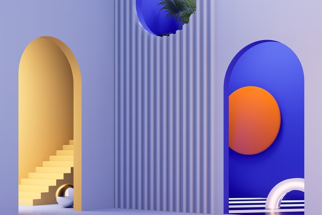
Jamie’s colour palette adds a playful zeal to this hyper-realistic Postmodern-inspired interior with Resene Deep Koamaru, Resene Energy Yellow and Resene Grenadier creating focal points.
Be inspired by the soft violet blue of Resene Perano, the deep violet blue of Resene Deep Koamaru, the blood orange hue of Resene Grenadier, and sunny Resene Energy Yellow.
ArchitectureNow’s On the Rise series, supported by Resene, profiles young designers from across the country who are shaping the future of the industry. In this instalment, we talk to Jamie Howard, Designer and Head of Visualisation at RCG in Auckland.
Jacinda Rogers (JR): Tell us about what led you to become a designer?
Jamie Howard (JH): I’m orginally from the UK, and in the years leading up to my interior design and architecture journey, I was drawn to modifying and customising things and painting large-scale murals for street art festivals. It wasn’t until my mid-20s that I discovered a passion for interior design and architecture; it encapsulated everything I enjoy about creativity, as well as the expression, functionality and individual identity that can be endlessly interpreted by a space, much like a three-dimensional blank canvas.
I finished my interior design degree in Sheffield and moved to New Zealand in one fell swoop.
JR: How did you come to work at RCG?
JH: After arriving in New Zealand, I briefly worked helping to construct homes and dwellings from shipping containers. I then moved to Auckland and began my time with RCG as an interior designer and I am still there today (six years later). It is with RCG that I found my passion for Archivis and visualising clients’ ideas into a tangible, visual reality to get them feeling inspired and excited by their project.

JR: What does your role entail as Designer and Head of Visualisation at RCG?
JH: I wear many hats within my role that align with my key design interests across architecture, interiors and graphic representation.
I work across a wide range of retail, tourism, hospitality and workplace projects, and currently manage them from concept all the way through to completion. I’m entrusted to manage and guide clients and lead the design process as well as driving the supporting consultant teams.
In recent years, I’ve become heavily involved with architecture and master planning. As my origins are interiors-focused, I’ve loved the experience of working on large-scale architectural projects such as assisting with the design of Wai Ariki Spa as a consultant on the interior component.
Since then, I’ve found myself working to produce large-scale commercial architectural designs and concepts.
JR: What are some stand-out projects you’ve worked on at RGC?

JH: I’ve supported the delivery of the recently opened Wai Ariki Spa, which has won multiple awards, including the Healthcare and Wellness Award at the 2024 Interior Awards, the 2023 Supreme Retail Design Award, the Purple Pin and Gold Pins at the 2023 Best Awards, NZIA awards and, just recently, it’s been shortlisted in the 2024 World Architecture Festival’s awards programme.
I am also the lead designer for the new Life Pharmacy store model, which was the Red Awards 2020 Supreme Winner for retail design, and I’m currently working on new design iterations for their sub-brands. I am also part of the Foodstuffs design team rolling out the new 4 Square store model, which won the Value of Design Gold Pin at the Best Awards recently.
JR: As mentioned, Wai Ariki Spa has garnered a lot of press as well as a throng of awards. How do you feel you’ve contributed to its success?
JH: I see myself as a vehicle for capturing and expressing identities and bringing them to life within the context of a space. This could be a retail brand (BYD), the identity of an iwi group within a tourism operation (e.g. Wai Ariki), or the identity of an organisation within their workplace (Te Taura Whiri).
There are many voices within projects. It’s important that all voices are heard and influence the design process for successful outcomes. These voices lead to a project being considered from different angles, where further value is created in capturing the functional, analytical and aesthetic considerations.
JR: How do you reconcile or work to create a synergistic design that meets stakeholders’ wants and needs?
JH: My role requires me to canvas many different brands, most of which already have strong identities. I need to establish how these identities translate into a sensory experience — responding to how differing groups of people interact with each other and the spaces themselves. These spaces become an extension of the brands and companies themselves.
I aim to not push my own agenda or preferences within a project. I find architectural visualisation (Archiviz) is the most powerful method to translate multiple ideas into conceivable design concepts, especially when collaborating with the less design- or creatively-inclined.
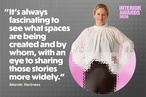
JR: Lastly, what inspired your Resene mood board colour choices?
JH: My Resene colour choices are inspired by Postmodern art and interiors, with my version utilising a slightly more pared-back palette. I selected two contrasting base colours in the rich deep violet of Resene Deep Koamaru balanced with the softer pastel of Resene Perano, both within the same colour spectrum. These cooler colours are warmed with a burst of Resene Energy Yellow.
As I’m drawn to small accents of hard-hitting colour, I tied this palette together with an punch of Resene Grenadier — a striking blood orange. I then used 3D computer modelling and rendering to produce a simple abstract composition, which, in turn, informed my colour choices.
See more from the On the Rise series here.