NZ vs NY: Ahi and Saxon + Parole
Two recent restaurant additions to Auckland’s Commercial Bay, Ahi and Saxon + Parole, boast some of the best public views of the civic precinct. One offers a homage to Ralph Hotere, the other a lesson in New York hospitality. Federico Monsalve discovers what sets them apart.
One is a tad Gatsby, the other a bit Hotere. One was aiming to be fine dining without the fuss, the other feels comfortable towing the line between fine-casual restaurant chain and flamboyant cocktail bar. One of the challenges, however, has more to do with casino hospitality interiors (à la Learning from Las Vegas) than it does with mall food courts: how to behave like sophisticated, destination restaurants without dismissing the more casual foot traffic that the retail precinct could potentially dish up (window-shoppers, office workers and those-formerly-known-as tourists).
Both restaurants were designed in a pre-COVID world, their construction halted and restarted within the same pandemic. Ahi – an expensive labour of love for its owner/chef – was forced to ask some very serious questions about the future of hospitality and its place within it. As a result, the restaurant now has a bifold window opening into the adjacent food court, which could allow it to operate as a takeaway/delivery outfit should gathering restrictions come roaring back.
For Saxon + Parole (S+P), New Zealand’s border lockdown meant less access to the United States-based materials and human resources that the local operation had intended to tap into during the last few months of construction. A quick-thinking executive from the owner (New York’s hospitality group AvroKO), with a flight change from San Francisco to Auckland as our borders were closing and lots of Zoom, ensured that the project was completed.
Yet, at a more structural and conceptual level, there are a few crucial differences and similarities in the narrative fabric of this tale of two restaurants.

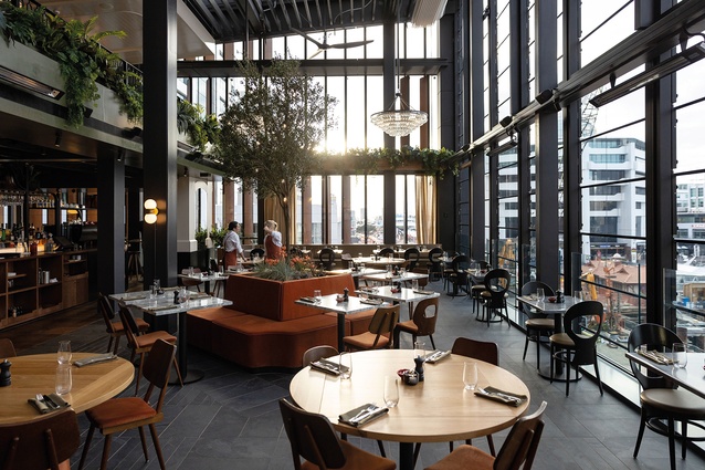
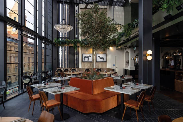
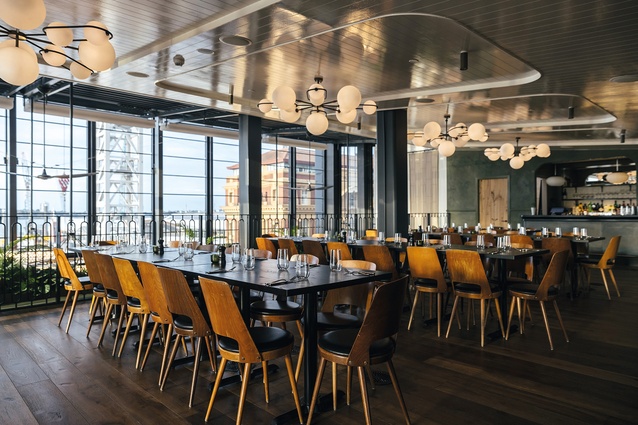
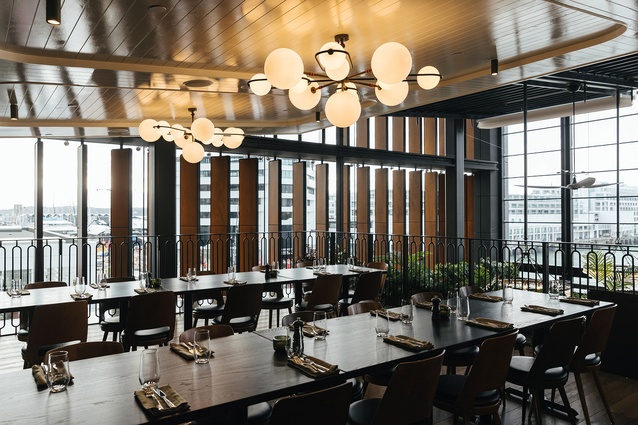
Ahi and S+P began their lives as parts of a sort of architectural afterthought: as the hospitality equivalents of the Harbour Bridge clip-ons that shine – visible from both venues – a few kilometres away. To varying degrees, both were built on what base build architects Warren and Mahoney had designed as terraces on the north-western (S+P) and north-eastern (Ahi) corners of Commercial Bay’s second floor. S+P was originally intended to have a sizeable outdoor area but, to make the business more financially robust, AvroKO decided to push the interior out, encasing it in operable louvres and maximising its occupancy rates regardless of the fluctuating coastal weather.
Ahi, on the other hand, can be classed more as a retrofit, as it occupies an area mainly intended to have been external. According to the interior’s architect, Jack McKinney, the task required significant work to seal it (also in glass) from the elements, which it was originally built to bask in, as well as to re-route all the building’s services needed to support that shift.
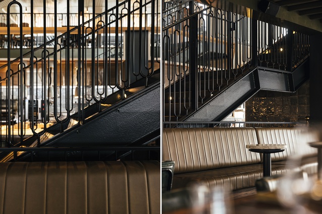
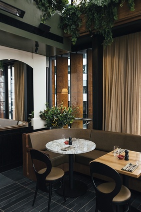
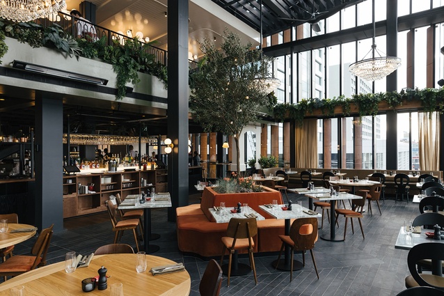
This re-purposing of exterior spaces also meant both venues had to deal with dramatic height shifts, as their locales transitioned from the dark Harbour Eats food court that surrounds them, and rupture through the building’s original façade. Each softened that transition by inserting a mezzanine level: Ahi concealed it and used it for back-of-house and services; S+P brought it out and, using a language of wrought iron, greenery and subtle allusions to classic yachting, offered additional floor space.
Thematically, both Ahi and S+P were conceived to represent, respectively, New Zealand and New York, not just through their food but through the designs of their interiors and all the tchotchkes that accompany them.
Ahi (meaning ‘fire’ in te reo) began as chef Ben Bayly’s attempt to define what New Zealand cuisine means and serve it within a space that represents those local aspirations. His focus is on point-of-origin and the traditional usage of ingredients: synthesising the flavour profile of hāngi, for example, or pairing and experimenting with meats such as mutton bird or tahr.
McKinney’s interpretation of that culinary brief began with an art installation he remembers seeing in his youth: Black Phoenix by Ralph Hotere. In it, the artist deconstructed a partially burnt-down, 12-metre fishing boat. Hotere then propped its bow against the gallery wall and placed some of its planks parallel to that and others lying on the floor.
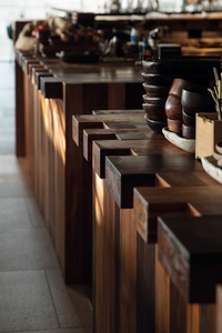
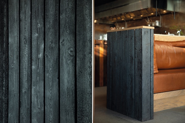
Art critics have compared those charred plank formations to fencing around a pā site and boards along a jetty. “Hotere took parts of that burnt timber and he planed them… like peeling back under the burnt stuff where you get the fresh timber again. That was quite a poetic thought… so, this is my little homage to that,” says McKinney.
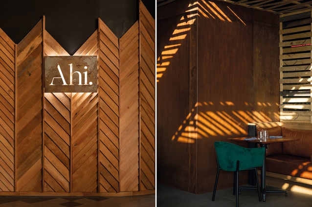
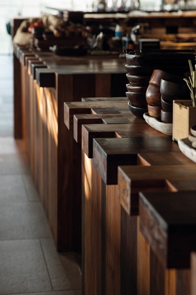
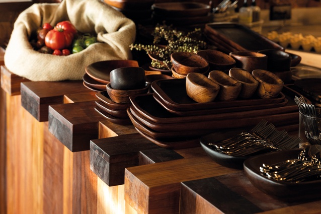
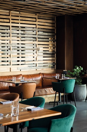
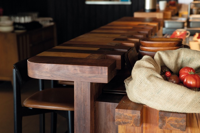
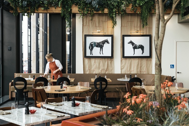
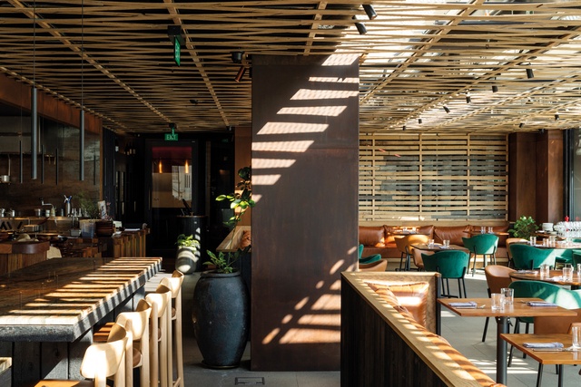
With the assistance of Waikato-based craftsman Tom Muir, a mixture of New Zealand natives and European species grown locally (salvaged rimu, mataī, swamp kauri, etc.) were used side by side here. Timber tabletops dating as far back as 35,000 years, counters and serving-ware all express a touch of the local flora. Perhaps in emulation of Bayly’s cooking style, some surfaces have been treated with a Hotere-like fire, leaving their veneers charred, while others have been left ‘raw’.
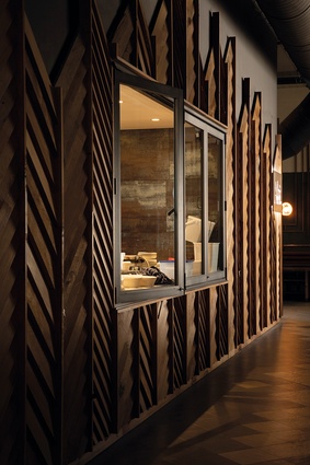
Meanwhile, on the glass ceiling above and on some walls, a timber lattice has been used, not only to hide some services and provide shading, a light-dappling effect and acoustics, but also to add a sense of continuity between the two binary areas of the restaurant. The lattice’s raw materiality and patterns –ranging from diamond-like to rectangles – can be read as a sort of abstraction of traditional basket-weaving or even Polynesian navigational charts.
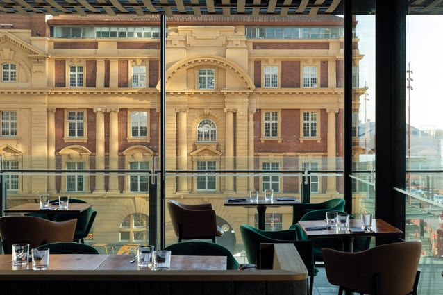
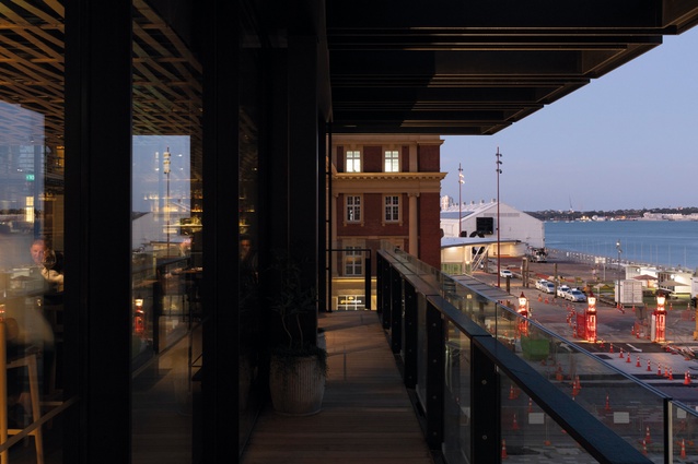
These traditional allusions and materials sit, almost within a glass jewel box, beside two imposing pieces of Edwardian baroque architecture (the Auckland Ferry Terminal and the Auckland General Post Office) and with enviable views of Ports of Auckland and the vast Pacific Ocean. At night, the highly reflective glass superimposes this timber and Corten interior onto its surroundings, almost creating an abstraction of itself onto the outside world.

For the design crew at S+P, the idea was less about expressing point-of-origin through materiality, but more about infusing the ceremony of eating and drinking within an atmosphere that felt quintessentially East Coast. “People want that New York experience but without really knowing what that means,” says Marion Emmanuelle, the Auckland-based partner from AvroKO.
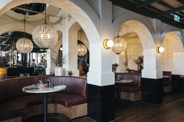
“For us, it has been interesting to dissect that experience. In the end, one key element… was about sparking connections,” says Emmanuelle, creating all the interior parameters to help people “start conversations with strangers and anyone next to them. That takes a specific environment. And that’s what we love about New York and our restaurants: the fact that you can just go to the bar, have a bite or have a drink and run into somebody, and then it turns into a larger crowd and you can’t really do that if the table next to you is six feet away.”

Kirsty Addison (of Mitchell Addison), who led the design of S+P, points out that, initially, the idea of cramming people together seemed so unnatural for the Kiwi interior firm. “[AvroKO] wanted to put two people where we normally would have been putting one and a half.”
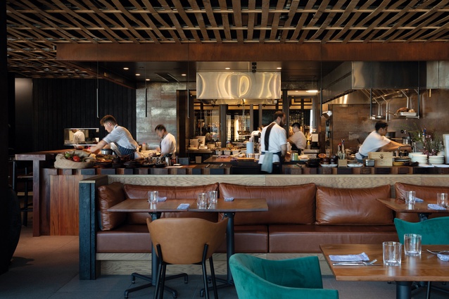
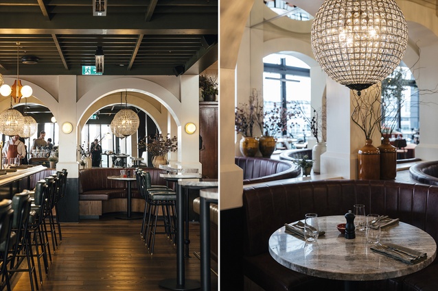
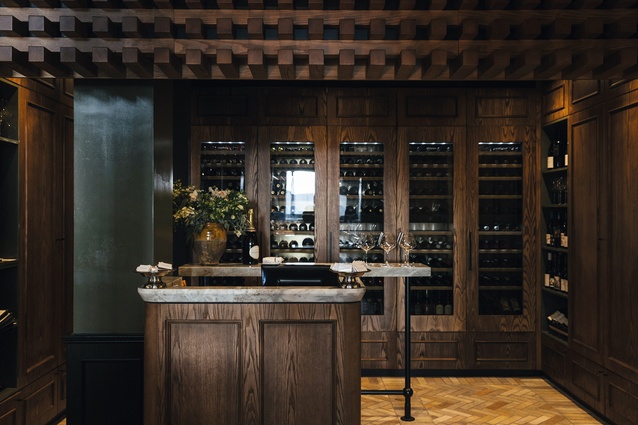
S+P uses many other spatial techniques to heighten the chances for sociability and a boisterous interior; a front-of-house kitchen (more theatrical than practical), a wine-tasting area and a pre-prepared cocktail cabinet with personalised bottles have been placed towards the entrance, facing any incoming customers.
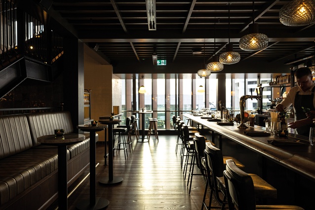
The main bar is also there (à la American TV show Cheers) and sports a ‘surfboard’ bar counter, which Emmanuelle defines as a wider, open-ended counter “so that people can congregate there. It’s a very convivial kind of experience and we love the idea of people going behind the bar and breaking the barrier between front and back of house.”
So, where one dining experience has been conceived for its ability to represent New Zealand through materiality, the other, with a touch of cultural diplomacy, seems to introduce audiences to a New York State of Mind when it comes to hospitality. Both venues accomplish this with varying degrees of success and even a touch of poetry.

