Auckland Airport welcomes Novotel Hotel
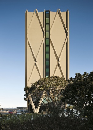
A tall, slim and simple hotel designed by Warren and Mahoney is a new addition to Auckland Airport.
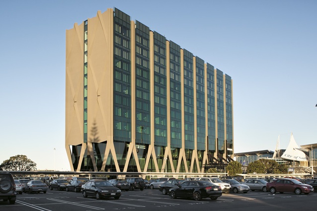
I was rather startled when I first saw this under construction in the car park right outside Auckland Airport. With its legs like a marching caterpillar, it’s as if a city high-rise has walked here from town and parked, like we all do, as close to the airport door as possible. As a building it can seem a bit adrift in a sea of cars, but as we will see its vessel-like nature is appropriate in so many ways.
At first glance the hotel seems a tethered crystalline airship, detached from place, resting only on an undercarriage. In one respect this may change: its site is not as generous as it may seem. In fact, it is tightly constrained, precisely located in relation to the airport’s development plan, which will see the whole airport pivot around it through major changes such as a new northern runway, domestic terminal relocation and major roading changes. However, I like this rootless aspect of its presence: this is an airport, after all, the buildings mere portals for all us souls in transit.
The hotel is a long, thin and tall rectangle, its plan largely driven, as all hotels are, by the module of the room layout and circulation. It’s deliberately simple in conception, which of course confers economic benefits important in the hotel business, but its thinness allows a sense of transparency. It expresses itself vertically rather than aiming to shape exterior space. It’s a stack of rooms reaching for the sky; this effect is enhanced by the air-frame base and the gradated glass façade. The tinted green glass lightens with height. The triangular legs are sculpted GRC, fitted together with careful precision around tubular steel struts. They have a delicate, faceted, bone-like quality, reminiscent of the furcula or wishbones of birds. Although crisp and minimal, the whole building has this elegant, sculptural quality, quite different from the more expressive, but flabby, swoop of the existing terminal that tries too hard to be symbolic of the City of Sails.
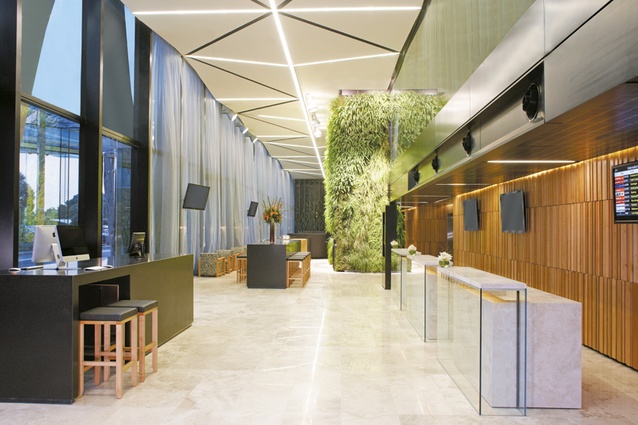
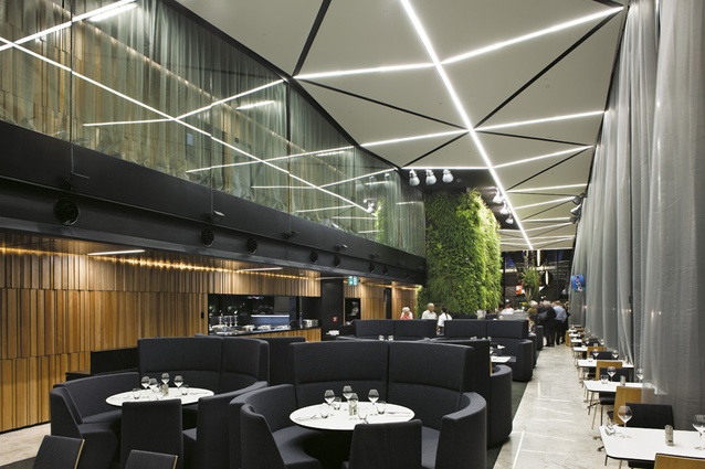
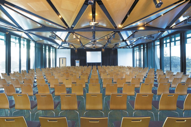
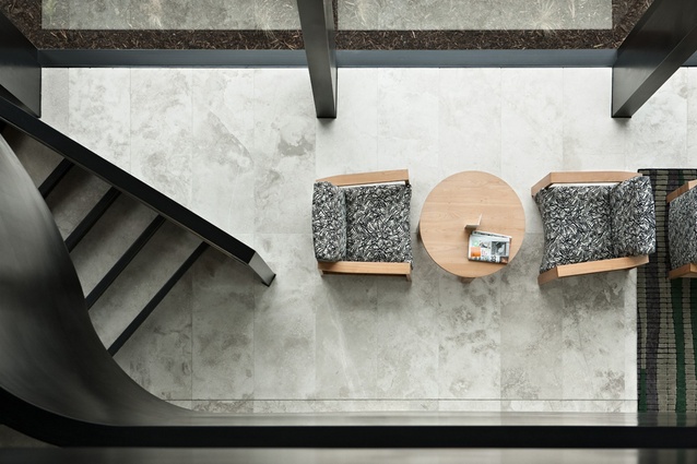
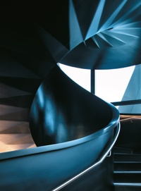
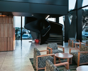
Inside, the ground-floor public area is a long, almost fuselage-narrow but double-height space with a long white cloud of ceiling. It is mostly restaurant, bar and lobby but has a private dining room screened off at one end with a set of patiki-patterned pivoting fins. At the other end, an obsidian-black helical stair twists into the air to access the mezzanine. Along this level are a row of meeting rooms and function spaces and above this floor is a gym. These three levels of public space usefully lift the bedrooms well above the car park, allowing better views of the wider airport, the harbour and the Manukau Heads. It’s also a very easy building in which to orient oneself.
The interior aims to have a New Zealand character. It’s dark, but the widespread use of black in here isn’t overtly All Black. It’s us, but it’s also elegant and enhances the few vivid colours, which largely stem from the use of natural materials rather than paint, such as the wall of beech from a sustainable South Island forest. This long wall of variegated vertical battens also successfully works to secrete doors to the kitchen and service areas. This interior is quite New Zealand-ish in that it’s very physical and elemental, in contrast to the usual highly artificial and insulated beige hotel lobbies in which your stereotypical fat foreign tourists frequently slump after a hard day on the tour bus. This is a tall space open to raking sunlight gently filtered through a veil of curtains that waft in the breeze. A lush waterfall of ferns cascades down through the centre of the space to spill over the black bar. The green wall is becoming a bit de rigueur these days but it works here as a promise of what is to come on your voyage around our country’s much-advertised natural splendours. It has a kind of an “expo” feel, but since this is the first or last New Zealand building many visitors may see, this approach is justified and certainly this interior is a crisp and refreshing contrast to the dismal, bland limbo of our airport terminal. And I very much enjoyed my bracing sauvignon blanc here as did many others, both native and foreign. Mind you, most of us seemed to be here on business.
This hotel is largely a Tainui venture. It is at the northern boundary of the tribe’s rohe but is a place of extraordinary significance. The Manukau received its name when the Tainui waka first arrived in this vast harbour, and Tainui have lived on Mangere’s shores for centuries. For most people this place is now Aotearoa’s most significant port of arrival and departure. This hotel is vessel like in many senses, not least in that it also represents the presence of Tainui, more clearly expressed than before at Auckland Airport. In some ways this is overt, for example in the inscriptions in stone and the carved panels on the building’s exterior, and this is right. Elsewhere it is done so subtly that one starts to look for metaphors everywhere. Does the zigzag of the building’s legs recall the path of the Waikato wending its way to the sea hereabouts? Do the pohutukawa flanking the building recall the story of the waka’s prow nosing under those tree’s branches on its first landfall in this harbour centuries ago? Certainly the patiki motif refers to the flounder of this shallow harbour, but also the meanings associated with that symbol.
This building, which at first sight seems to float in a car park, untethered from place, can be seen to resonate and recall an earlier time before reclamation and airport development; a once tidal environment of shifting shores and sinuous waterways, rich in fish and birdlife. This hotel is a vessel for travellers but also a new waka of Tainui. And as one leaves the airport precinct and travels through the Auckland Airport Authority’s recent developments – a few square kilometres of the same big, dumb box developments (The Warehouse, Countdown, KFC, McDonalds), the new tide blighting the New Zealand landscape – one may well think this slim vessel could be the most engaging experience of New Zealand you will have for a while. Certainly it’s the best piece of architecture around here. If it still seems out of place to you, my advice is bowl the other airport buildings. Let’s have more like this.

