Multi-storey media and arts building
Irving Smith Jack Architects designed a building that allows everyone to see how it was built.
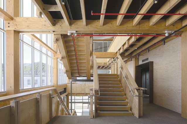
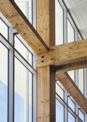
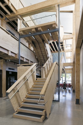
Entering a vaunted “world-first” building is a bit like being led into a well-telegraphed surprise party: you have been primed to expect novelty and noise. So perhaps the most striking aspect of the Nelson Marlborough Institute of Technology’s new multi-storey timber arts building is just how familiar it feels. Walk into the atrium and you immediately see that the frame, which like everything else in this building has been left fully exposed, is nothing more exotic than a series of two-bolt post-and-beam junctions.
The idea, according to architects Andrew Irving and Jeremy Smith, of Nelson practice Irving Smith Jack, is that anyone who uses the building should be able to understand at a glance how it has been put together. “We like that someone can come in and go ‘crikey, that’s just a straightforward house junction; this isn’t such a big deal’,” says Smith.
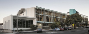
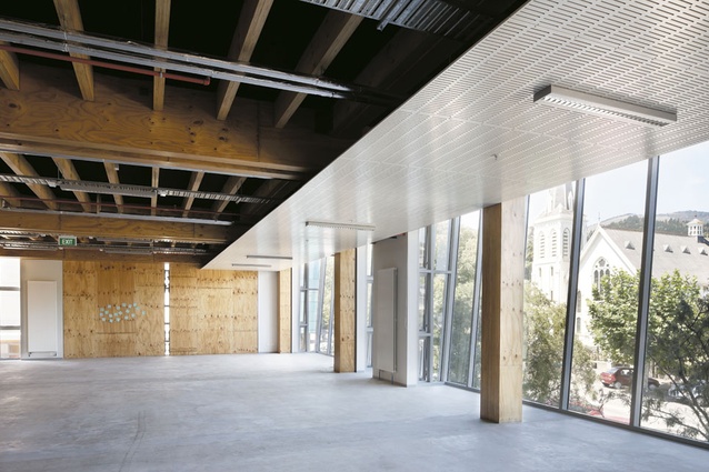
Should a visitor linger a moment longer they will note that all of the services are similarly on display, the pipes painted red, black or blue according to function. “In fact, every material in here has been done as a legend. If it’s structural timber then it’s clear, if it’s non-structural it’s blonded, if it’s not timber then it’s white.”
The preoccupation with simplicity and legibility reflects the fact that this is a teaching building in more than the obvious sense. After years of batting about plans to build a dedicated arts building at NMIT – they were talking about it as long ago as the 1980s when the institution was just known as Nelson Polytech – the advent in 2008 of a dedicated building fund happily coincided with an announcement from the Ministry of Agriculture and Forestry (MAF) that it would put $1 million towards any public building that promoted the use of timber in low-rise construction.
Icons were off the menu. Rather, MAF wanted a replicable building with which to counter the construction industry’s traditional prejudice against timber as being good for only houses. As an aside, following the Christchurch earthquake, timber buildings such as this one are being seen in a new light. Against some big names – Warren and Mahoney, Athfield Architects and Architectus were all shortlisted – Irving Smith Jack, whose offices are scarcely 400 metres from NMIT, won MAF’s design contest assisted by a simple scale model of one of those post and beam junctions and a plan to source almost everything from within 80 kilometres of the site.
The Nelson practice has a track record of using timber successfully in domestic settings. Its Kumutoto Bay house won the 2007 New Zealand Timber Design Supreme Award and Smith and Irving describe the arts building as essentially a scaled-up version of that work. That belies the complexity of what was involved here.
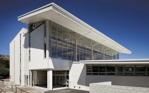
“For our first three-storey building to be a prototype has doubled the steepness of the learning curve,” says Irving, who spent long hours at the factory with the engineers and LVL fabricators developing timber solutions and refining what was essentially an industrial product into an exposed architectural element.
Two developments in timber technology made the building possible. The advent of laminated veneer lumber (LVL), which is engineered by rotary peeling radiata into veneers then gluing them together, has produced a timber product with the compression strength along the grain of concrete. The sight of ten-metre-long spans of LVL being slotted together during construction may have put onlookers in mind of a medieval fortress, but the technology was pure 21st Century.
The other innovation is the use of post-tensioned timber shear walls, a critical element in the building’s world-first ‘damage avoidance’ seismic system that project engineers Aurecon developed using breakthrough research from the University of Canterbury. It was those walls that allowed everything else to be so simple.
The use of such technology raises an interesting question. Was the building, recently shortlisted in the World Architecture News top 25 International Education Building Awards, an engineering or architecturally-led project? “Because of the timber questions posed this was a much more hand-in-glove thing with the engineers than normally,” remarks Irving. “At the end of the day for a building to be successful for our client it has to be about more than the engineering. The fail mark would have been if this was a fantastic piece of engineering but not much of a building to be in.”
The feedback from arts and media students who, until now have been scattered around campus in various locations, is that their new home is already encouraging a more collaborative way of working. The atrium, for which the architects had to fight hard, is a catalyst for much of that. Generously sized and with well-controlled levels of northern light and venting for passive heating, it performs both as an extension of campus and a fluid, informal gallery space in which the students are encouraged to display their work. Walk in one evening and you might find 70 chairs arranged and a speaker holding forth from the stairs; arrive the next morning and three yards of fabric have been rolled out across the concrete floor.
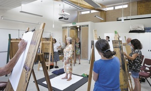
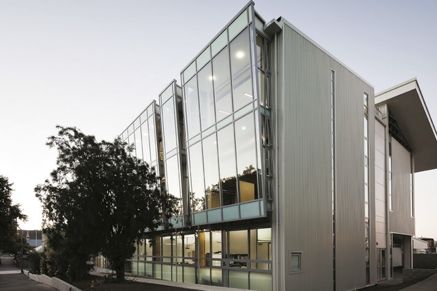
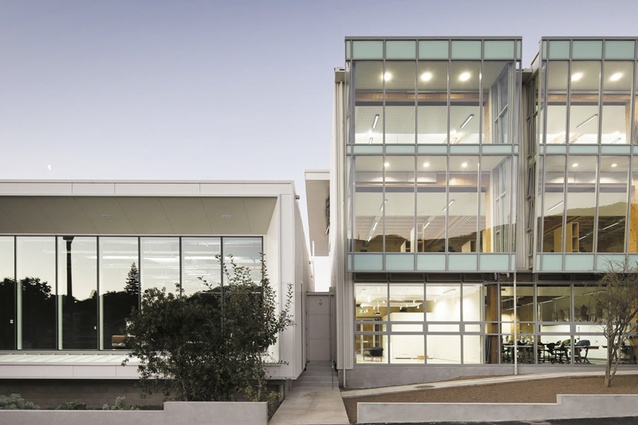
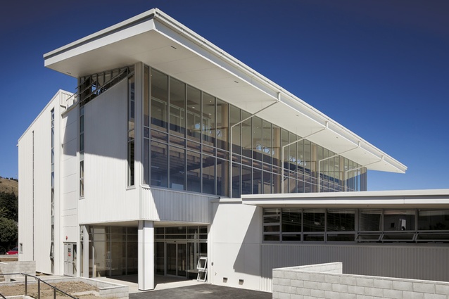
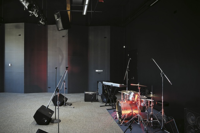
The architects’ working mantra “Exhibit not Inhibit” takes on another meaning on the southern side, where the workspaces are concentrated and where NMIT faces its residential neighbours. Here, pessimists might have anticipated a mind-your-own-business curtain wall; instead the street frontage has been generously set back and its glass face gently canted to allow passersby to see into the studios. At ground level, that means an unimpeded view into the velvety black depths of the “Johnny Cash” band room.
There is only a glimpse of the building’s real star. A landmark timber building with not a single piece of external timber? Smith and Irving say that from the earliest moments of conceptualising the building it was decided to wrap it in a protective skin of steel, with the aim of lessening the maintenance burden for NMIT and so that the ‘bones’ could be fully on display inside.
Bodily metaphors are overused but they’re appropriate here. This is a soft, warm building, comfortable with having all of its inner workings exposed, as befits a practical-minded arts institution in a provincial town not given to slick gestures. “We’ve been honest in showing everything,” says Smith.

