National Library of New Zealand Te Puna Matauranga o Aotearoa
Tap the word ‘architecture’ into the National Library of New Zealand’s online database and nearly 90,000 entries arrive at your fingertips. Yet, the National Library building is not a library filled with just books; instead it is mainly collections, databases and services that line these walls. With information and books now so accessible online, ‘the library’ has morphed into a staging post for knowledge, collaboration and community. But this particular library carries great significance, not only for researchers in New Zealand and abroad but as the guardian of taonga and the collector of our culture and its vagaries.
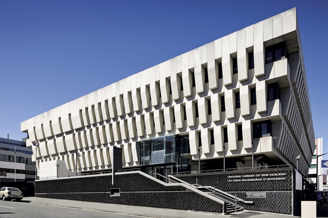
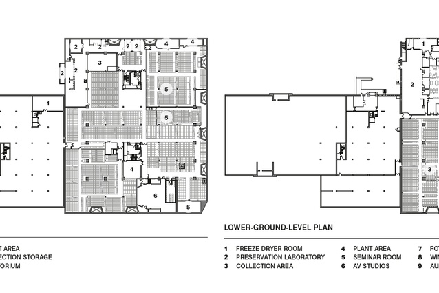
The National Library was originally designed in the brutalist style during the early 1970s and completed in 1987 but, by the late-2000s, it was ready for a contemporary revamp. Some of you may recall that Warren and Mahoney responded with a radical design that covered up much of the distinctive façade and caused considerable controversy. However, the architects’ final scheme is something altogether different and is very nearly complete. There are plans for the north-eastern corner of the ground floor to be fitted out to hold The Treaty of Waitangi, along with the finishing of an auditorium on the lower ground floor. There is also potential for better integration of the building into the adjacent plaza if more funding comes on board.
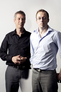
Justine Harvey discussed the design of The National Library of New Zealand with Warren and Mahoney’s Ralph Roberts and Rodney Sampson in Wellington, a few days after the Cook Strait earthquakes on 21 July 2013. An abridged interview follows.
Let’s start right at the beginning. Ralph: It all started with a design competition presented in the auditorium downstairs. Roy (Wilson), Andrew Barclay and I were there. Penny Carnaby was the National Librarian then and she said they liked that we were interested in change and looking forward, not backward. Out of that came a whole spur of debates, as well as some really good discussions with Penny around the digital experience for, not just the library, but the direction of communication in general. She was a strong advocate of preserving and using what we have here, but embracing the digital and the internet experience as well. And engaging all ages, young and old, and their gurus – they call their researchers ‘gurus’ – so changing the model for the National Library by making it a place for all New Zealanders.
It sounds a bit kitsch but the library wasn’t being used by many people and that was the big kick-start…
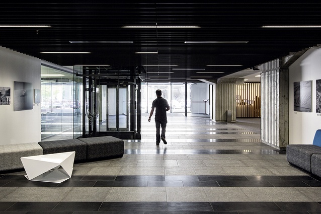
The design solution was that you could walk right through the building to move from A to B in inclement Wellington weather. You might be encouraged into the building to use the free Wi-Fi. It’s heated, students could hang out in here at any time and use the systems. So, rather than just looking at the function of the library, it was looking at the greater area.
Rodney: The parliamentary precinct forms an urban village with all the facilities in it, but it didn’t have a large public open space in which people could gather. There was an opportunity to become a community hub for workers during the daytime with other activities on the weekend. The library saw that as a positive thing: that every person in the door would understand more about the library and the word would spread. Penny was very keen about it being open, even if it’s just being a pathway in wet weather.
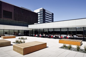
Even simple things, like having a coffee shop. Rodney: I think that convenience and experience are the two things that add to the richness of the knowledge base, allowing people to rub up against it. We’re sitting [in the café] where an old gallery was, that had been very poorly planned, and the public experience was nil.
Ralph: All the windows were blacked out down here because they didn’t want light damaging the paintings… This café is a little bit colourful and it’s becoming a magnet for the whole of Molesworth Street.
Rodney: This is probably working twice as hard as they expected. It has actually activated the public.
I saw that in London at the Tate Modern, where they’d designed a huge café on the ground floor and it was always packed day and night. Ralph: That’s a pattern we’re seeing internationally and with the Ministries around here… What didn’t come about was this access to media and library content from the café; that was a very strong part of the brief early on, which slowly eroded and wasn’t able to be achieved in a physical way where you might see screens of CNN or the Alexander Turnbull Library here (in the café). You have to go up and see those. What it does do is provide a space for the Ministries to use – talking and doing business – and that’s also happening with some of the work we’re now doing with the Ministries’ buildings. One example is Stout Street, the old defence building; that model is not dissimilar to this. They do different things completely but there is this idea about engagement and access: that the public can share and use their facilities, is being adopted, even by the Ministries. It’s in the private sector already and it’s clearly working, so that’s starting to evolve through here.
Many people just don’t know what’s available at the National Library. I was looking at family tree information online and a lot of research comes out of here. Ralph: Their online content has become very good. It’s more accessible but the resources and cost to go online is a hindrance. It will happen more but slowly.
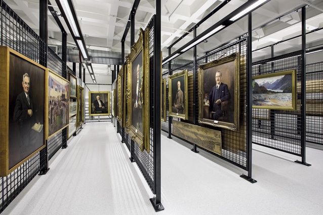
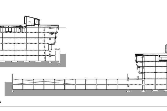
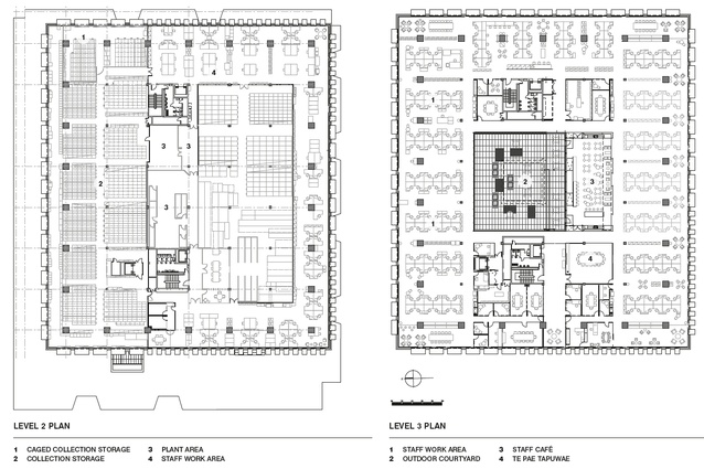
Underneath what we’re sitting on here, which is a public floor, are two levels of collections and they extend underneath and across the boundary into what was the State Services Commission building…
Rodney: Part of the rationale for the work, in terms of providing a secure environment for the collections, was that we separated public and staff from the true collection areas. Probably only 30 to 40 per cent of the collection was in a humidity-and-temperature-controlled environment, but now 100 per cent is controlled. Staff and public can’t work in those areas; we’ve separated them out so, from a preservation point of view, the collection is much stronger.
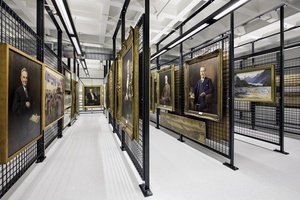
The big change is that the Alexander Turnbull Library (ATL) now lives within the National Library. Before, you could go to either one or the other, now everything comes through the ATL as the portal for the public accessing all of the collection material.
Ralph: The ATL has moved around the city between five sites, I believe. There was a Government Act that said that when the National Library was developed it should look after, in perpetuity, the ATL collection. They’re locked together because the ATL collection is irreplaceable. The National Library collection is different; that is replaceable… The ATL has developed more mana in terms of the library.
How the collections are managed, maintained and collected was fundamental to your brief. Ralph: It’s absolutely paramount. When we received the brief, we had a set of priorities in terms of a business case, a funding model and where the project sat – providing safe and secure storage for the collection in a 25-year-old building with significance… When we started, we didn’t know it was going to be such a long process. The change from a single-funded large gesture to an outcome staged over about 13 stages has been very tiring and hard work for the team and the library. So the way funding is procured for these things has an incredible impact on the outcome. All the money in the world doesn’t give you the best design. We’ve had to work our way through the fundamentals and slowly that’s evolved. What patience, as an architect, and what patience, as a project manager… What we did get to, through the design process, is that holistic idea about what the briefing solution is for the whole building? We developed a good understanding of what it could be through developing the one-build solution and, while we didn’t maintain that idea, we maintained the essence of the idea throughout the various stages…
What was the remit? Ralph: It was a complete refurbishment of the building, including a full façade. The whole building was being preserved.
I’ve seen pictures of your original scheme for the building. It was controversial, wasn’t it? Ralph: Yes it was, which is good because it created discussions… Some of those ideas are in there: the thought process about what is a New Zealandness or what is it about the National Library for New Zealand that could help inform other countries’ national libraries? Why can’t it be a leading light? Why does it have to be Seattle or somewhere else? There were cultural, landscape and urban discussions around its place in the parliamentary precinct, offering Wellington as a tourism drawcard, its knowledge base. The catchline that ‘we hold the memory of New Zealand’ was the thinking… Early on, there was this idea of bush, damp, changeable weather, moodiness, lack of colour, animal life, bird life: all those sorts of things.
Neutral isn’t it? Ralph: Yeah it is. It’s not bright, hot sand or arid desert, so a lot of the colours and tones you see through the whole building are dark blacks and greys.
I looked at a house in those tones yesterday and can imagine some people thinking that it’s a bit grey and brutal but I think it works in context with Wellington’s landscape and weather. Ralph: I think there’s a busyness around built form which is people, furniture, cafés…
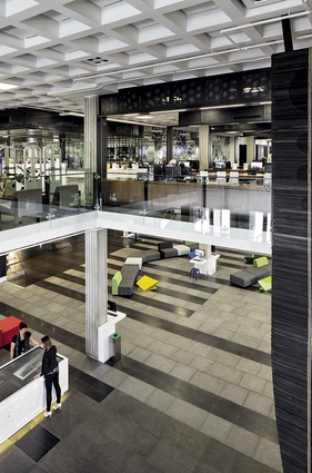
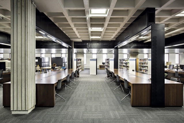
Even though this building is of its time in one sense but, partly because it’s a sculptural form, I think it’s held itself. Rodney: The move with the gallery… is that it’s one big strong form in the middle of this floor and that is it. Everything else we thought should be open around that and able to be changed. And working with the waffle ceiling, concrete slab system which is quite beautiful and it’s pretty tough.
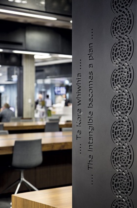
And you get that subtle pattern matching going on as well. Ralph: We continued something that Athfield’s team had done around the entry early on and it wasn’t to try and change that but to build that in as part of the language. Some of the work that they’d done with folded steel plate was an interesting idea that we thought was very good and we should continue, so you see them folded around the café here and on other parts.
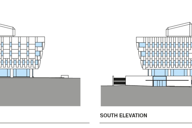
Rodney: And the idea for the outside of the building, being this really strong, robust form and then this very fine glass is a surgical-like insertion into that. How do you cut an opening when you’ve got minimal opportunities, because we were restricted in terms of what work we could do on the outside and the inside. You see that repetition of the larger strong forms that things hang off and then, when we do make a cut, it’s really definitive. That was the intention behind it.
The floor plate has some robustness and flexibility and it won’t be here for just five years like a normal fit-out. This is a civic building in its nature. The library will evolve. We know that the Treaty of Waitangi is going to come in here but we don’t know exactly how it’s going to manifest itself into that public space out there so, at the moment, it’s a bit of a place-holder. Things are going to change around that but, in 10 years’ time, the elements like the gallery will be in the right place, away from the sunlight and well controlled. It’s like you step back into the building.
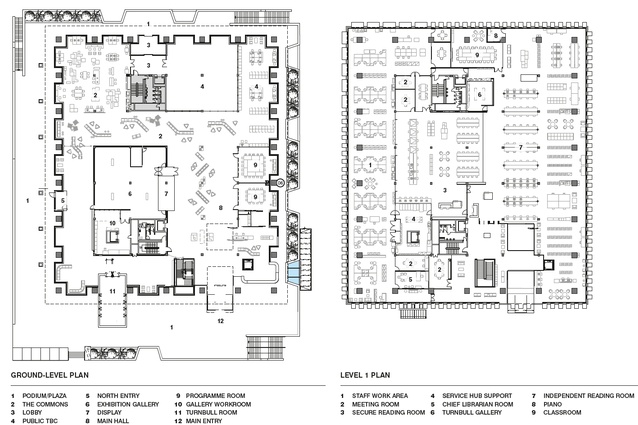
A box within a box. Ralph: There are two key open spaces: the public space at the front is a deliberate move within the funding model to find a connection between ground floor and first floor. We did look at a number of more adventurous proposals but the stair had to remain. What we’ve done is connect from the south side of the building away from the sunlight, the main hall which is effectively a long rectangular hall, half of the ground floor, and at the end of that form is a place-holder for the Treaty. It’s flanked by the gallery on one side with the shop window… and some public rooms on the other side. That space is ideally a fully flexible space, a travelling exhibition that can change. You could build something for three years and take it out of there but mirroring that thought on this level is exactly the same form on Level 1. The same orientation, the stair length of two and that is the grand hall for the ATL. We’ve purposefully ordered the research tables to help define that space and then we can flank that space with the Rare Book room and the watercolour gallery, which is a working area.
So there are these two spatial forms if you like, one above the other and I think people won’t realise that, but that will come into its own in time; if someone needed to punch a hole between the two, connect the two, they will become very clever, workable spaces.
Rodney: Create a visual connection, just to sight something else happening on another floor.
The other part of the brief was the ceremonial pathway on the ground floor. This is a space that is used quite a lot for protest, so it’s a gathering space before they go over to parliament. There’s a procession which starts out on the front where they welcome people in and there’s a marae out here. You can take a powhiri of up to 300 people in this space at one time, so it was designed to be a significant volume. At the moment, without the Treaty in here, which is really the last piece in the puzzle, it’s probably lacking that intensity.
They must get that in there and do it right. That’s the nucleus of it; it will be the other component to the National Library that’s really important. It will be completely different from the archives building as it works now, so integrated with the library offering, the memory of New Zealand and all the information available, there will be a constant stream of people through here. You can imagine what Waitangi Day will be like. Just the pre- and the post-Waitangi Day for the two weeks will be huge. You catch a glimpse of what we were trying to do there.
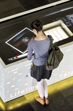
Exciting. Ralph: What the library ultimately wants to do is capture the memory streams that people are creating and upload them as a thread of research into its database. Those connections will make the database and the information its holding much more meaningful…
Rodney: There’s the time-lines idea, about where you go to access information. Researchers have often done a lot of research to get from A to B, threading their way through weeks and weeks of information. If you could record that, plug that into a space that somewhere someone can grab a tentacle of it and then carry on.
Even if it’s not for 50 years. Ralph: Yeah, so the 50 steps it took them to get to there, if you could see that manifest three-dimensionally on a computer screen, you’d go, I’m going to grab that and carry on. Then, for kids to see it and use it as a pattern to start learning about how to research is really quite exciting. It’s completely devoid of the architecture we’re doing but inherent in the memory and the data that’s in the building.
I have an album of my grandfather’s, which has photos taken in Samoa between the two world wars when the New Zealand army took over from the Germans, which I could upload… There is very little information around about that piece of history… Ralph: If you want a central depository to hold that, just come in, plug it in and then it’s in here somewhere. You’ll know it’s safe and looked after for generations.
And all the people out there with all kinds of information that isn’t stored anywhere. Ralph: And you should be able to plug in from your website, it doesn’t matter where you are, but use the National Library as the glue to pull that stuff together.
That would be a great legacy. So, how did the building respond in the earthquake? Ralph: I saw the CCTV, looking out when it happened, and there was quite a bit of movement; it wasn’t a small quake by any stretch. [There was a glass breakage at the front.] It’s the top panel, there’s a bit of firewood in there. But, amazingly, it’s a vertical piece of glass but, because it’s toughened laminate, it falls into little balls as opposed to shards and landed on top of the roof. Quite dramatic…
What’s the structure like? The building was inherently very strong and the floor loadings were very strong for the weights of shelving and the extended weights. We’ve put a new concrete roof above the old concrete roof now, all heavily insulated with new membranes. There’s Pam Harris, who Rodney is talking to. Pam was running the project towards the end. She’s getting married to the contractor actually.
Did they meet through the job? Yes, a lovely story.
See, you’ve brought people together.

