Modernist horizon
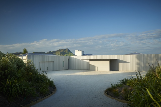
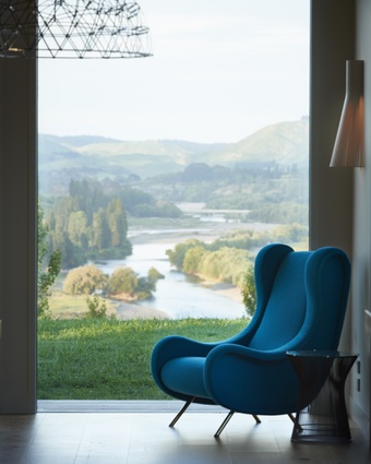
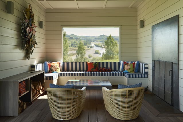
In late spring, when poplar fluff drifts like snow in the valley, it’s easy to imagine the sleeping giant of Te Mata peak may sneeze and wake. This home on a small promontory overlooking the laconic Tukituki River offers front-row seats for such an event.
Its glazed face that ushers in the wraparound spectacle may for some be the pinnacle of architectural intention here. For designer Andy Coltart, it is not. That accolade belongs to the entrance façade. “It’s the best part of the house,” he says.

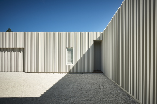
For its surprise factor and sheer scale, this timber frontage is awesome (in the very essence of the word). Formed of board and rough-sawn battens, it rises white and formidable from a shingle courtyard. At 30 metres long and 4.5 metres high, it’s a statement that Andy, known for gabled modern farmhouses, is not used to making. Yet he does it well. The tops of the battens are planed off at 7 degrees. “It makes them sharper against the sky.” The texture and shadows created by a pattern of battens that he describes alternately as “random and non-random” is sculptural.
When owner Alister Moss, who was born in Wellington but now works in Hong Kong, approached Andy with a vision for a mid-century style house and a folder filled with examples in the Palm Springs genre, it was an irresistible challenge. “I had to get my brain working in a modernist way,” the designer says.

To be fair, the brief was unusual. He was asked to build ‘a pure white iPhone: flat and simple’. Taking that concept and converting it to a liveable reality has been a team effort. Andy’s sense of scale and his practical knowledge of timber played against Alister’s strong aesthetic drivers and specific requirements.
The owner wanted to be able to wheel a trolley from inside to out without going ker-klunk over a sliding-door frame. High benches in the kitchen (he’s almost 2 metres tall) were a must as was a place to plug in the vacuum cleaner in every room. Most importantly, adjustable art railings for his extensive collection of New Zealand and Asian art needed to be incorporated in the walls.
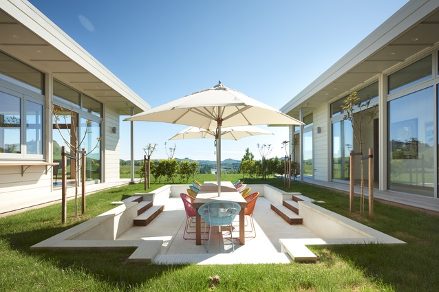
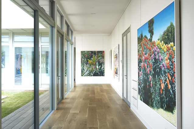
In plan form, the house has a U-shaped heart set around a sunken courtyard. Off to one side, an extra wing wraps around a pool. One branch of the U is allocated to bedrooms; the other is the living and kitchen zone. A glazed hallway is dedicated to large-scale art. Vibrant works by Karl Maughan, Stanley Palmer, Nigel Brown and Ian Scott hang side by side in this natural gallery with a view.

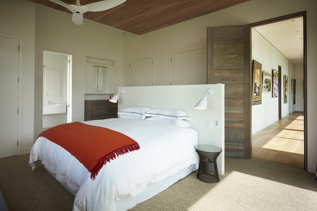
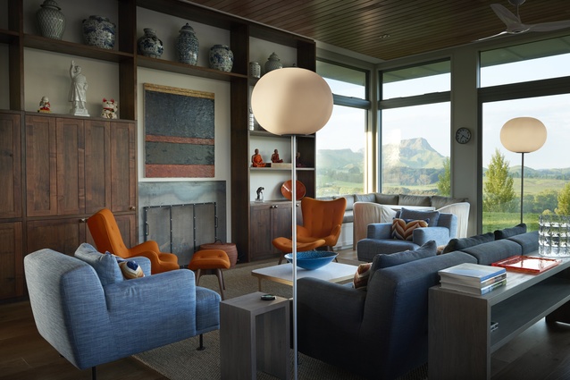
Interior designer Brigit Christie worked to craft a look that was in keeping with the modernist flavour and simultaneously embraced colour. “Alister has lived in Asia for 20 years, and he loves the tropical vegetation and vibrancy there. He encouraged me to be brave – no browns or beiges – and he particularly likes orange,” she says. Florence Broadhurst fabrics resplendent with yellow cockatoos, accents of red in the master bedroom and blinds printed with tropical palms are just part of the mix.
The exuberance is not confined to art, window dressings and scatter cushions. In the living room is a pair of beautifully contoured Grant Featherston chairs in, yes, orange, and a Zanotti chair in teal blue has a secluded spot that overlooks the river.
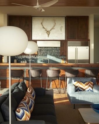
The kitchen, by Alister’s own admission, is “microscopically planned”. He’s a keen cook who has studied French cuisine and patisserie making, so it’s little wonder he required wet and dry pantries, efficiently used corner spaces, a Carrara top for pastry work and, oh, enough storage for 60 crockery sets.
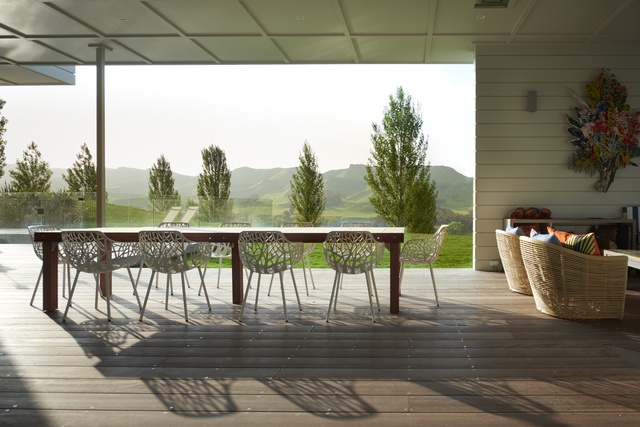
With courageous colour and floor-to-ceiling shelves to display Alister’s keepsakes gathered across the years, there’s an awful lot going on in this space. Andy Coltart is not distracted. His eye is on the woodwork and proportions. “In a building such as this, you live or die by the fascia and soffits,” he says.
A former farmer and joiner, he’s drawn to the timber elements – to run his hand over the Chilean cherrywood doors, to point out the negative detail around the frames or to sit on the built-in leather benches and look out, not at the view, but the underside of the eaves. He speaks in a language of numbers rather than design: a 3.5 metre stud, doors at 2.7 metres, soffits to 1200mm, 30mm-thick weatherboards.
It’s a dialect that has brought definition to a vision that was completed between owner and designer through email and smartphone photography. “Andy would send me designs, and I’d head off to the printer, who offered the service alongside selling chicken feet and used tyres,” explains Alister.
While he does not yet live here permanently, there are definite plans to do so. In the meantime, Alister visits to hang out here with family a couple of times a year and rents the house for others to experience. The day will come when he returns to the area he calls “the Napa Valley of New Zealand” to once again be wowed by the big, bold entrance, to stand tall at the deep benches preparing a SE Asian-inspired meal for friends or to stretch out on the squabs of the covered courtyard for an afternoon nap, a sleeping giant his constant companion.


![“[The designer is] drawn to the timber elements – to run his hand over the Chilean cherrywood doors, to point out the negative detail around the frames..."](https://cdn.architecturenow.co.nz/site_media/media/cache/26/81/2681a3f06a1db6d5fc20966cc4330f6c.jpg)
