A modern homestead

Click to enlarge
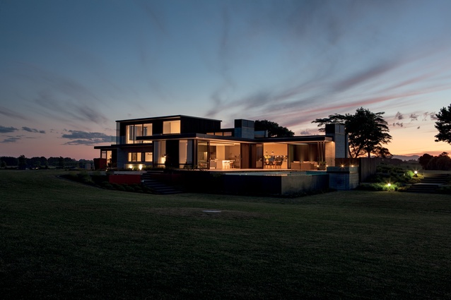
This is a spacious homestead that responds to the site’s unique views and can accommodate an expanding family, but also doesn't feel too large for a couple.

This is a spacious homestead that responds to the site’s unique views and can accommodate an expanding family, but also doesn’t feel too large for a couple. Image: Simon Devitt

1 of 18
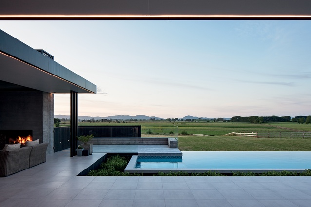
In lieu of pool fencing, a moat with hedging was devised to separate the patio and pool areas, so as not to obstruct the rural view.

In lieu of pool fencing, a moat with hedging was devised to separate the patio and pool areas, so as not to obstruct the rural view. Image: Simon Devitt

2 of 18
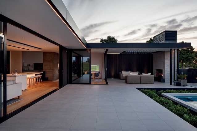
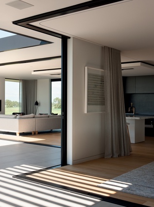
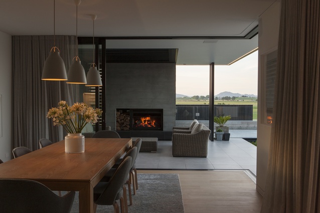
Thresholds are dissolved as a result of the free-flowing layout of interconnected alcoves.

Thresholds are dissolved as a result of the free-flowing layout of interconnected alcoves. Image: Simon Devitt

3 of 18
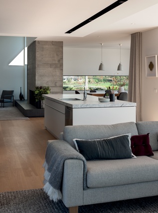
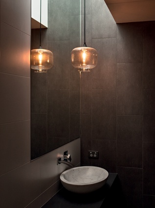
In the interior, concrete chimneys, marble and linen provide a serene and tactile palette.

In the interior, concrete chimneys, marble and linen provide a serene and tactile palette. Image: Simon Devitt

4 of 18
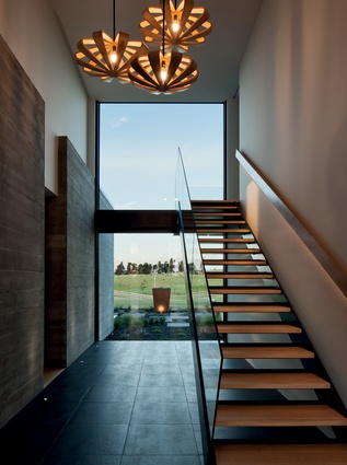
In the entry circulation space, windows capture selected views of the rural landscape.

In the entry circulation space, windows capture selected views of the rural landscape. Image: Simon Devitt

5 of 18
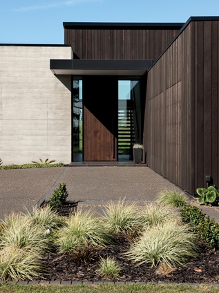
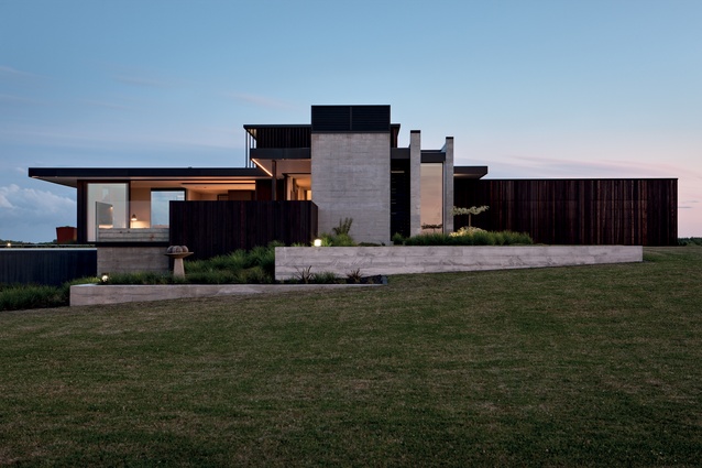
The building acts as a pavilion, with a series of sculptural forms fanning out from a 3.5 metre entry ‘court’.

The building acts as a pavilion, with a series of sculptural forms fanning out from a 3.5 metre entry ‘court’. Image: Simon Devitt

6 of 18
Conventional rusticity is eschewed entirely in favour of the pleasure of a sculptural aesthetic – yet the warmth of the dwelling is undeniable.

Conventional rusticity is eschewed entirely in favour of the pleasure of a sculptural aesthetic – yet the warmth of the dwelling is undeniable. Image: Simon Devitt

7 of 18
The outdoor room with concrete fireplace is a cosy, sheltered spot.

The outdoor room with concrete fireplace is a cosy, sheltered spot. Image: Simon Devitt

8 of 18
Level entry transitions between indoor and outdoor areas dissolve the sense of separation between spaces.

Level entry transitions between indoor and outdoor areas dissolve the sense of separation between spaces. Image: Simon Devitt

9 of 18
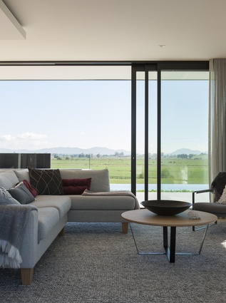
The family room enjoys all-day sun and views of the Hakarimata Ranges.

The family room enjoys all-day sun and views of the Hakarimata Ranges. Image: Simon Devitt

10 of 18
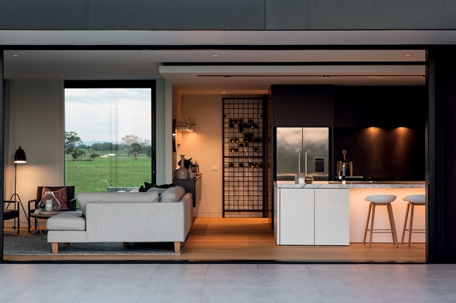
A large butler’s pantry is hidden out of sight at the rear of the kitchen and means the spacious living areas are free from clutter.

A large butler’s pantry is hidden out of sight at the rear of the kitchen and means the spacious living areas are free from clutter. Image: Simon Devitt

11 of 18
Clients Robyn and Graham Ballard imagined a spacious building, which would respond to the site’s unique views.

Clients Robyn and Graham Ballard imagined a spacious building, which would respond to the site’s unique views. Image: Simon Devitt

12 of 18
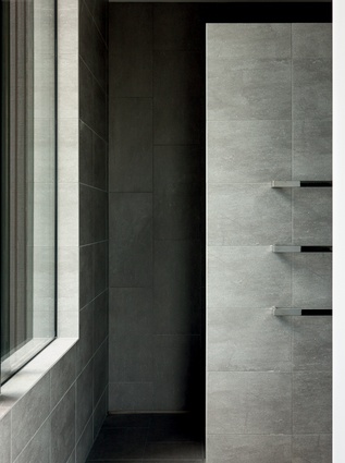
The master bedroom is found on the second floor and has a light shaft spanning both levels – allowing natural light into its walk-in-robe, and into the family bathroom downstairs.

The master bedroom is found on the second floor and has a light shaft spanning both levels – allowing natural light into its walk-in-robe, and into the family bathroom downstairs. Image: Simon Devitt

13 of 18
White says a great deal of attention has gone into the proportions of the spaces, in order to dissolve the thresholds of each area.

White says a great deal of attention has gone into the proportions of the spaces, in order to dissolve the thresholds of each area. Image: Simon Devitt

14 of 18
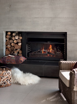
This concrete backed fireplace creates a cosy outdoor room.

This concrete backed fireplace creates a cosy outdoor room. Image: Simon Devitt

15 of 18
The seamless flow confuses interior and exterior landscapes and allows the inherent warmth and character in the materials to define a reinvigorated sense of ‘homestead’ cosiness.

The seamless flow confuses interior and exterior landscapes and allows the inherent warmth and character in the materials to define a reinvigorated sense of ‘homestead’ cosiness. Image: Simon Devitt

16 of 18
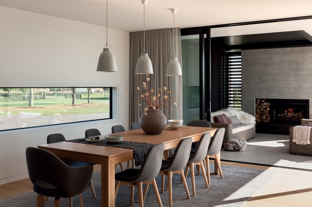
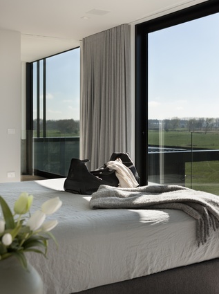
A palette of warm white and pale grey, characterful marble, soft linen drapes and American white oak flooring are enveloped with light.

A palette of warm white and pale grey, characterful marble, soft linen drapes and American white oak flooring are enveloped with light. Image: Simon Devitt

17 of 18
The warmth and character in the materials create a reinvigorated sense of ‘homestead’ cosiness.

The warmth and character in the materials create a reinvigorated sense of ‘homestead’ cosiness. Image: Simon Devitt

18 of 18

On a bucolic, rambling 265-hectare farm in Waikato, it’s difficult enough to select a house site – let alone define the scope of a dwelling. But thankfully for these Gordonton dairy farmers, an elevated promontory with distant views of the majestic Hakarimata Ranges to the north and of the Kaimai Ranges to the east offered itself as an exceptional platform from which to create a homestead.

Naturally, the site constraints that often inform a design simply weren’t there, says architect Brian White of Edwards White Architects.

“Designing a house here is quite different from designing a house in the middle of Auckland,” says White. “You have to have a few specific strategies to capture moments within an expansive landscape and delineate the different functions of the dwelling.”

The warmth and character in the materials create a reinvigorated sense of ‘homestead’ cosiness.  Image:  Simon Devitt

Clients Robyn and Graham Ballard imagined a spacious building, which would respond to the site’s unique views and could accommodate an expanding family of grown children and grandchildren but without ever feeling too large for the couple. In response, White devised a number of courts – each with its own unique identity and purpose.
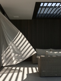
A palette of warm white and pale grey, characterful marble, soft linen drapes and American white oak flooring are enveloped with light. Image:  Simon Devitt

A series of sculptural structures characterise each court, with vertical concrete planes and dark cedar-clad forms feathering out from a central entry circulation space. Here, a 3.5m high entry door acts as the crescendo of these gradually stepped forms. This entry space bisects the living and private quarters, thus reducing the expansiveness of the dwelling.

Certainly, a sense of ‘entry’ was important to the owners and is evident in the sculptural quality of the building – signs of habitation are minimised in favour of unadorned faces of textured concrete and blackened cedar.

“We like to create a sequence on entry. We don’t reveal everything straight away,” says White. “You have the stepping of the materials. You start with dark cedar, move to the concrete and then to the blue of the pool.”

These monolithic materials aren’t typically associated with the warmth and cosiness of a farmhouse, nor do they embody the conventions of the traditional rural homestead. Evidently, conventional rusticity is eschewed entirely in favour of the pleasure of a sculptural aesthetic – yet the warmth of the dwelling is undeniable.

A palette of warm white and pale grey, characterful marble, soft linen drapes and American white oak flooring are enveloped with light, as each room is orientated to make the most of the sun’s rays. 

“When the sun’s out, there’s not one place in the house that’s not laden with light,” Robyn enthuses.
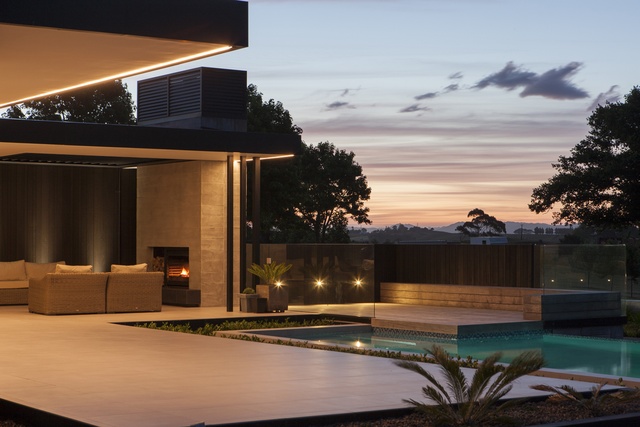
The seamless flow confuses interior and exterior landscapes and allows the inherent warmth and character in the materials to define a reinvigorated sense of ‘homestead’ cosiness. Image:  Simon Devitt

The impressive kitchen island’s marble slab was sourced by Robyn on a family train trip through Italy. Serendipitously, as she was travelling through Carrara, she remarked on the beauty of the marble dust settled on the hills, which prompted the idea to enquire a little further into the marble yards. Only hours later, she had selected a stunning piece of marble – cut to the maximum size the saws would allow – and had it packed into a container to be shipped back to New Zealand. 

This particular piece of marble was smaller than the original design of the island bench. “We had to shrink the kitchen wall to accommodate it,” says Robyn. Fortuitously so, as the kitchen sits in comfortable proportion to the other living spaces in the living court, which is essentially a pavilion with large eaves – limiting direct sunlight in summer and letting it flood in during winter.

A large butler’s pantry is hidden out of sight at the rear of the kitchen and means the spacious living areas are free from clutter. Image:  Simon Devitt

This pavilion consists of interconnected alcoves rather than vast open-plan spaces, creating a unique plan of open living nooks. The adjacent sheltered outdoor area with fireplace benefits from the same approach (“We can be sitting out here when there’s a howling gale and you’d never know!”) 

This concrete backed fireplace creates a cosy outdoor room. Image:  Simon Devitt

It’s difficult to say whether you are inside or out in any of these interconnected spaces. The patio directly linking the living areas with the pool is seamless in its transition; the indoor and outdoor fireplaces as well as an interior wall are constructed of concrete, yet are tactile and further blur the sense of indoor/outdoor locality. 

White says a great deal of attention has gone into the proportions of the spaces, in order to dissolve the thresholds of each area. The dwelling’s natural connectivity to the site is also due to this panoptic approach to living. “We’re not exterior decorators. We are interested in the building as a holistic whole.”

Attention to detail is paramount in the success of this home, as its seamless flow confuses interior and exterior landscapes and allows the inherent warmth and character in the materials to define a reinvigorated sense of ‘homestead’ cosiness. Accordingly, the tracks for the wave-pleat linen drapes are recessed neatly into the ceiling; lighting is on sensors with switches hidden throughout; entryways are level and you won’t find a step in sight.  

For an interview with the architect, Brian White, see here.


More projects