Houses revisited: Mission Bay house
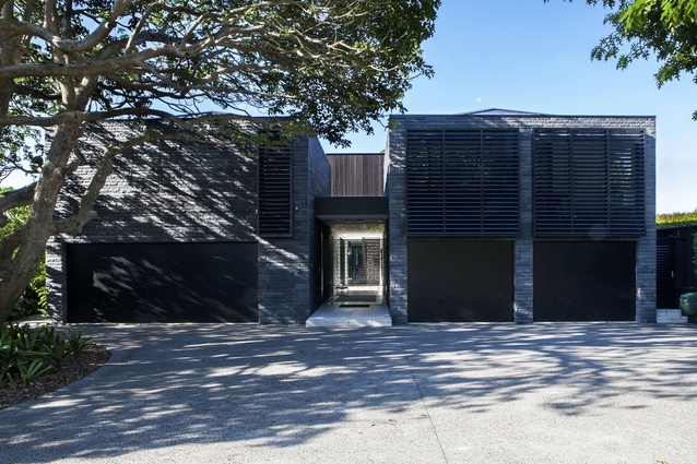
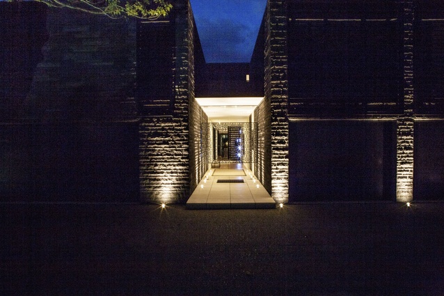
With its imposing textural stone-work, filigree detailing and entrance gateway that leads to an inner courtyard, there’s something faintly Middle Eastern about this home. Certainly the house, designed by Tim Dorrington and Sam Atcheson of DAA, hasn’t the pretty weatherboard, picket-fence aesthetics of its neighbours in the East Auckland suburb of Mission Bay.
Its planning, too, sheers away from the central hallway with rooms leading off it typology. Laid out on a couple of intersecting axes, visitors enter a passage between those two monumental blocks, and must pass the courtyard before encountering the living pavilion at the back of the home.
“The clients wanted the house to act as a portal to the garden — an architecture that celebrated its park-like setting,” says Atcheson.
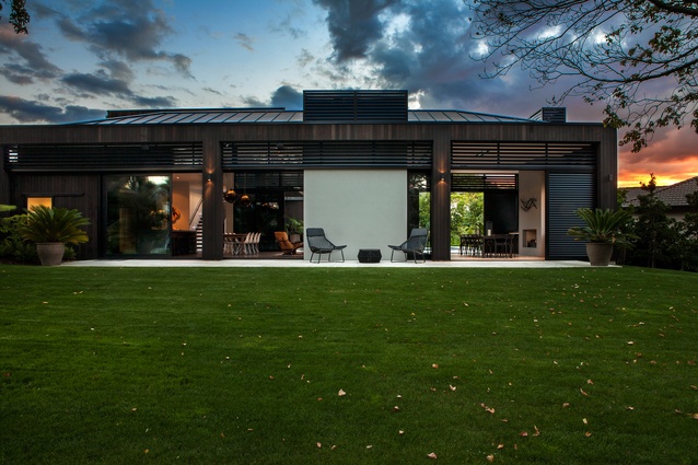
On the street, nestled up to a protected puriri tree, two bluestone-clad garage blocks, with bedrooms above, act as gate-keepers. Although they are identical in terms of volume, DAA varied the screens and window placement as detailing that is deliberately asymmetrical. Chief to the plan was balancing expansiveness and enclosure. “The house starts as a solid grounded mass but opens up as you progress through until it explodes into the back garden,” says Atcheson.

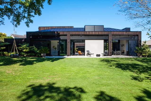
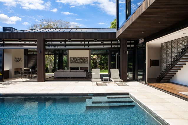
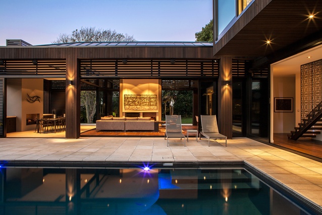
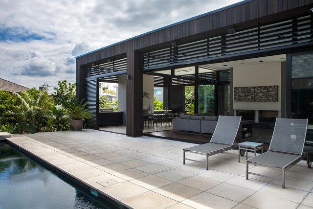
“The living pavilion with its three-metre elevation is a permeable punctuation between the courtyard pool and an expansive stretch of lawn. “With such height and extensive joinery, it could have been a monolithic glass-box, but we made it more recessive by using louvres and vertical cedar cladding.”
Conceived as ‘a table with interspaced legs’ — it is a simple form with a hipped Euro-tray roof and timber-wrapped posts that disguise the downpipes.
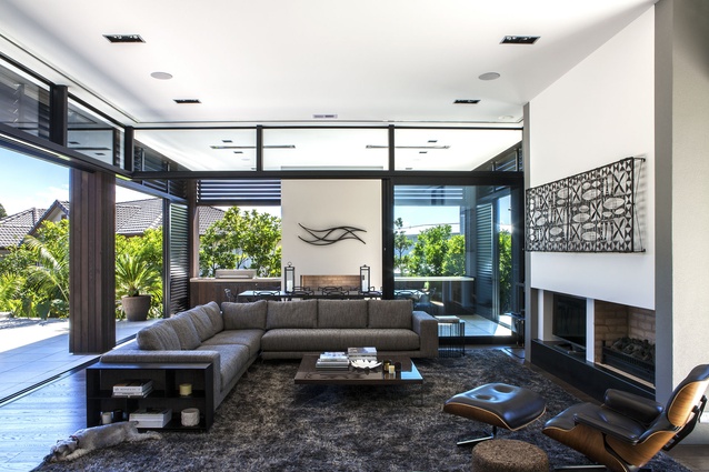
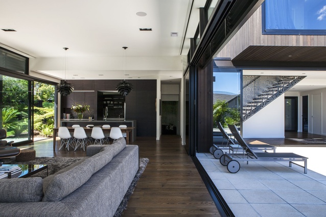
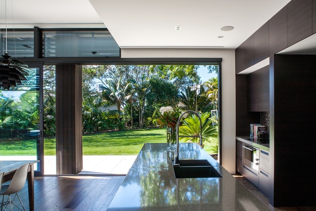
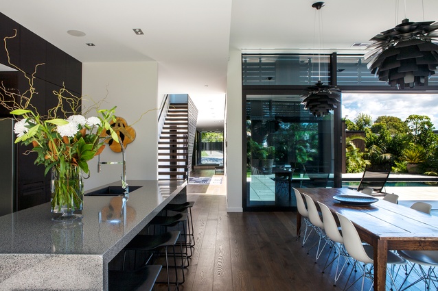
On one side, the courtyard paving continues seamlessly into a dining area within the pavilion to further blur the transition between alfresco and interior spaces. Elsewhere pre-finished oak flooring defines the living zone and kitchen, bringing textural warmth. With its dark-stained cabinetry, the kitchen becomes ‘a block within a block’. It and two fireplaces act as internal focal points to offset the lush view of the garden.
Choosing a material palette that was modern but not overly sterile was the key to this project. DAA worked closely with the clients, builder and interior designer Debra Gardien in a collaboration that combines simplicity with drama.
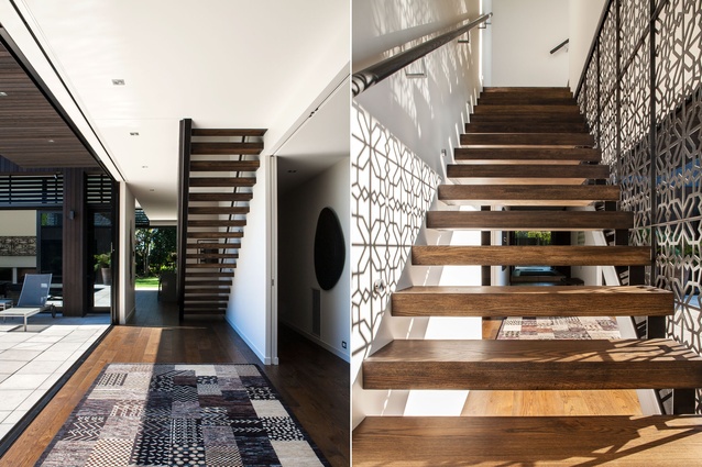
A trio of bluestone tile, cedar and black aluminium provide a strong framework; Gardien added the “little pieces of awesome” such as the patterned iron screens on the entrance gate and the stairwell to the master-bedroom block. In a never-ending play from morning to sundown, these screens throw a tapestry of shadow onto vertical and horizontal surfaces; the reflection of light from the courtyard pool similarly dapples the ceilings.
The media room, set a few steps below ground level, is bunker-like. It is enclosed on three sides but a window becomes a focussed aperture to the outdoors. “By effectively burying it, it becomes the antithesis to the transparency of the pavilion,” says Atcheson. To emphasise the point, Gardien chose to define the room with wallpaper that looks like weathered concrete.
With flexible spaces that accommodate the needs of the couple and their two children — plus many options for entertaining — this house, with its unusual planning and touches of material magic, does the business for both work and play.
Click here to see more Houses Revisited. And sign up to our email newsletters to receive Houses Revisited straight to your inbox.
Note: These are stories from our archives and, since the time of writing, some details may have changed including names, personnel of specific firms, registration status, etc.

