Mediation meditation: Lyttelton Port Company
Abigail Hurst explores the careful negotiation of waterfront access and industrial relations contained in the Lyttelton Port Company’s Waterfront House by Athfield Architects.
On reclaimed land in the crook of the Lyttelton Harbour is a building that staunchly faces the sea, and its history – a history of adversarial relationships between its management and operations staff. Their unison is now under one roof.
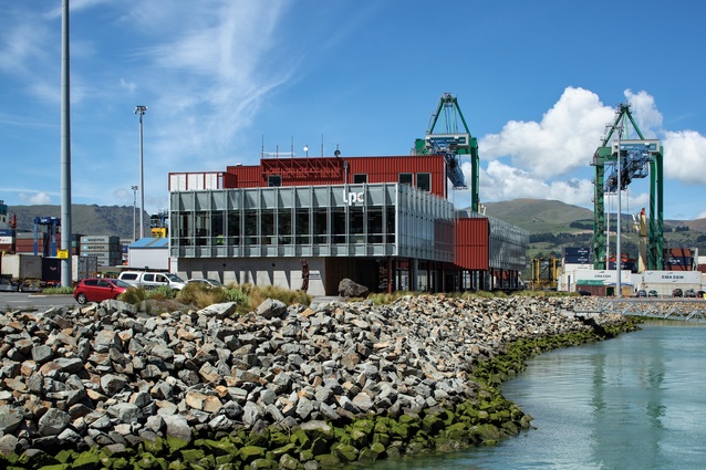
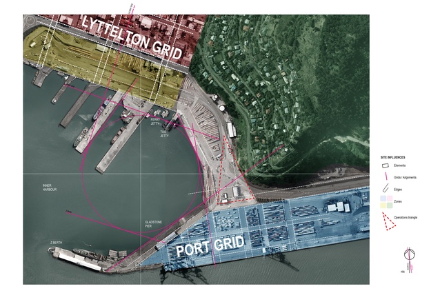
An ambitious proposal seeking to bring two groups of people closer together, the building poetically takes the shape of two intersecting volumes. One volume references the grid of Lyttelton’s commercial township and the other, the grid of the port. Situated just four metres back from the water’s edge, it is a design that boldly asserts its position to the elements and its bond to the water.
Whakaraupō (Lyttelton Harbour), the landing point for the first four ships carrying European settlers to Canterbury in 1850, remains a significant hub today thanks to its proximity to Christchurch and connection to the ocean. Occupied 700 years earlier by Māori, the harbour has a long history and includes a number of land reclamation projects; the first was in 1910 and the latest is currently under construction towards Te Awaparahi Bay.
The Lyttelton Port is the largest port in the South Island, and a vital link within New Zealand and internationally. This connection was tested during the 2010–2011 Canterbury earthquake period, when the majority of the port’s wharves and its administration building were damaged.
This devastation prompted the Lyttelton Port Recovery Plan, a 30-year vision for the future of the port. Lyttelton Port Company (LPC) Waterfront House, the new head office for the company, is a result of these events.
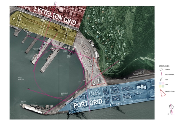
It is a rare opportunity in Christchurch to design so close to the water’s edge, and the significance of this was recognised from the beginning by Athfield Architects. Although the proposed site was already designated within a larger master plan, the wider context was the first port of call. How to value and extend the connection with the water was a key question.
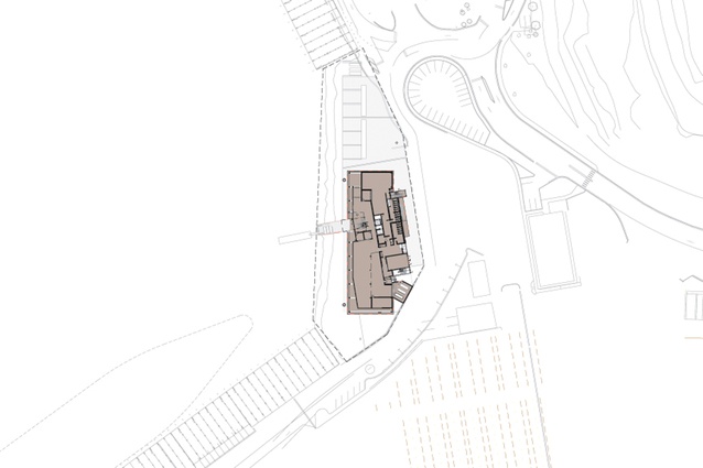
One of the suggestions was a walkway along the waterfront. The client was sceptical but, now, this promenade is part of the everyday commute for many of the port workers and a quick walk into town can be made for lunch, bringing business to the locals. The pontoon, another gesture to the water, wasn’t in the brief at all but the architects kept drawing it on the plans. After assurance the project met budget, it was given the go-ahead and now provides a fantastic opportunity to engage with the water’s edge.
Within a high-security zone, access is currently restricted but, with plans for a new cruise ship terminal within the port, there is a possibility of future public accessibility and enjoyment of the sea where there has previously been only a barrier.
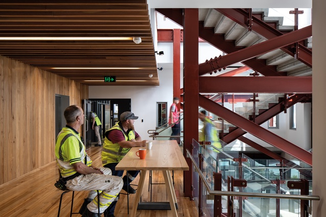
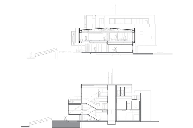
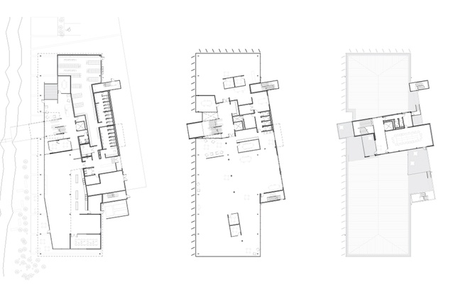
The pontoon in the plan sits on the same angle as do the circulation spine and the Mixer Stair: a big open series of steps that all workers and visitors use. Here, on the central large landing, you really do have the feeling of hanging over the water. The Mixer Stair also allows informal interactions between the management and operation workers.

To the north is the reception and, to the south is a generous cafeteria space, also shared, with the operation workers’ laundry, bathrooms and lockers backing onto this space with practical back-door access to the port. The workstations of the members of the management staff (including the chief executive) are situated on the first floor, dispersed in an open plan between meeting rooms, booths and a library zone.
In part attune with current co-working trends, employees are empowered by the choice of where to work, creating a more animated office environment. Acoustic ceiling panels around the office perimeter veil mechanical services visually and reduce the potentially disruptive bustle created by boosted levels of interaction occurring within the open plan.
This office edge continues to have careful consideration and forms a 2.5m buffer zone that can be used more like a break-out space, with a variety of furniture arrangements encouraging people to work in the spaces but not take ownership. This means the quality space and best views are available equally to all.
Not everything could be shared, however. For practical reasons, there had to be division between the 24/7 operations and staff members who work 9–5. However, openness and transparency inside mean the main spaces feel like one whole with many working parts: a valuable concept for any organisation or company to aspire to. While the building has been designed around two separate groups, the hope is that it will begin a constructive cultural shift. This is a difficult thing for a building to do but, so far, the client’s feedback has been positive.
Viewed from the water (this is the common aspect seen by the public eye), the three-storeyed building sits at a comfortable scale within its landscape of shipping containers and industrial machinery. With a wealth of hardy textures in the context, a robust look was brought.
The building doesn’t just look robust, it sits on piles designed to keep it standing even if the ground is washed away. Concrete pre-cast walls face the port side, with the main façade wrapped in large amounts of glazing with light managed by vertical fins, which provide shade.
A bespoke, aluminium rainscreen cladding clothes the main circulation pathways and top-floor boardroom. This element looks like a series of stacked shipping containers: a somewhat daring manoeuvre of imitation that could have offended the building’s otherwise honest sensibilities.However, its flashings and details, inspired after careful study of profiles in a shipping container catalogue, give it credibility.
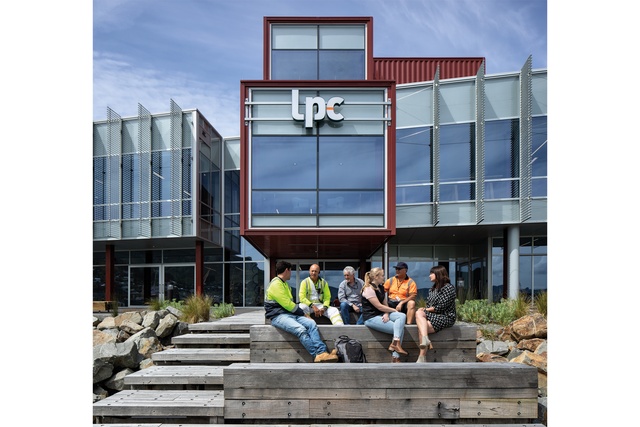
The significant lower-storey cantilever shows us it is not pretending to be a shipping container but is a reference to one in its own right. It is the building’s flagship, steering the fit external aesthetic of the building. Inside, steel and services are largely visible and salvaged wharf timbers have been made into joinery items and linings. Greens are used in the carpet in reference to the hills behind and also anchoring the building to the land while looking out at the blue.
The success of this building is largely a testament to the quiet guiding hand and steady vision of the architect; a gentle handling of client concerns and the prioritisation of client workshops enabled discussions through the various layers of the LPC, as well as careful decision-making during value management.
The design mediates between two groups in one house while, also, lending sensitivity and thought to the public’s yet unrealised future access to the water. The building’s accomplishments are encouraging, and its worthiness will continue to be tested by nature’s forces and a lifetime of occupancy.
One thing is for sure; here on the edge of the Lyttelton Harbour is a wee grunt of a building, taking a small step towards changing tides and confronting the waves head-on.
This article first appeared in Architecture New Zealand magazine.


