Material symphony: David Thulstrup
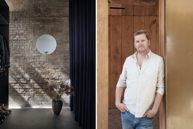
David Thulstrup may be a Danish designer but he’s had a lot of outside influences. For one, an internship with starchitect Jean Nouvel led to a three-and-a-half-year full-time position in the Frenchman’s Parisian studio. Nouvel’s trademark is the absence of one – famously, he has no signature style.
Next, Thulstrup moved to New York City to work for Peter Marino, whose outspoken interiors for high-fashion brands might leave some Scandinavian minimalists cowering in the corner. Thulstrup wasn’t thinking about personal tastes at that point; he was trying to learn from whom he considered to be the best. “They’re my two great heroes,” he says.
“I learned so much from them. That knowledge gave me self-confidence and pride in what I do. I took those attributes with me when I went home to start my own thing.”
Home was – and still is – Copenhagen. “Having a studio is a long journey – a winding path of self-improvement,” says Thulstrup, reflecting on the search for his own aesthetic. “You have a sense within you that tells you what’s right or wrong.” That sense, he says, develops over time, after a period of leaning on past references for inspiration.
Nowadays, he’s influenced by his surroundings as well as his staff – a team of 22 people without whom he “couldn’t do what I’m doing. I’m not a one-man show. Marino always said he was a chameleon. I feel like that too. I don’t want to be put in a box. It’s not that I do only raw wood and grey tones. I experiment with a lot of things. And it’s also important to have input from clients. Of course, there are ways to make a project say ‘Studio David Thulstrup’ but I’d get bored if I did the same thing over and over again.”
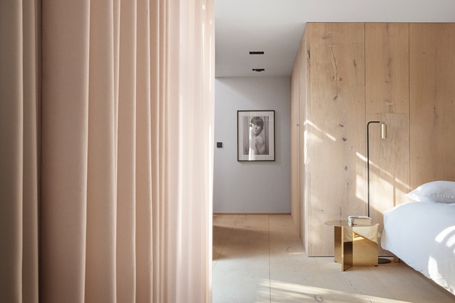
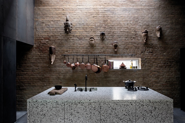
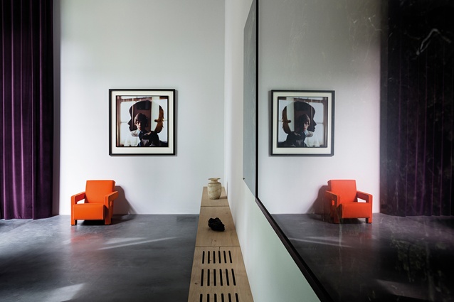
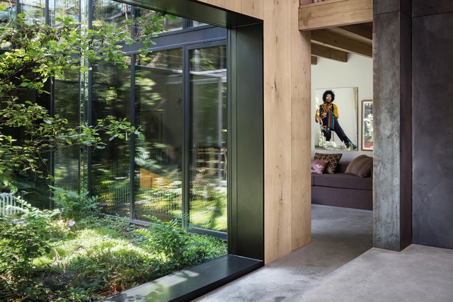
Thulstrup’s breakthrough project was a house for Peter (Krasilnikoff, not Marino). This Peter is a photographer, a colleague from Thulstrup’s early days as a stylist, who wanted to transform an old garage in Copenhagen into a professional studio and private house. “It was my dream assignment,” says Thulstrup. “Not exactly a money-maker but it was my first residence and I was entrusted to come up with the right response to the plot of land.”
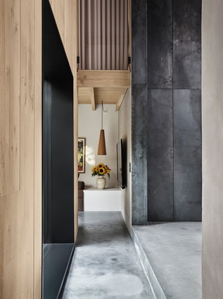
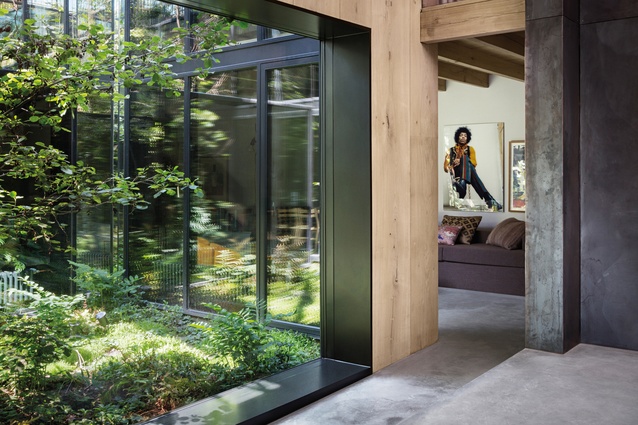
The result, finished in 2015, is a sophisticated celebration of industrial materials. Peter’s House was strewn across Pinterest and design sites, thrusting Thulstrup into the spotlight. And now, Krasilnikoff has returned for the renovation of his beach house. “I feel privileged that many of my clients come back. You build up trust with them, particularly when designing their personal residences. Communication is important.”

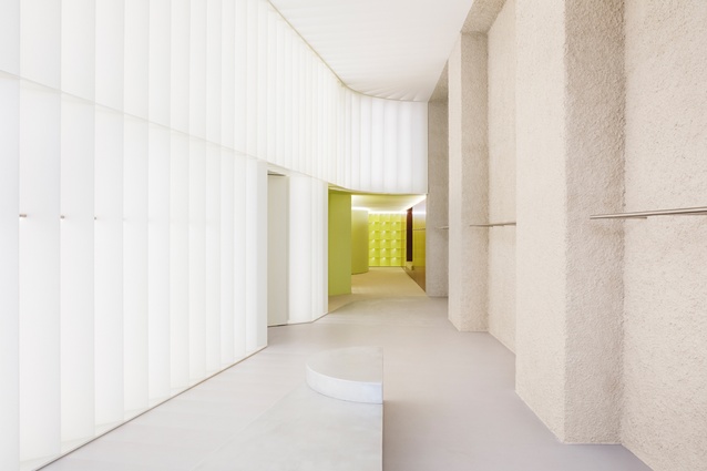
A sensitive juxtaposition of materials features heavily in Thulstrup’s commercial projects as well. Blow beauty salon, for instance, pairs marble with plywood in a neutral scheme with pops of yellow. At the time (2013), Blow was seen to be rather daring, opting for industrial chic over opulence. It was part of a new, pared-down wave of luxury that infiltrated interior design the world over.
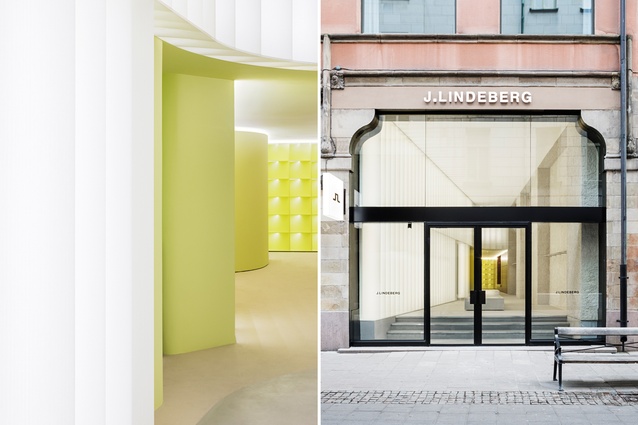
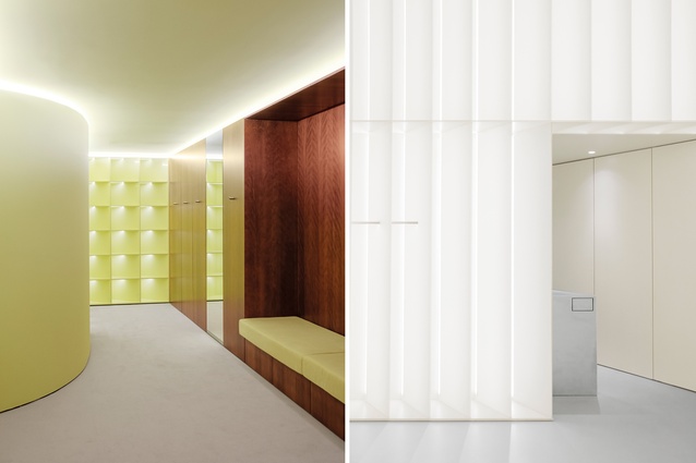
And Thulstrup has continued to ride the wave with a blossoming portfolio full of unpretentious yet material-rich spaces: everything from a gallery-style flower shop to a fashion-forward showroom-cum-office. Recently, the J.Lindeberg flagship in Stockholm represented a new step for the studio in terms of retail. “It’s a big brand and we feel we’ve succeeded in making something great,” says Thulstrup of his concept. Inspired by the J.Lindeberg logo, pop art and 1970s sporty motifs, the interior is conceived more like a museum: flexible enough to host events and other happenings.
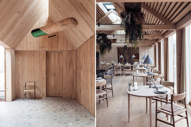
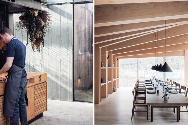
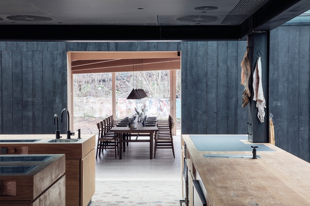
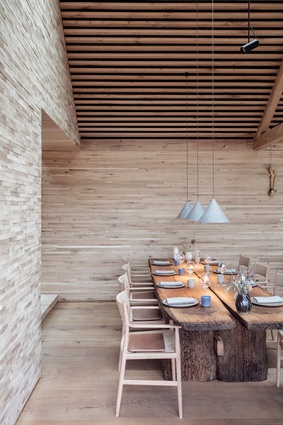
The list of Thulstrup’s big moments wouldn’t be complete without Noma. Last year, the Copenhagen institution – ranked as the world’s best restaurant on four occasions – established a new home. More residential than restaurant in appearance, the project explores a contemporary Scandinavian aesthetic, devoid of Nordic clichés.

What, if anything, connects the designer’s growing portfolio? “The obvious common theme is materiality,” he says. “Every wall is treated.” Diving deeper, he describes a certain “accessibility and volume” – the way the spaces make you feel. “There’s a physical sense of well-being when you enter – of being greeted. And different sizes, heights, materials and masses interact to evoke accessibility and groundedness.” He says that, although J.Lindeberg may look a bit flashy on film, for instance, the space’s smaller areas make customers feel safe and nurtured.
While the designer currently has a number of other retail projects on the go, as well as residences, hospitality venues and products, he’s keen to be more involved in the hotel industry. “It’s no secret that the world is becoming closer and more connected. Those who travel want to feel a sense of place when they arrive. If I’m sleeping in Paris, for example, I don’t want to feel as though I’m in LA.
“I think we’ll stop seeing big hotel chains rolling out massive concepts. There are ways to create that unique feeling through furniture and colours. Not in a stereotypical way but by sourcing local products and working with local manufacturers. I also want to work with things that have a longer liveability – that’s very interesting to me.”
This article first appeared in Interior magazine.


