Material Focus: Waka Kotahi NZTA
We talk to André Bankier-Perry of Designgroup Stapleton Elliott (DGSE) about the delivery of a 9000m 2 government workplace fit-out, and how social sustainability and sense of place were pivotal throughout the scheme.
Tell us about the design rationale for this project.
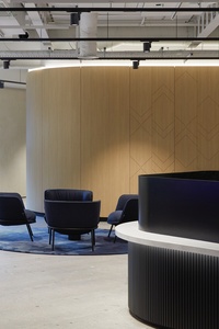
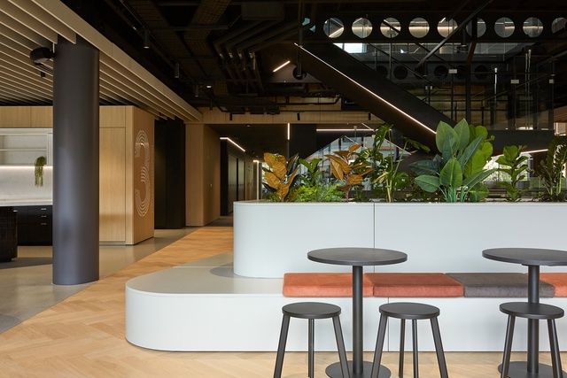
André Bankier-Perry (ABP): DGSE worked alongside Waka Kotahi to distil their aspirations around consolidation, environmental outcomes, social sustainability and sense of place. Pivotal to this was the shift to an ‘activity-based working’ model, providing a spectrum of flexible collaborative settings, focused work environments, gathering zones and support facilities, while maintaining consistency and familiarity across the six levels. The building is situated within the parliamentary precinct and overlooking Wellington’s elevated arterial highway; the idea of ‘connectedness’ became a major design driver, both in the physical sense of ‘place’ and through the spirit of Waka Kotahi’s role in greater Aotearoa.
You mention social sustainability as a key objective. What did this mean to Waka Kotahi and how was this implemented?
ABP: As a values-based design practice, we find social sustainability is fundamental to many of the projects we work on. For Waka Kotahi, we set out to enhance everyday experiences and end-user wellbeing through design-led initiatives. Fresh, dynamic and immersive environments lead to greater equity, increased productivity and improved mental health. Key moves included enhanced access to nature, maximising daylight, places for faith and respite, and destinations for communal interactions.
The material palette moves through a spectrum of soft, earthy hues. How did the exploration of connectedness and sense of place lead you to this?
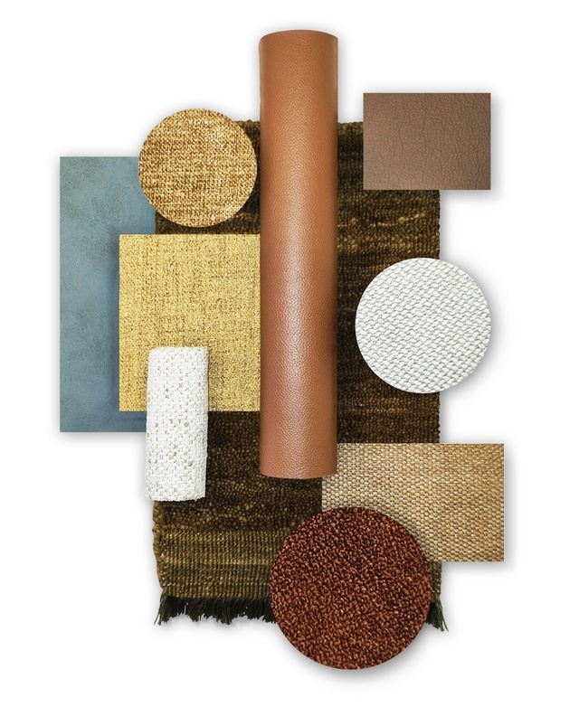
ABP: We knew the palette needed to be expressive, legible and timeless, shaped by a bespoke te ao Māori narrative. Working in partnership with DGSE’s Indigenous Design Rōpū (IDR), a narrative was developed around ki uta ki tai, from mountains to sea. This acknowledges the balanced natural order of ecosystems — a foundational characteristic that speaks to the essence of Waka Kotahi’s role within Aotearoa. The narrative is expressed within tactile architectural surfaces and through tonal variation, gradually revealed as users transition floor to floor.
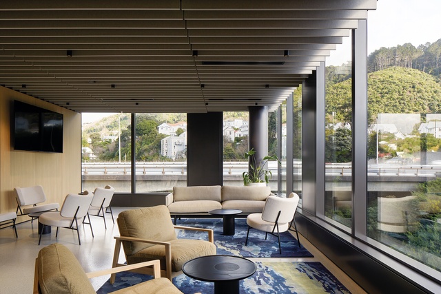
Tell us about the role fabrics played in this colour story.
ABP: Fabrics were fundamental in pulling the narrative through from space to space. Upholstered joinery, squabs, furniture and drapery were used as touchstones for users to locate themselves within the building. Warwick Fabrics are robust and cost-effective, while exuding a rich, tactile quality. Bouclés, textural weaves, knitted suedes and wools provide a beautiful residential feel and sense of respite. Moving up the building, the palette gently shifts from earth terracottas to muted verdant greens, smoky blues and ethereal, vapoury greys.
See more in the Material Focus series, including inspiration from Picnicka by CTRL Space, Arvida by Stack Interiors, Gulf Rise by Urban Lounge, SemiCreative’s Seven, and more, here.
ArchitectureNow and Architecture NZ work with a range of partners in the A&D supply sector to create appropriate content for the site. This article has been supported by Warwick Fabrics.
If your brand or clients are interested in similar creative content email mark.lipman@agm.co.nz to enquire.


