Masters of reinvention
Amanda Harkness takes a tour of Precinct Properties’ revitalised head office, by Warren and Mahoney, and finds a series of dramatically different elevations.
The first time I visited Precinct Properties on the 12th floor of the HSBC building was about four years ago, ahead of a scheduled walk-around of the new Commercial Bay building the day before its official opening.
A throng of media jostled through an unassuming space and headed for an oversized storage room to gather equally oversized steel-toecap boots, fluoro vests and hard hats. We were then herded towards a nearby air bridge and I had barely registered my surroundings.
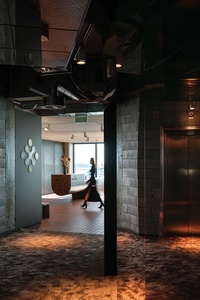
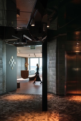
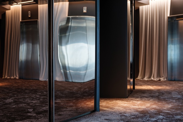
My most recent visit, along with interior project lead Dan Kempka of Warren and Mahoney, couldn’t have been more different: quite literally, like night and day. Stepping out of the lift into the lobby of the country’s largest developer and property manager, you’re greeted with the unexpected juxtaposition of luxurious bronze carpet and raw concrete-block wall. The lining of this foyer has been stripped back to the core structure so the frames around the lift openings appear to protrude like metallic blades, softened by draped fabric on either side. Opposite, a faceted-mirror wall intentionally distorts your perception of space and, above, the ceiling, too, is mirrored: certainly not your typical workplace arrival.
I’m not sure if it’s intentional but it is almost impossible not to pause at this juncture, as if to enter a new state. From the relative darkness of this unconventional entry follows a transition towards the light of the north-facing elevation, where an entirely different experience unfolds.
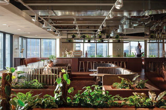
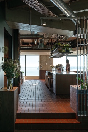
Here, the Waitematā Harbour forms an impressive backdrop to both the reception and communal ‘live lounge’ and bar areas. The soft carpet underfoot gives way to a meticulously laid and aligned terracotta tile floor, designed to reference the Quay Street pavers of old. “We’re bringing that local connection right up to this floor,” explains Kempka, “because it’s been part of this landscape for a long time.”

The tiles stretch the length of the space, 68,000 of them, individually laid by hand. They run below the floating log-shaped reception desk and up and around the elevated central island; they form planter boxes and a gently sloping path. Importantly, they introduce the concept of grid. “We see Precinct as the ‘protagonist’ in the development and building space,” says Kempka, “so, we wanted to reinforce that architectural language and the concept of constant change in their workplace.” Hence, the [city] grid becomes key throughout, strict and geometric, playing out in every facet of the fit-out.
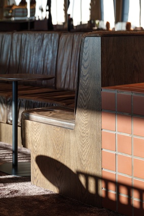
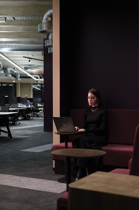
Reminiscent of ceramicist Ben Pyne’s outer courtyard installation at Objectspace (but on steroids), the terracotta conjures a relaxed mood, combined with plenty of greenery, leather booth seating and timber cabinetry. This front-and-centre space is about encouraging connection and collaboration, says Kempka. He alludes to city building again by pointing out the ‘building blocks’ and ‘little pockets’ created within this zone.
The space can comfortably accommodate the 90 or so employees within Precinct’s Auckland office if everyone is needed in one spot; that includes members of the Generator team, specialists in the co-working domain. Exposed ceilings in this area reveal some of the original beams and offer additional height as we move up the sloping floor.
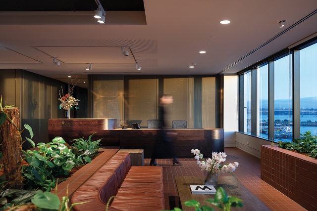
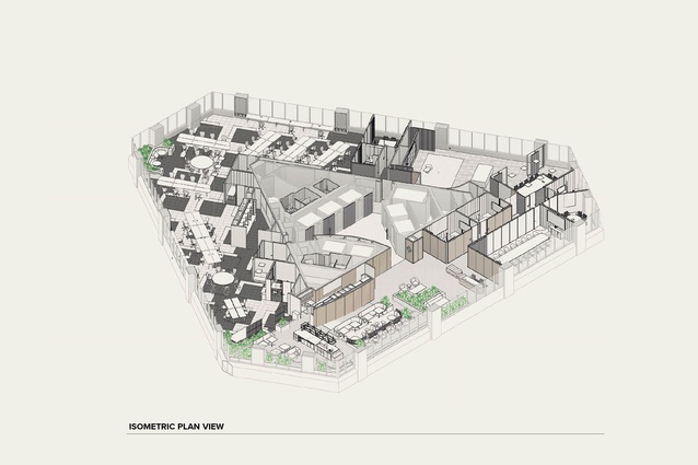
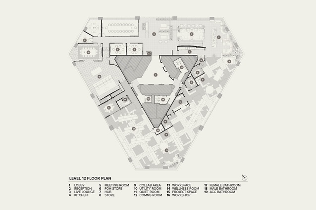
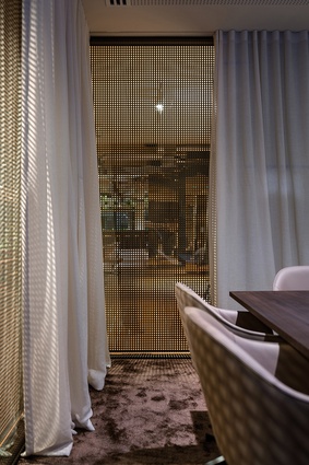
What’s significant here is that close to 50 per cent of Precinct’s floor plate is given over to non-traditional workplace settings. Meeting rooms are positioned against the northern and western core, with levels of privacy discreetly maintained by a combination of brass mesh and heavy drapery; the latter, on close inspection, even sports a grid pattern through the looseness of its weave. This layering creates a degree of curiosity, revealing a sense of activity and movement but leaving the rest to the imagination.
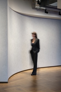
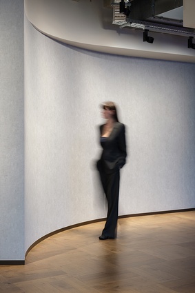
As the tiled walkway comes to an end, a change in the material language signals a new experience, designated the ‘workshop’ zone. Screens are subtly swapped out to mirror the façades of projects within the Precinct portfolio, such as that on the N. Cole Pavilion next to 10 Madden. The flooring and wallpaper, in turn, reference the L36 workplace suite offering in Commercial Bay. “The idea is that, if you’re familiar with Precinct and their work, when you come into their office, you’ll be able to pick up certain hints of their projects around Auckland,” explains Kempka.
We have now entered the company’s showcase space, where past and future developments are set upon plinths like floating islands and a large screen offers the opportunity to present reels of renders. Conveniently, the west-facing windows look down onto the car park that will become the site of perhaps Precinct’s most ambitious project to date, overshadowing even the hugely substantial Commercial Bay. Downtown, a proposed design collaboration between Warren and Mahoney and Snøhetta, while still several years off commencing construction, will be made up of two towers above a central podium, providing office, residential and hospitality as well as new urban spaces for both residents and the public. “Precinct’s place-making projects shape and transform the city,” Kempka points out, “and we’ve sought to reflect that vision and purpose creatively through this series of diverse and responsive workspaces.”
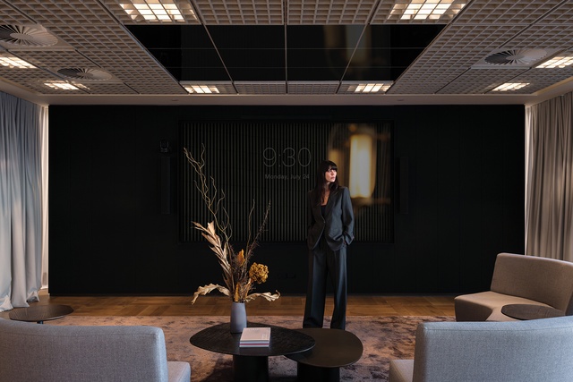
Transitioning into the workshop zone, it’s evident that employee well-being is a priority, not only through the choice and variety of workspace on offer but also with the discreet positioning of a wellness room for quiet retreat or parenting needs, or if you’re just not feeling too well. Personality and warmth are introduced through a wall of cashmere-coloured cabinetry, and ‘neighbourhood’-based workstations are placed on an unexpected angle in response to the angular shape of the building.
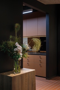
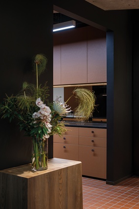
Around the corner, ‘sumptuous plum’ cabinetry runs along a second interior wall leading to the kitchen and lounge area, having come full circle or, in this case, full triangle back to the central hub. The planting here is almost like the undergrowth you might find in the cracks of a city, rather than species from the forest or bush. The project is on track to receive a 5 Green Star rating, which is as high as can be achieved within the 22-year-old 188 Quay Street building, and Kempka says the team at Precinct seems very happy in their new environment.
What Warren and Mahoney has created here, in collaboration with Black Interiors, is an ambitious, experiential workplace, with a focus on hosting and networking at its core. The architects describe it as “a transformational space for a transformational business” and they have been masterful in their manipulation of what was previously a largely unremarkable environment. Even the site visit steel-toecap boots look better behind sumptuous plum.


