Manukau Tertiary Centre
“Something to nothing, to something.” That’s how one contractor tidying up a few loose ends described the new Manukau Tertiary Centre. The building, designed by Warren and Mahoney, took more than two years to finish. It was initially being built by Mainzeal but that firm’s sudden death-spiral to insolvency left the partially built structure roofless for a dismal period. Some of its innards, exposed to the elements, were necessarily excised by Hawkins – the ‘nothing’ part of the equation – when it stepped in to complete the job.
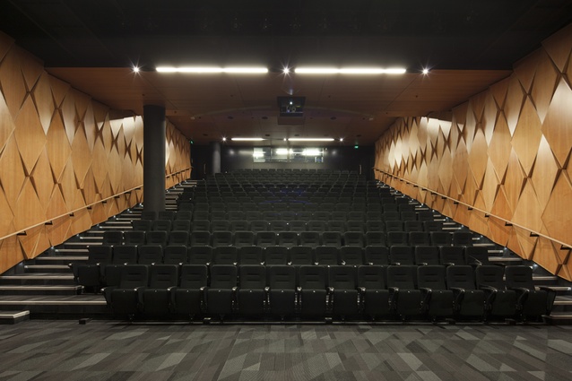
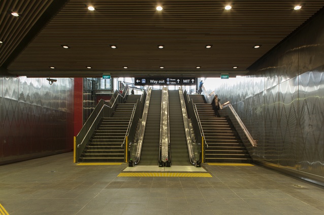
A nightmare scenario: money down the tubes, time wasted but now a spirit-lifting result. This building is now a number of ‘somethings’: a Faculty of Business and Information Technology and School of Logistics, a large, technical building with capacity for up to 5,000 students on site and 20,000 connected to the MIT cloud at any one time. The building harbours a 250-seat theatre, a multimedia design lab and a business simulation area. Downstairs, there’s a train station and transport interchange. At ground level, there are food and beverage purveyors. All that aside, this local landmark has another role. This is a building with a social agenda.
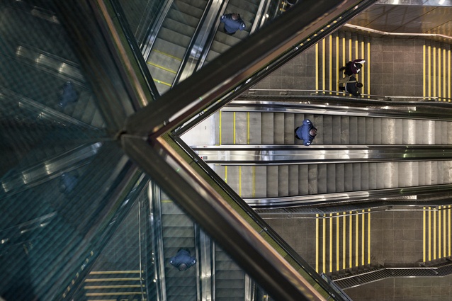
The plan runs thus: In the future, about 600,000 passengers a year are expected to use the train station in the building’s basement. Those commuting will become familiar with the building’s vocational role and this contact could help reduce the disparity in the uptake of post-secondary-school education between South Auckland and the rest of the country.
Peter Brothers, MIT’s chief executive, does a better job of explaining the premise. South Aucklanders take part in post-secondary education at a rate of only half of the national average. MIT’s mission, he says, is to “light the flame of desire for further education within the community”. By integrating the transport interchange with the campus, the plan is to “break down barriers between academia and community”.

“The building is really the spark; if the travelling public can see members of their own community studying, the idea of education begins to seem normal and accessible. Every time you catch the train, there is an interaction with the building that says ‘remember you can learn’. It’s being able to walk through the building with no barriers; it’s being able to say; ‘MIT isn’t a problem – I’ve been there; I’ve bought my sandwiches there’. If members of the community see the space as their building rather than as MIT’s campus, that will be the proof of the project’s success.”
Warren and Mahoney worked on this project for four and a half years. Blair Johnston, who with fellow director Andrew Barclay led the project, cites ‘joined up thinking’ a decade ago between MIT and the then Manukau City Council as the cornerstone for the co-location’s success.
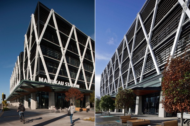
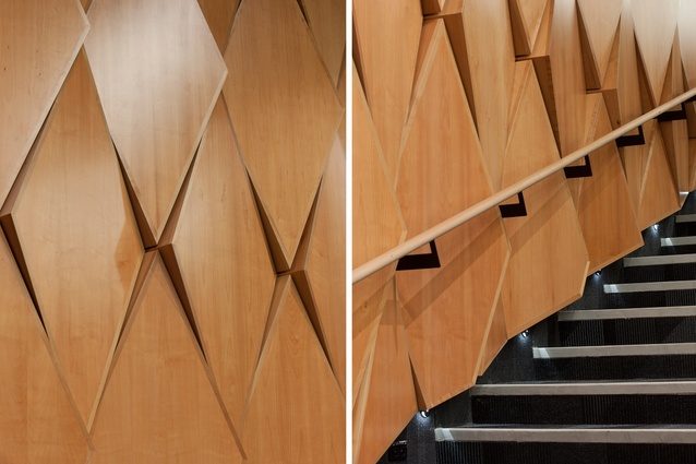
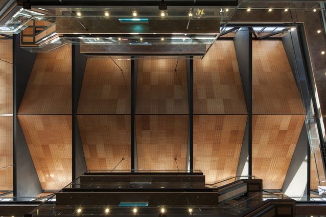
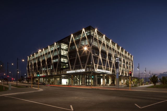
Formally, the building is known as Te Waonui O Te Mātauranga – or The Forest of Learning. It’s a place where you can, pardon, see the wood for the trees – silver birch, for the most part, which confers a natural-ness to a building that proudly exhibits its structural devices. Informally, thanks to its exterior diagrid, which removes the need for columns and other support structures on the floor plates, the building will probably be known as the ‘diamond building’ (or, at worst, the train station – not such a bad thing in this part of the city, trapped in the confluence of two motorways).
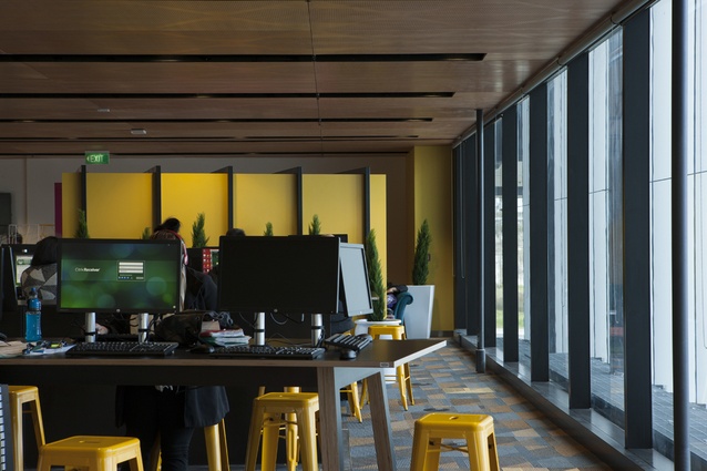
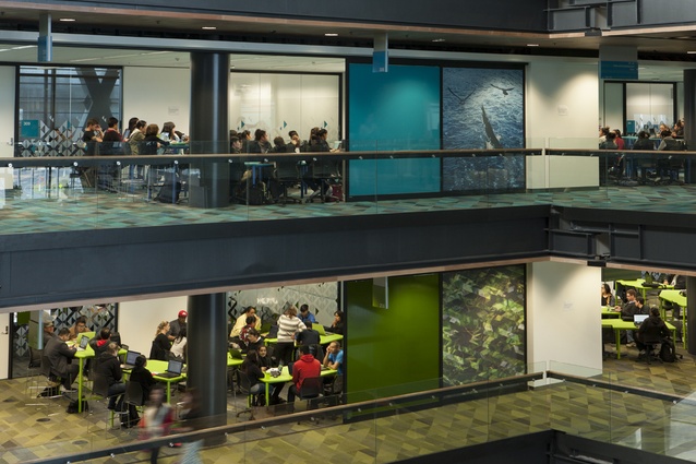
Pushing the columns and beams to the external façade lines freed up the sort of interior space MIT desired: not big, traditional lecture theatres, the “last gasp of dinosaurs”, but “learning spaces [that] need to facilitate what we refer to as a ‘flipped classroom’, focused on student interaction,” says Brothers.

The exterior form of the building, says Johnston, was driven from the inside out. “It’s absolutely driven around providing flexible long-term floor plates. We don’t know what education is going to look like in 25 years but we do know how to design flexibility into a building to accommodate what we don’t know. The key move was developing long-span floors with columns pushed to the outward edges. In all the teaching spaces, none of the walls are structural; none of them are impeded by columns, so there is limitless flexibility as pedagogy evolves.”
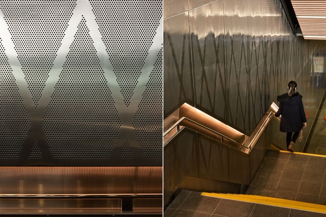
Pushing the structural support to the exterior provided some architectural challenges. The architects were concerned that the building be read as cultural and not commercial. They embarked on an exercise of façade testing: structural efficiency versus subjective readings. The cross frame, for instance, depending on the bay articulation, could be read as either a series of ‘X’s, or a series of diamonds. “A series of Xs was perceived to be bad karma, whereas diamonds were perceived to be appropriate.”
Warren and Mahoney worked on a number of alternative proposals for the site before the built scheme was chosen. The rail trench was a key factor in the design – it was not designed to take any structural loadings, so building forms were required around it. The iterations included a “simple L-shaped building with an exposed trench, because MIT had to pay to cap the trench, and that was a significant cost; separate buildings around an open rail trench, versus where we ended up, which is three buildings with an enclosed space over the top of the rail trench. That’s a 1,200m² space that wasn’t briefed.”
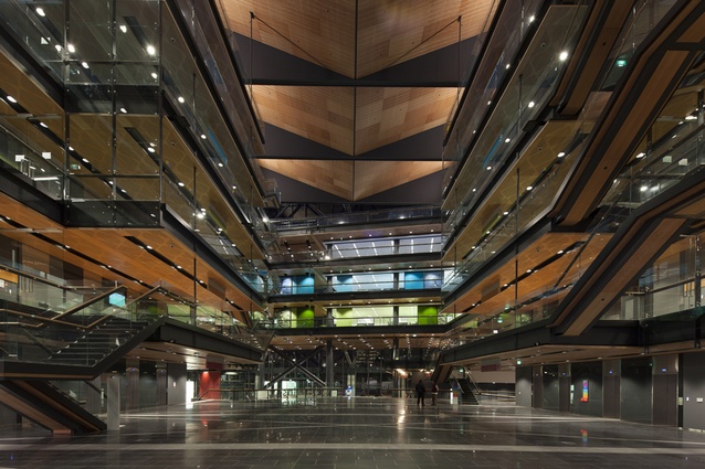
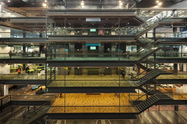
The resulting atrium is the building’s most magnificent space. It rises six storeys, filling the void created by the three buildings. Its scale gives it gravitas; its art, texture and pattern make it a place for people. Above the atrium floor, the building’s colour-coded learning floors push out to the edge of the void and key break-out spaces or informal learning areas occupy visible positions on the bridges that traverse the atrium’s end.
And it’s here on the atrium floor, where the public can freely range, that you can see the promise in this building. Here you really can see education in action; it ebbs and flows throughout the building. You can see evidence also of what Johnston calls the “the coat hanger and the cloak”. The coat hanger is the building’s structural fabric, largely neutral, with a lot of timber. The cloak is the life of MIT, its artwork and its colour: “It’s the people that inhabit the space.”
—>

