Making connections
Thirteen years ago, 2degrees burst onto the local telco scene: the new kid on the block, the disruptor, the Robin Hood of mobile phone land. Its name, patently, stands for connection, not only across the cellular network but also with each other – there are, after all, only two degrees of separation between each of us here in Aotearoa, sorry Karinthy.1
While the business has grown solidly and given Spark (previously Telecom) and Vodafone a run for their money, it has always held true to its underdog position, even adopting the mantra ‘Fighting for fair: to make New Zealand a better place to live’ as recently as 2019.
Part of that fight, CEO Mark Aue explains, is not just for customers but for staff, too. “I can’t wait for our people to feel more connected with each other, to customers and to our purpose, empowering us all to move quickly and grow,” he said on the eve of the team’s recent move to its new HQ on Fanshawe Street.
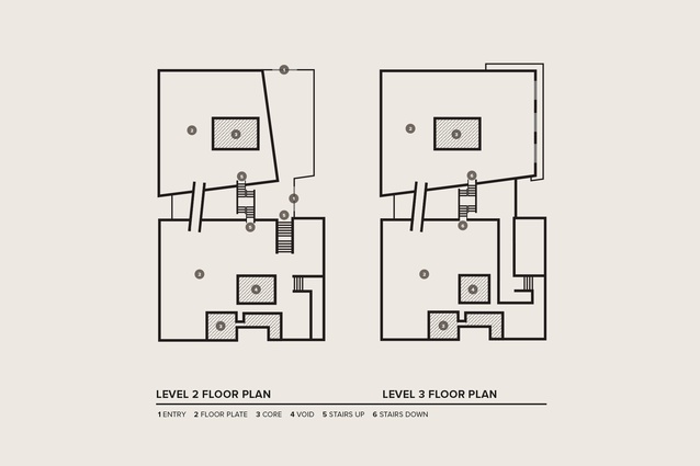
Here, in the seven-storey Formis-designed Mansons TCLM development, which also happens to be New Zealand’s first 6 Green Star-rated building, 2degrees has taken out 5200m2 of office space over levels two and three. The building follows a similar model to that of other Mansons developments, with large, open floor plates connected via a shared atrium, which essentially divides the building into two.
Warren and Mahoney interior and workplace designers Asha Page and Daniel Kempka were charged with bringing the team of 700-plus largely siloed employees together into the one space – a first for the business. “Its contact centre had previously been spread over one or two buildings and its main corporate office was in another building,” says Page, “so this was a chance for the team not only to be much more efficient with the business but to consolidate departments and pieces of the organisation into one place.”
Designing the space through the first lockdown period of the pandemic, commencing in March 2020, presented some great opportunities, says Page. “Like a lot of companies, 2degrees realised how brave it could be, in both acknowledging we could work from home much more easily and still be productive but, also, in thinking about what was going to draw people back and, when they did return, what would they be doing?”
Being brave and bold cut across the look and feel of the space as well as the employee density ratio. “Before we came on board, a workplace strategy had revealed there wasn’t a high utilisation of space across its previous premises,” says Page. “But, what Covid did was make everyone realise how good we were at working remotely, having that more-mobile workforce, so we knew we could work to tighter ratios and comfortably bring everyone back in under the same roof.”
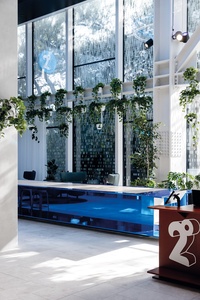
Visitors to the building can take the stair to level two, signalled by 2degrees blue lighting to the handrail, where they are welcomed into a double-height, concierge-style reception: a showcase-cum-hosting space. With glass on all four sides of the box, there are shades of Apple retail but the signature ficus trees are swapped out for hanging plants and fritting to the glass affords some privacy and glare control. The eastern wall provides filtered, dappled light through a large, mature oak tree on the Graham Street boundary. The showstopper here is a six-metre-long digital wall, which cleverly draws on the organisation’s data to create an animation illustrating activity on the network, by area and frequency, the length and breadth of Aotearoa. It makes for compelling viewing: texts flying overhead, someone calling home and data on the move, all set to a visual 3D relief of our country that rivals the weather maps on the six o’clock news. An eight-metre-long aluminium hosting island is wrapped in 2degrees-blue chrome, with stools running its length and a tap at one end. Good to keep your guests hydrated.
Across the foyer from the main reception is what the designers call the ‘gateway’, from which visitors are hosted to one of the front-of-house meeting rooms. Here, a wall of shelves is home to plants, awards and various fascinations, while two large TV screens at either end help keep waiting visitors amused as they perch on an art-gallery-type bench. Perhaps watching Rhys Darby’s commercial antics on loop?
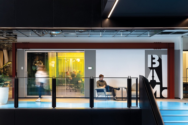
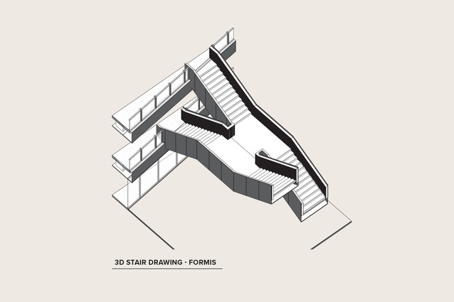
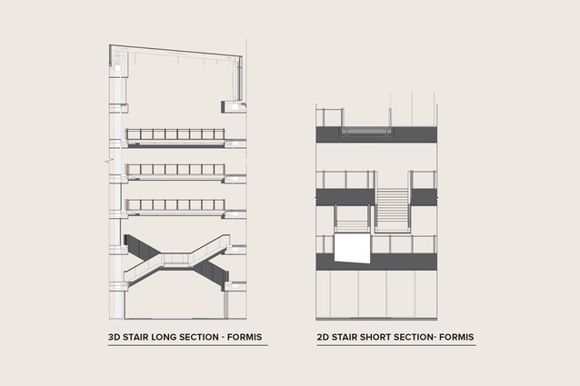
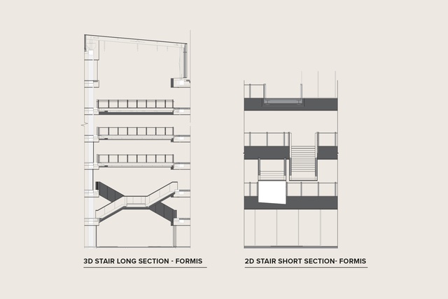
But the big design move is just around the corner. Where other tenants zigged, 2degrees chose to zag, unsurprisingly. Or, rather, where other organisations chose to walk straight across a bridge over the 11m x 8m atrium, from one floor plate to another, 2degrees chose to go up a stair, across a landing and down, “or you can go up this stair, turn the corner and go up,” says Page. All very Escher but infinitely sensible.
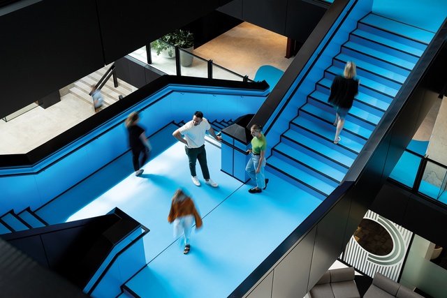
“Because it’s spread over two levels, it connects you both horizontally and vertically,” explains Page. “So, you don’t have levels siloed or separated. We made this design call at base build stage and it’s proved very successful – it’s positioned so it’s the shortest distance to key areas.”

One of these key areas is the 420m2 staff hub on level three. “We realised early on how important it was for 2degrees to have a headquarters that invited the community into its new space,” says Kempka. “So, we created more community-based spaces out the front and centralised the experience of a big staff hub, which allows staff, visitors and guests to interact far more in the whole experience.”
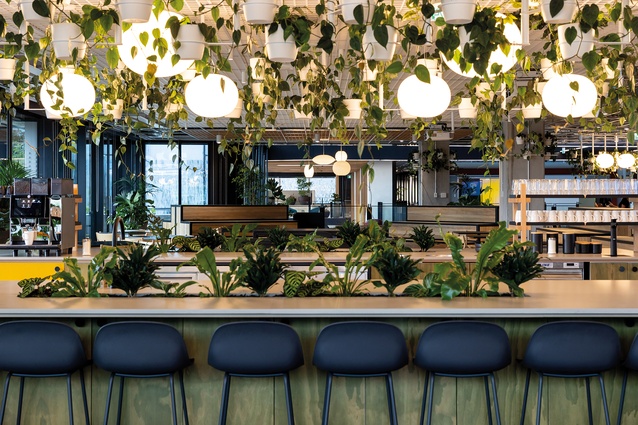
With sight lines to the Viaduct between buildings on the other side of Fanshawe Street, the open-plan hub is described by the designers as a shared space that affords a lot of flexibility and variety: one in which you can create completely different settings from day to day. Large items of furniture, such as custom-made, grandstand-like bleachers on wheels, can be moved around and reconfigured to create town hall events, incidental meeting spaces or pockets of interaction for a more café-style set-up.
“2degrees didn’t have this kind of space before,” explains Page. “It had to go offsite if it had more than 20 or 30 people in one space; that was a real driver to have this generous hub to allow for bringing the community in but also bringing staff together as well.” The move paid off, with the space comfortably hosting the dawn-blessing guests at the official opening of the headquarters, with numbers at about 250.
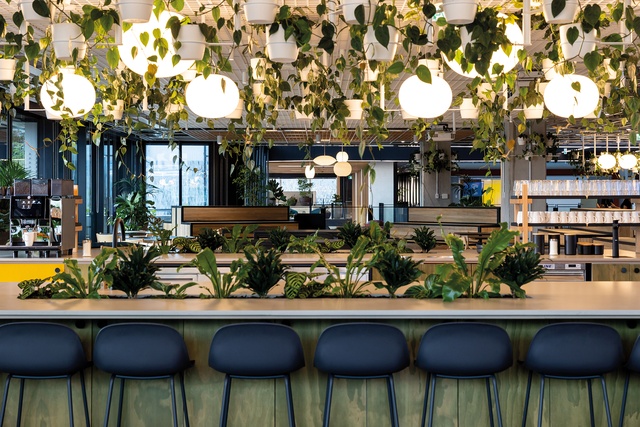
Kempka sees the adaptable nature of the hub and prototyping of the timber-clad bleacher concept as just one example of the client’s willingness and bravery to explore different ways of working, to help its people be more productive and creative, and to create an environment that would be far more conducive to collaboration, connection and variety than the company had previously had. This has filtered through to the workspaces.
“We were having fun and experimenting with novel, unique and innovative ways of doing things,” he says. “We soon found out how adventurous 2degrees’ culture really is.” Words like ‘protagonist’, ‘audacious’ and ‘heroic’ were central to the thinking, presumably harking back to the start-up days and in an effort to maintain a sense of doing it their own way.
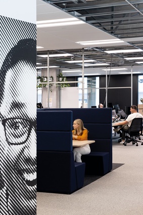
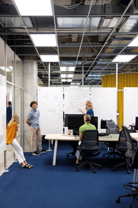
Workspaces are set out over eight neighbourhoods and, while anyone can sit anywhere, the neighbourhoods provide home bases for storage and amenity. Within each ‘hood’ is a collaboration corridor, with ergonomic, boat-shaped desks set at normal height and high, for either standing or high sitting. These are areas where teams can get together, surrounded by a customised Unistrut metal framing system onto which lightweight magnetic whiteboards can be stuck for brainstorming sessions. “You can take over an area and create a project space,” says Page, of the fully customised concept that was a first for the Warren and Mahoney team.
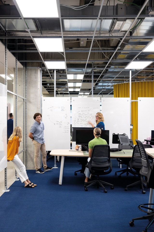
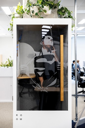
Full-height mustard Maharam curtains and furniture by Tim Webber, Simon James and Kada, amongst others, soften the silver steel and white aesthetic while pop-art vinyl wall decals provide energy and attitude in spades. It’s hard to tell if the glossy-blue acoustic resin floor finish to the stair, which appears to encroach organically onto landing areas, is meant to resemble seeping paint or the brand spreading onto the floor plates. Either way, it’s uplifting and inspired. A paint roller effect on a level two wall paints over a collection of phone technology artefacts (previously held in storage as part of the company’s responsible e-waste recycling strategy) and graffiti-like slogans are sprayed on surfaces, offering up challenging mantras such as ‘Dare to be different’.
In amongst all the fun and audacity, there is a serious side to this workplace offering, focused on the well-being of all those who come to work here. 2degrees is aiming to become the first organisation in New Zealand to achieve a WELL Certification,2 which, according to CEO Aue, means that “everything, from air quality to sound mapping, considered lighting design and restorative spaces, has been cleverly designed to impact the health and well-being of our people positively.” There are even VOC (volatile organic compounds) sensors positioned throughout the floor space, offering live updates as part of the building management system.
A parents’ room offers a private space for breastfeeding mothers or those wanting to express, there is a mindfulness room dedicated to meditation, yoga and prayer, and extensive planting is found throughout the two levels. In addition to these restorative moves, healthy eating is promoted, with a fresh daily supply of organic fruit and vegetables on tap, and there are numerous places to “rest and revitalise”, offering views to nature or prompts to go outside, alongside more quiet spaces for those needing some ‘me’ time.
Judging by the size and shape of its new HQ, this underdog of the telco scene has well and truly matured into a flourishing, environmentally concerned employer and industry player, with health and well-being high on the agenda. We can only hope more of its team will be able to enjoy the new workspace as the progression of the pandemic begins to allow greater ease of movement.
1 The concept of ‘Six degrees of separation’ was originally set out in Hungarian author Frigyes Karinthy’s 1929 short story, Chains (Láncszemek).
2 The International WELL Building Institute’s WELL Building Standard aims to advance human health through design interventions, and operational protocols and policies that foster a culture of health and well-being.

