Mackelvie reclothed
There is no longer a reason to wear down the soles of your designer heels trekking from one end of Ponsonby Road to the other in search of high-end retail therapy. The recent intensification of retail in the Mackelvie Street area means a new shopping hub has been created in central Ponsonby. The street, which was formerly a semi-industrial area occupied by laundromats, mechanics and artist studios, is being transformed with the renovation of historic buildings and warehouses and the development of several key sites.
Lot 3 on Ponsonby Road sits adjacent to Mackelvie Street and is the latest site to be developed into a mixed-usage building (retail, studios and offices). The historic brick building (more recently known as the site of Open Late Café and Ponsonby Pies) on the corner of Lot 3 has been retained. Jasmax principal Nick Moyes says to preserve the architectural rhythm of Ponsonby, “we needed to break (the new building) down into ’Ponsonby-sized pieces’.”
To achieve this, the new complex’s façade pays respect to the old red-brick, plaster and blue-stone building, with glazing lines and canopies reinforcing the horizontal alignments of the original building’s composition, as well as a complementary palette of terracotta, metal and glass.
Lot 3, however, is only an entry point into an area replete with fashion retailers whose interior personalities might just dictate the future of this urban enclave. Just around the corner, a retail development designed by RTA Studio won numerous awards in 2013 for its use of perforated decorative façade panels, imitating the proportions and decoration of the adjacent Victorian-era shops. And, more recently fashionistas Eugénie, Deadly Ponies and The Shelter have moved into the street. Here is a sample of some of our favourite interior details from Mackelvie’s new garments.
For some time, owner Vicki Taylor had been searching for a suitable space where she could stock her own well-known fashion label, Taylor, in combination with other luxury and ethically produced brands.
“The idea is that you can access design-led versions of all your lifestyle essentials at The Shelter. Food, clothing and homeware are all delivered to create a sophisticated and creative environment for discerning shoppers,” says Taylor.
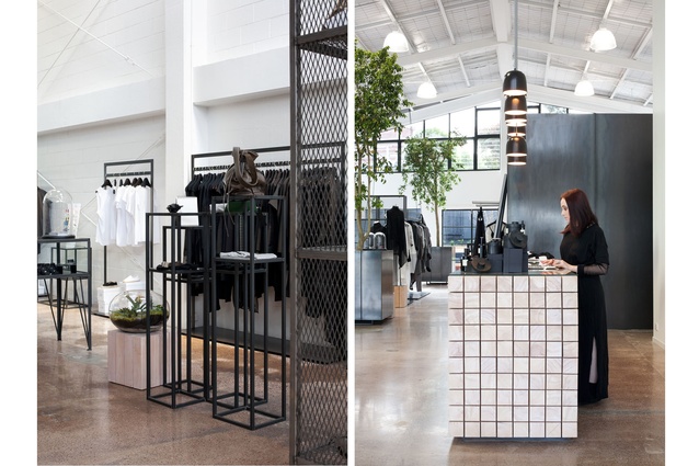
She had created a clean, simple, semi-industrial style in her boutique stores and engaged Pennant & Triumph architects to achieve a similar, timeless look in the new concept store. “The former laundromat building had a number of elements not suitable for a retail space, however it had great bones being essentially a small scale empty warehouse,” says Justin Roderique from Pennant & Triumph, “the brief was to turn the site into a contemporary shared retail space”.
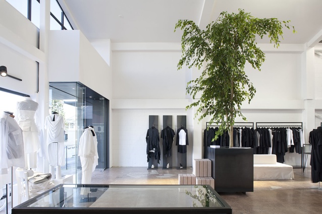
Polished concrete floors, set against white walls, create a large gallery-like space, where collections of clothing, jewellery and homewares from the likes of Maison Martin Margiela, Danish clothing designer Barbara Gongini, Canadian jewellery designer Arielle de Pinto and local brands such as Jimmy D, are stocked regularly.
Bespoke steel-and-glass cabinetry and pale-oak timber shelving and display tables create a simplicity and timelessness that echoes the quality of each carefully selected brand.
Large indoor trees in oversized planters bring the outside in and a timber bed, made up in natural linen, hangs from the roof trusses, creating an idyllic display nook. The on-site café Blend provides food and coffee, with an outdoor courtyard in which to relax, while a bike store stocking luxury bicycles and accessories from Tokyobike completes the retail experience.
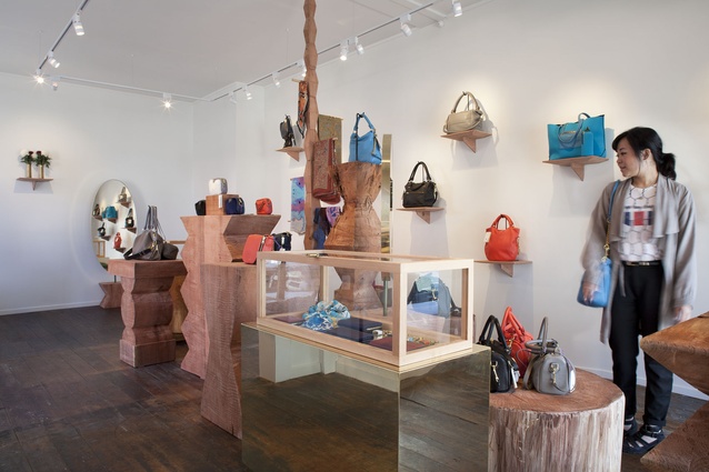
Deadly Ponies’ creative director Liam Bowden knew he had found the perfect space in which to exhibit the luxury brand’s leather, silk, brass and fur accessories when the century-old space (formerly part of the Gary Nash glass studio) became available this year.
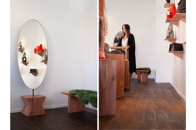
Interior designer Katie Lockhart was engaged to realise the brand’s vision for a studio space with flexibility. Floorboards were sanded and kept raw, while walls were painted white, giving the flagship store an artistic feel.
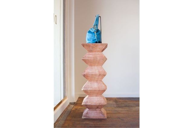
The idea of creating wooden totem plinths was inspired by a visit to the Centre Georges Pompidou in Paris.
“I knew that I wanted contrast between the perfection of Deadly Ponies’ hand bags and the materiality of the totems and I started thinking about Brâncuşi’s atelier, which I visited last year in Paris,” says Lockhart.
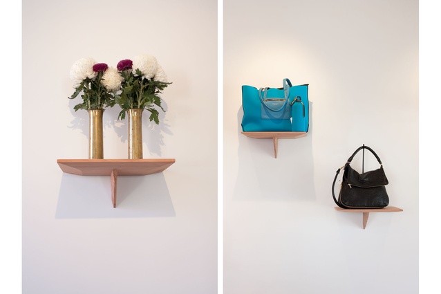
Plinths and shelving were carved out of a single redwood tree, in reference to the celebrated Romanian sculptor’s work, and create a gallery feel to the space while maintaining flexibility for reconfiguration in the future.
The perfume of the timber creates a strong sensory dimension to the tactile experience in the store.
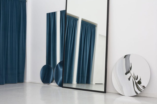
The raw and artistic feeling of the space is heightened with the use of metal and natural elements. Brass chests and oval, brass-framed mirrors reference the hardware on the handbags and timber- framed glass display boxes sit against linen mannequins draped with silk scarves in marbled colours.
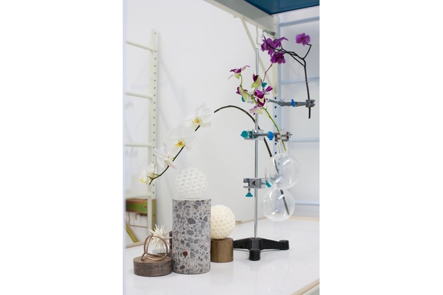
What does the largest machine on earth have to do with emerging label Eugénie? Former Karen Walker employee, Liz Wilson’s fascination with the Large Hadron Collider (LHC), a giant machine 27 kilometres in circumference that allows physicists to test the predictions of different theories of particle physics, creates the inspiration for the juxtaposition of science and fashion found in Wilson’s Mackelvie Street store.
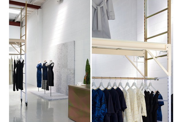
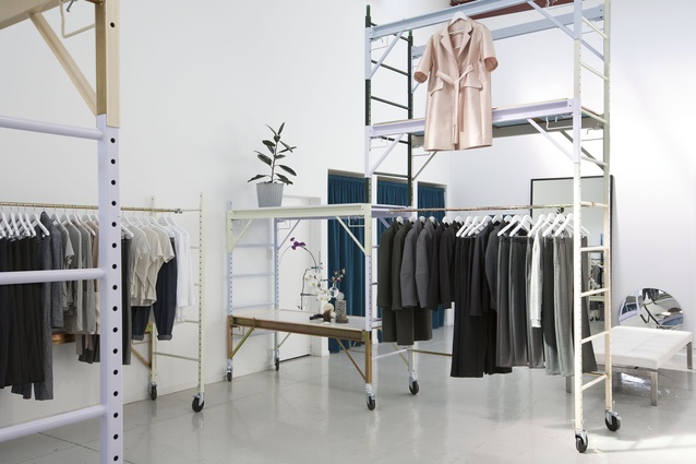
Opened in July of this year, the airy warehouse space, which has a two-coat epoxy white floor and white-painted cinder-block walls, sets the stage for her latest collection, an exploration of femininity and physics, with references to particles and dark matter set against lady-like florals.
The fit-out of the boutique was designed by partner Simon Oosterdijk, with the industrial-style modular clothing racks and shelving able to be dismantled and reconfigured as needed.
Liz says space exploration also played a part in the look of the interior.
“We were looking at NASA space centre and manufacturing facilities and trying to see if we could feminise those ideas,” says Wilson. To further confuse the two themes in the space, grey ceiling insulation tricks the eye into seeing marble (or a lunar landscape), behind a display mannequin.
Oosterdijk, who publishes Risograph books (an old method of printing, similar to screen printing) in the space at the rear of the store, stocks these and other local, obscure and hard-to-find titles in a highly curated library in the boutique.

