Houses Revisited: Courtyard house
This former worker’s cottage has been slowly transformed into an ideal and permanent home for two Wellington architects. First published in 2017.
One of three cottages on the side of Mount Victoria — built in 1887 for workers in a nearby quarry — this house had been altered a number of times before it came to the attention of Judi Keith-Brown and Ewan Brown.
Purchased when their grown-up-and-now-flown-the-coop children were small, the couple, both architects (Judi is a sole practitioner while Ewan is a principal at Tennent+Brown Architects), have been slowly transforming the house over the years, with the end result being a family home that is warm, light-filled and sheltered, despite its central and south-facing position in the windy city.

“One of the reasons we bought and fell in love with this house was because it had all these rooms that were quite small but really efficient,” says Judi. “I don’t like houses that have massive rooms filled with fancy furniture for no reason. I try to do this for my clients too: give them somewhere where they can have a nice conversation or lie around and read a book, and it’s comfortable and big enough, but not too big.”

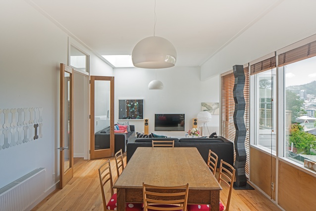
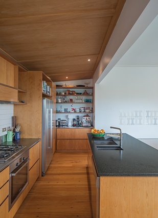
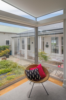
The U-shaped living room is exactly this: a comfortable and warm spot flooded with light from a skylight above and windows that look across to downtown Wellington and the harbour. The kitchen is clad in macrocarpa with a clear finish, which has allowed the cabinetry to remain relatively unscathed after years of life with two young boys. The floors are made from recycled matai joists.
“The reason for the macrocarpa and matai was that if we had a long day at work and then walked up the hill with the southerly blowing in our faces and freezing cold, I wanted to walk in here and visually it’s warm, like honey. As soon as you turn the lights on, the room looks warm — and not too sterile either,” says Judi.
Not long after moving in, the couple excavated under the house and inserted two bedrooms and a bathroom for their sons. At that point, the well-worn bathroom and laundry were at the front of the house, which sported bungalow windows and a verandah — a not particularly a well-considered alteration from the 1970s.

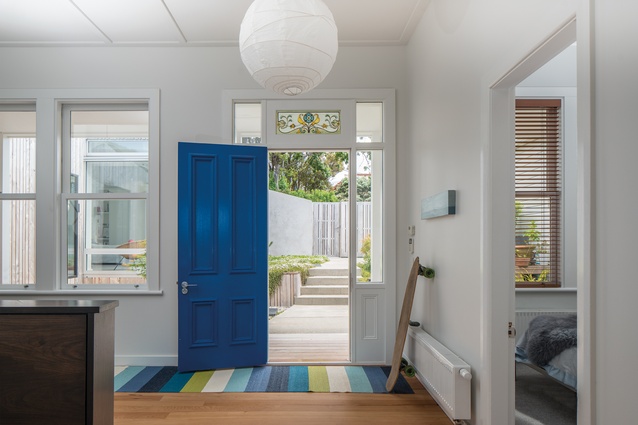
The couple replaced the bungalow windows with new timber double-hung windows, which match the house’s history. They moved the old back door to the front and hung a stained-glass panel above it, which was a gift from a Scottish firm where Judi worked some years previous.
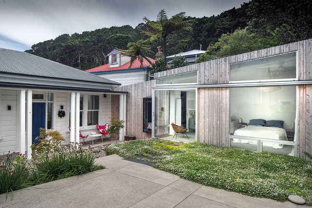
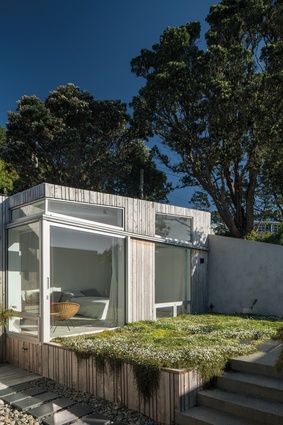
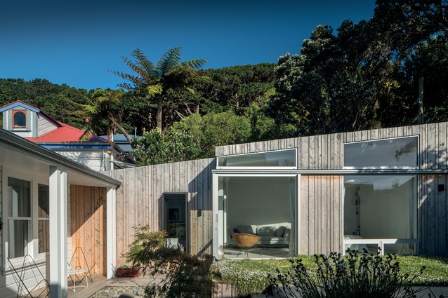
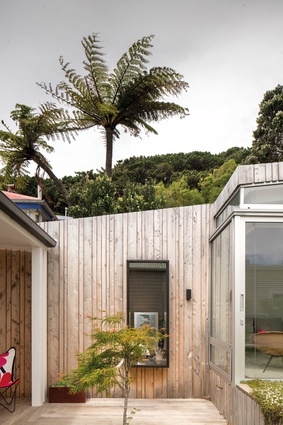
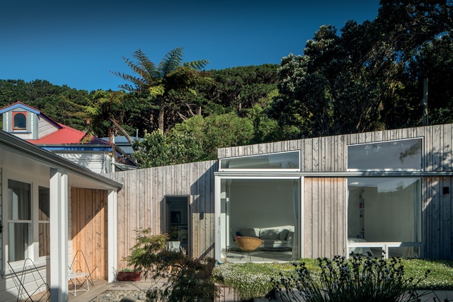
They also added the master bedroom addition, which reaches towards the gate and cradles the courtyard that now leads to the front door. This is clad in vertical Lawson Cypress boarding, which extends into the gates.
“The amazing thing that has happened from doing this work is we’ve gone from a bungalow to a courtyard house. The south wall blocks the southerly wind that comes up the driveway. It’s a lovely little spot to sit in the sun,” says Ewan.
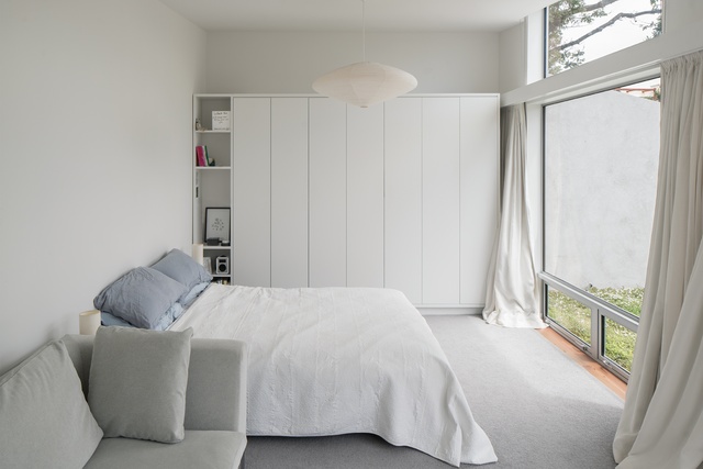
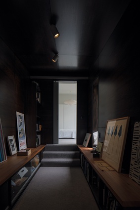
The master bedroom addition is accessed via a corridor that is clad in dark-stained oak veneer. In contrast to the rest of the house, which is mostly light-filled with walls painted in black-white, this corridor provides a spot for the couple to house any special items that could be damaged by sunlight, such as artworks and books.
The addition has a sense of Frank Lloyd Wright’s theory of compression and release, as it leads from this dark and narrow space into the entirely white and luxurious master bedroom three steps above.
“We decided when we did the work that we would stay here forever — we can walk into town, and when we are decrepit, we can get an Uber home or one of those self-driving cars!” laughs Judi. “We have experimented with this house because we haven’t been able to afford to do it all at once, which has meant we can live in it and find out what is best.”
Ewan agrees: “It has worked really well for us over the different phases of our lives. We have had time to know the climate of the site, and the result has been crafted around our lifestyle.”
Material Selector
Judi Keith-Brown talks about the external cladding used for the extension.
Why choose Lawson cypress?

It is a good local timber that weathers well. We both like the way this timber silvers off over time creating a natural contrast with the painted, rusticated weatherboards of the old villa.
Why go vertical?
Vertical cladding provided a contrast with the horizontal lines of weatherboards on the existing house and suited the panels of wall that we created. As we used Lawson Cypress as a screen over the cladding layer behind, it allowed us to avoid the capping flashing that is typically at the top of a wall. We wanted to simplify the wall to one material and extend this around in the gates and fence to enclose the courtyard.
Have you used it before in other projects?
Ewan’s office has used Lawson Cypress on many projects over the last 20 years, so he had experience with it in many cladding situations. We knew how it would weather and that it could stand the test of time.
Click here to see more Houses Revisited. And sign up to our email newsletters to receive Houses Revisited straight to your inbox.
Note: These are stories from our archives and, since the time of writing, some details may have changed including names, personnel of specific firms, registration status, etc.

