Loretta
Three things architects love above all else: open briefs, endless budgets and short commutes. Sam Donald certainly had the latter for his latest project, Loretta, one of the capital’s newest cafés. Located on Cuba Street, Loretta is directly downstairs from Parsonson Architects, where Donald has worked since 2004.
“Having a 20-second commute meant we were able to be on site a lot,” laughs Donald.
Loretta is the ‘little sister’ of Floriditas Café a few doors down Cuba Street, which owners Marc Weir, Julie Clark and James Pedersen opened 10 years ago. The trio had a strong vision for their new space, which has had several guises since it was built in 1910, including a cinema arcade, café and boulangerie.
“All three of us were keen that the materials used in the fit-out should very much reflect the food,” says co-owner Weir.
“Our food is very clean and honest, including lots of vegies and grains, and we wanted to showcase that in a setting that was as casual and relaxed as possible.”

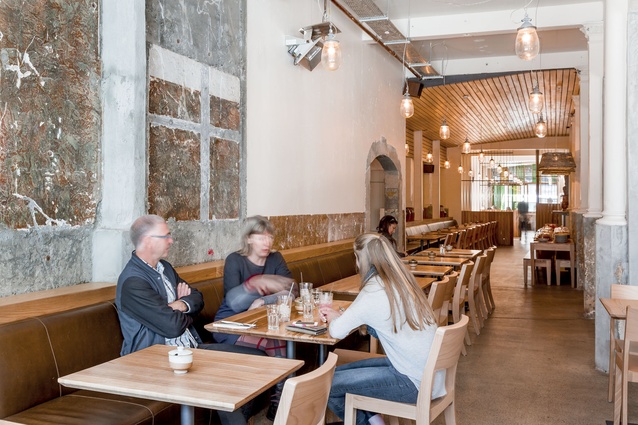
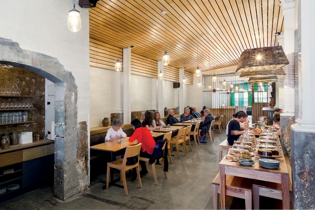
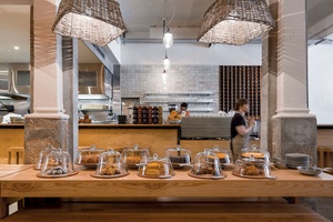
Particular inspiration was drawn from the movie A Single Man, in which Weir admired the mid-century Californian Schaffer house by John Lautner. Hence the white walls, lightly polished original concrete floors and liberal use of light American white ash timber not only in the open bar and kitchen but also in the veneered, slatted ceiling panels which play a dual role in softening the shell and concealing the acoustic treatment necessary in a 270m² space with several hard surfaces.
First to go was the rabbit warren of poky rooms at the rear of the space that had most recently been a commercial bakery. The former service bay was also incorporated into the space by removing the ramp, raising the floor and replacing small, high windows with large north-facing windows that flood the space with light and give the impression of there being a courtyard at the restaurant’s rear.
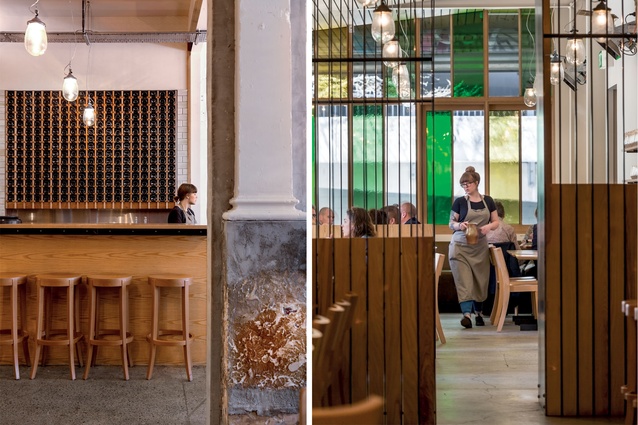
“Our challenge was how to maximise such a long, narrow space,” says Donald. “We did this by creating distinct zones with timber and steel screens that soften the space and create a level of intimacy.” The same steel is used to edge the counter and food service areas, and slats are used to encase the pizza oven.
Exposing the shell revealed elements of the original building, including classical pillars, which once demarcated the shops of an early shopping arcade, that were damaged in several places.
“We wanted to honour history so only roughly plastered them where needed, as well as cutting the slatted ceiling panels to indicate where the original capital would once have been. It’s a mix of old and new textures that play off against each other.”
During the five-month build, the team also stripped out the soffit to reveal the original bull-nosed verandah and, by doing so, allowed more light into the street-facing section of the café.
When it came to the décor, Donald says the brief was to focus on the natural, earthy tones of Paul Melser’s pottery. The Wairarapa potter has supplied not only the crockery but also the earthenware jars and vases that line the café’s northern wall. The sole artwork is an enormous photograph of chickens taken by acclaimed photographer Ans Westra.
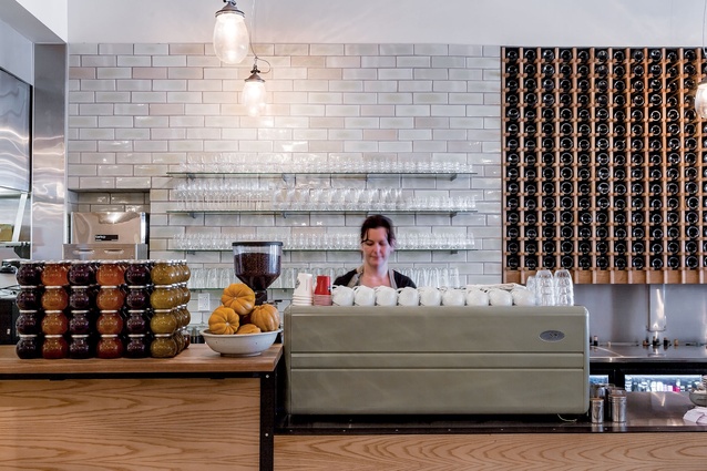
Behind the bar, which features almost 300 bottles of wine ‘turned the other way’, hand-made and hand-glazed white subway tiles made in Waiuku climb the wall. They are also featured in the exterior shopfront and wrap around the banquette seating.
When it came to furnishing the space, the owners looked towards furniture maker Thonet for the European beech chairs and tables and leather banquettes, all of which buck the current trend for seating at the chocolate end of the colour chart.
Russell Millar from Thonet says his company was able to assist “not only with furniture solutions, but also with the analysis and layout of spaces to maximise the space planning ratios within difficult confines”.
Loretta is the first café project Donald has worked on and he’s pleased as punch with the outcome.
“It was great to work on a relatively fast project for a change as a lot of our houses take two or three years from concept through to completion. The food and coffee are also so good, we joked about putting in a dumb waiter at one point!”
—>

