Lobby group
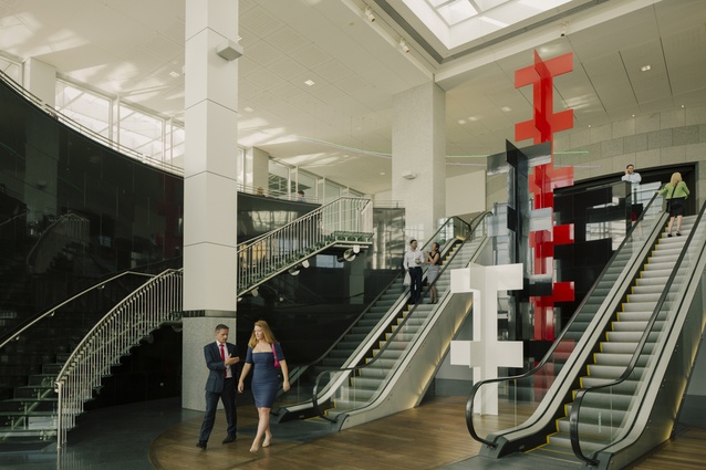
The lobby of the PwC Tower is one of Auckland’s best examples of public and private integration. It is highly connected with the surrounding built fabric and encourages public usage altogether peripheral to the occupants of the tower above. Each morning and evening, the podium becomes a heavily trafficked series of thoroughfares as workers from the downtown area pass through. It connects the Downtown Car park with Westfield Downtown, and Quay Street to Customs Street through the AMP Plaza – and the topographic shifts in each direction are tackled with strong gestures of bridging and climbing.
As a result, it is one of Auckland’s most well-used lobby short cuts. This fact alone may lead you to believe it has been well worn by the consistent passage of pedestrians through the 12 years since its opening. However, a recent refurbishment of the lobby by Jasmax serves to highlight not only a few fresh details but also the quality of space created in the original base build and fit-out.
In 2002, the Stephenson & Turner-designed lobby opened as a triple-height space that branched around Three Standing, a large artwork by Richard Thompson. Above was the programmed space of the lobby and transitions to the east and west. The change in level between what was essentially the floor level of the neighbouring AMP Plaza and the Quay Street footpath was achieved through patterned glass staircases and ubiquitous escalators. This connection to Quay Street is arguably a stutter in an urban design sense, being particularly closed in and lacking the generosity of the plaza above. However, the transition between levels occurs in a triple-height volume that, once occupied at high level, provides a huge amount of light and a generous view out to the harbour.
It is at this elevated height that the lobby becomes a personable public space. On one side, a pleasant café opens into the lobby. On the other, soft jet-set era-inspired lounges and an outdoor terrace face back to the iconic Ferry Building. Comfort and sophistication are the order of the day when it comes to seating. The reupholstered creamy leather of the seating would welcome even the most stressed executive’s posterior. The richness of finishes, along with the contrast of the hard and soft textures, produces an interior that is highly tactile while maintaining the civility of the corporate space.
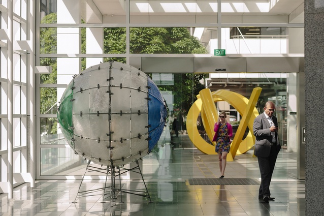
The collection of large-scale artworks remains unchanged through the recent refurbishment. The works do, however, benefit from the enlivening of the space. In particular, the new accents of reds and oranges through the updated carpet play well with the strong colours of Three Standing and to a lesser degree with the colour of Bill Culbert’s Wall Wave.
The reimagining of the carpet through the lounge areas of the lobby also keys into the original acknowledgement of the lost sea wall, which once marked the edge of the harbour reclamation. A basalt line of paving marks its former position and is translated into a bright crimson line through the new carpet, prompting reflection that once this site was totally underwater.
The refurbishment of the foyer has not transformed the space, nor has it substantially dealt with its few failures. But is has drawn attention to the parts of the foyer which have been well considered and has injected new life into a part of the city that still manages to straddle the divide between the public and private realms. Like any good piece of conservation architecture, it renders the quality of the original apparent, while making the new seem as though it should have always been there.


