Listening to the building
The waves are climbing our sea walls and gnawing away at our coastlines, storms are more frequent and intense, and waterfalls are falling from the skies. Climate change is upon us and one thing that has become more apparent in architecture is that we need to change our practices, not just to cope but to try to reduce emissions and assuage the worst-case scenarios.
One of these is more adaptive re-use of existing buildings – even if you do have to strip an ugly bugger, such as some 1960s’ office building, back to its skeleton. Concrete is a major offender in terms of carbon footprint and it doesn’t make sense to demolish a concrete building and throw it into landfill in order to pour more of the stuff. This is happening internationally and, when Lacaton and Vassal won the Pritzker, it was almost official; we can and should cut waste and adopt a more sustainable attitude by taking existing buildings and upgrading them to higher standards.
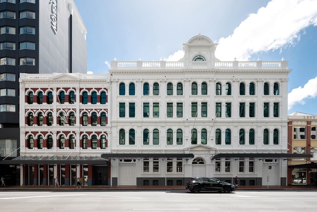
It wasn’t a hard sell for Peddlethorp at Britomart; in the Peter Cooper-developed precinct, many heritage buildings, several of which are listed, have been kept and give the place its character, and what is new has been handled with sensitivity. Located a few blocks from the wharf, these two formerly separate buildings, both shipping offices and warehouses, have now been combined into one large boutique office premises.
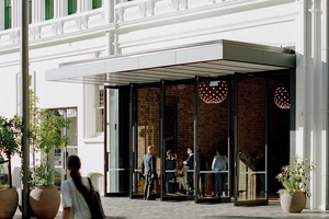
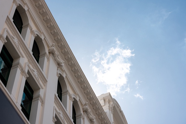
Hayman was built in 1900 by a British firm, although the company’s first branch here was in New Zealand’s then-biggest city, Dunedin, during gold rush times. The design by immigrant architect John Currie was a Victorian version of Italianate Palazzo. Hayman traded in important things like saddlery, tobacco, crockery and other household items, essential to a rapidly growing young country. In the 1930s, the building was modernised with an arcade entrance and terrazzo floor – I would’ve liked to see that but, of course, it was long since modernised away. Tenants included names still around today, such as art dealer John Cordy and Lloyd’s, the shipping insurer. You may know the building by its 1980s’ name, the Pacific shipping line Sofrana. That is also when its façade was lobotomised with the removal of its pediment because, you know, it was an earthquake risk, that catch-all reason for vandalising heritage architecture.
The Kronfeld Building was designed by the same architect, in a different style, a few years later. The eponymous Gustav K was a Prussian who had arrived here via the Pacific with Samoan wife Louisa. At that time, Samoa was a territory of the German Empire before its capture by New Zealand, on behalf of Britain, in the first days of the First World War. Gustav and Louisa’s great-great-granddaughter, the artist Emily Parr, has created a lovely work, and so we find them all over the universe now, that hangs in a window on Galway Street. It is an ‘ula, or necklace, inspired by ‘Oli ‘Ula’, the Kronfeld’s home in nearby Eden Crescent, now gone, of course, like the sweetscented flower for which it was named. I wish more of the architecture in Auckland and Aotearoa did this: draw out the diverse histories of us all and how we got here. Of course, Gustav was locked up as an enemy alien on Motuihe Island during the war and died in the 1920s. Louisa died in 1939, gifting her Samoan taonga to the Dominion Museum, now Te Papa.
The two buildings span two streets, Customs and Galway, allowing daylight and views on pretty much all sides. The handsome Customs Street exteriors of both haven’t been much touched but considerable effort by architectologists and pedimentricians has gone into rebirthing the arched pediment on Hayman in glass fibre reinforced concrete (GRC). And, is it just me, with my rose-coloured architectural critic glasses on, that sees a harmonious congruence between the Kronfeld façade’s delicate rhythms of red brick and little white arches with the beads on Emily Parr’s necklace in their Galway Street vitrine?
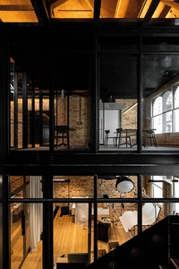
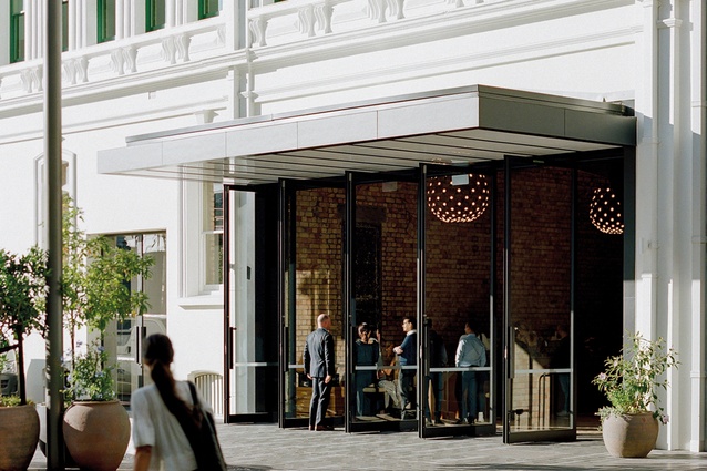
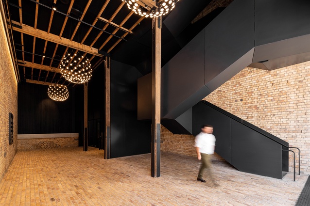
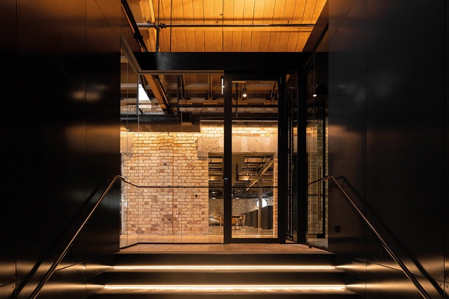
Most of the ground floor will be devoted to retail, with upper floors already mostly occupied by offices. A circulation core now links the two buildings into one, placed in the centre where one building abuts the other. This is quite a bit of fun, as pretty much the whole core and lifts are sheathed in expensive fire-rated glass and, as the two structures don’t share many common floor levels, your lift trip isn’t the usual suspended animation in a conversation-less box, but offers voyeur-esque glimpses into other tenancies at different levels. Similarly, the stairwell is a crisp, black, origami-like steel structure that unfolds and threads its way up, illuminated by daylight and also affording peeks of this and that, more village-like than commercial premises. It’s better than Skype or social media at noseying into the neighbouring businesses’ interior design and deployment of lobbies, workspaces and electric bike parking, and whether or not their pomp rivals your circumstances.

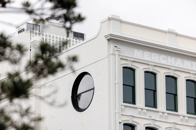
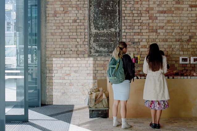
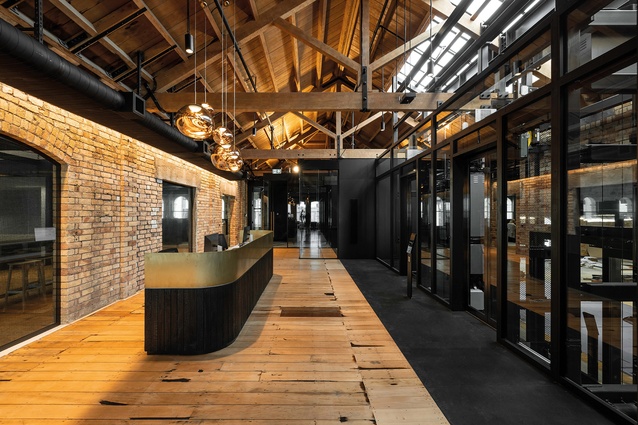
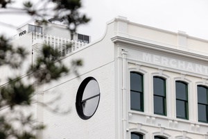
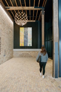
These days, of course, it’s de rigueur to live, work and exist in distressed circumstances – which is to say that both the existing and the new structure is exposed; the internal brickwork, timbers and concrete are raw. Easy here, as most of the upper floors would have been warehousing or similar so there is plenty to play with. Rather roughly laid brickwork of varying types and colours is placed on ancient oozing mortar, like a map of Mars, all ruddy frowns and brown wrinkles. At the top, you can still see charred roof timbers from an historic fire. The windows are original, although the glass has been replaced to a higher specification. New openings have been cut through some walls and the building also sports a few new circular windows of the same diameter as that of the arched windows. You can see a pair near the top: binocular-like on the east elevation.
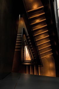
One kaupapa of the work was to reuse all surplusto- requirements materials from the building, such as timber and brick – hence the lobby is paved with recycled brick and you can find recycled timber used as panelling; it’s cleaned up and sanded but still pocked with black pits from knots and nail holes. New openings inserted into brick walls are crowned with poured concrete lintels. I am making it all sound a bit rough and ready but the execution of the work is slick and the ambience warm. There is also a bit of fun to be had in the toilet blocks, inserted into spaces like pods. One is quite glamorous in its black décor and stylish LED strip lighting: offering more of a nightclub moment than does the usual trip to the toilets.
Hayman Kronfeld is a virtuous exemplar of adaptive re-use. Targeting a five Green Star rating, it is a demonstration of sensitive alteration of two heritage buildings with insertion of state-of-the-art services and technology, such as the monitoring of water and energy use. This has happened through, as Richard Goldie of Peddlethorp puts it, “listening to the building”. And with all this upgrading and all these modern improvements, you don’t just get an efficient workplace, you get a cool place to be, too. As Goldie tells his clients of this approach, “it doesn’t cost any less but you get the character for free”.


