Like stepping from concrete to carpet
Inspired by interior design, home renovation, DIY and tastemaking; artist Charlotte Drayton is taking over Christchurch’s Physics Room art gallery and re-inventing its layout. Urbis spoke to Drayton about the conceptual place where building and art collide.
You are not a trained architect but a lot of your work focuses on that field… why/how did this fascination begin?
I think my practice has dealt with space in one way or another for about five years and there is certainly a history of artists dealing with architecture. I think the fascination for me began simply with watching my immediate environment. My dad was renovating his home in 2012 and the kinds of decisions that he was intuitively making were interesting to me.
The house was a small weatherboard home in a quarter acre section in Te Atatu Peninsula, painted avocado green, and this was just at the tipping point of the Auckland housing market’s extreme rise. This house, which I was very familiar with, was suddenly stripped back and exposed – its walls removed, its blueprint revised – and I started to consider how the decisions around placement shape our daily fluctuations and, consequently, the manner in which over time architecture becomes invisible through its familiarity.
When I was at art school I majored in sculpture and we were encouraged to make something if we wanted to see what it looked like in space (rather than designing it first). That is how my work developed – through making walls, casting concrete, gib-stopping etc.
Tell me about the first piece you made that focused on the built environment.
It was in 2012, in my third year of art school. It was an eight-meter wall that I built in a foyer opposite a set of three lifts – it mirrored the white wall behind it precisely, but instead came out on a subtle angle.
What has changed since, what questions are you asking that you were not asking back then?
I think at that point I was very interested in drawing influence from details in the immediate environment, gallery-like spaces. Since then, my focus has taken an expanded scope, examining the wider architectural environment, particularly suburban architecture. I have found myself interested in notions of taste and how it is formed.
What does The Physics Room work involve; what can audiences expect?
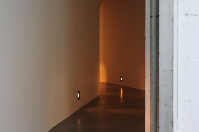
I think that it entirely depends on the audience, the work is a really large architectural gesture – and it has entirely shifted the audience’s movement through the gallery. What was once a singular long gallery, with a smaller L-shaped return off to the west, has now been reconfigured to a series of rooms that run off a central corridor. I have furnished the space with arched doorways, cream waffle-texture carpet and LED tread lights (on a dimmer switch). It has a more intimate, domestic feel to it. Unlike previous works that I have made, which are often pulled down at the end of an exhibition, this gallery configuration will remain for the year and other artists will use it and interact with it for their own purposes.
For people that are familiar with the previous gallery layout, the work will have quite an impact, but for those that haven’t been to The Physics Room previously, it will look a lot like an empty space. However, the new space includes a minding desk which is directly opposite the door as you walk in, this is staffed with some lovely volunteers that will be able to contextualise the show for curious first-time visitors.
There will also be a small fold-out publication that contains an accompanying essay and an interview between Jamie Hanton, The Physics Room director, and myself – so there will be a wealth of contextual information readily available for those curious.
So… how does your work differ from what a “tradie” does… what makes your work art rather than spatial design?
To put it simply, context. I think with both a tradie and a spatial designer the focus is different, the goal is different, the drive is different— however similar it might seem to the production of either profession. I also have the luxury of not working to a brief, and control all of the decision making myself, and as a result I don’t really make any money from my work. I certainly do not have the skills of a spatial designer, my plans for this show were very basic and hand-drawn – the alterations were thought out somewhat more intuitively, like that of the home-renovator.
The new gallery is based on a combination of certain practical considerations and my interest in specific home-decor tropes. With this project, I was working for the first time with builders, Peter and Jeremy, who were fantastic — this was great as it allowed me the time and space to step back and focus on the details more.
The press release for your show mentions that you seek: “to find a kind of median taste that speaks to the ideas of ‘ordinariness’, ‘averageness’, or ‘normality’”. Is this a critique of home décor trends or an alternative view of what constitutes taste in the residential context?
A bit of both, I think I am interested in looking at the most popular versions of things and examining the reason for their popularity. I am curious about what it is that draws so many people to particular paint colours, light fittings, carpet styles. I think trends are driven from somewhere, and aesthetic trends can be particularly telling in what they reveal about the local cultural and political climate.
You also mention that the exhibition “is a means of exposing the structures and hierarchies that determine” taste in home décor, trends etc. I guess magazines like ours are parts of this hierarchy. How do you see the current popularity of house-related media influencing local culture?
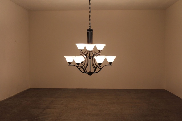
Yes, I think Urbis is certainly part of that hierarchy, as an arbiter of taste and high-end style. The kind of work that I make probably sits at the other end of the spectrum – it utilises the most commonly available styles, rather than those that stand out for their originality or sense of luxury – it is utterly recognisable, and also almost completely anonymous in its ubiquity. People often relate to my works through a very personal lens – they have an aunt that has that type of light fitting or they painted their living room that colour.
I guess taste or style can be seen as a kind of signifier, a way of projecting an image of oneself out into the world, and I am interested in drawing viewers attention to this. I use styles that are often both incredibly common and slightly out of date in order to catalyse reactions – people often have strong opinions one way or another about the style of decor – but I am less interested in taking a position on what good or bad taste might be, and more interested in how these opinions form and the types of biases and world views they portray.
Like stepping from concrete to carpet: Charlotte Drayton
18 February – 18 March 2017 at the Physics Room, Christchurch.


