Light+Building fair: Day 1 report
Camille Khouri of Interior reports from the Light+Building trade fair currently taking place in Frankfurt, Germany.
I had been warned to wear good walking shoes to the Light+Building fair at the Messe Frankfurt in Germany, and they weren’t kidding. You could spend a whole day in one hall alone, and there are eleven halls, connected with travellators inside and shuttle buses outside.
On advice from a lighting designer back home, I decided to start with Hall 1, which is spread over two floors and contains architectural and design lighting. The exhibitors in Hall 1 are mostly small-time designers, with some just starting out and others more established.
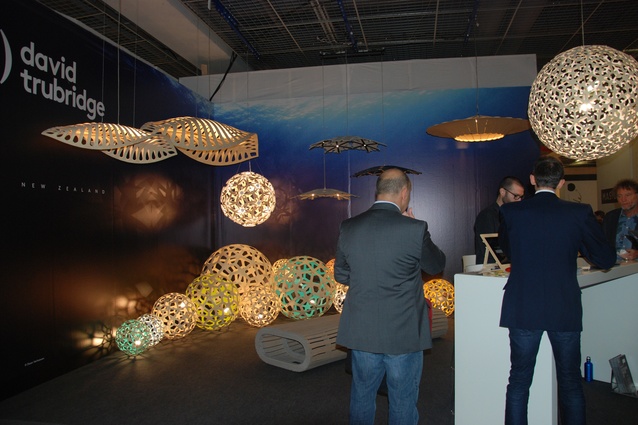
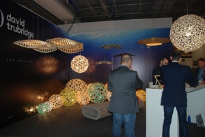
Frankfurt’s online design magazine Stylepark had created a map highlighting their picks from Hall 1, which included New Zealand’s own David Trubridge. The Trubridge stand was easy to spot, on a corner site with a very New Zealand aesthetic, images of underwater seascapes providing a backdrop to their distinctive timber lamps, which in this very effective collection resemble microscopic sea creatures.
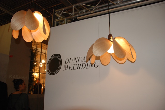
David Trubridge’s business manager Josh Lynch directed me to my next highlight of Hall 1, a Tasmanian designer named Duncan Meerding, who creates lamps and furniture from recycled and found timber. His cracked log lamps are simple but effective conversation pieces, where the light spills from chopped-out segments in salvaged logs.

The propeller light series was my favourite of Meerding’s designs though; these resembled flowers and provided an interestingly skewed light effect. His work is made more remarkable by the fact that the designer only has around 5 per cent of his sight remaining.
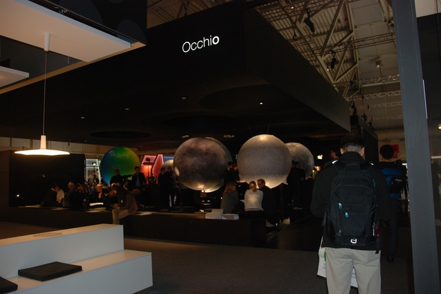
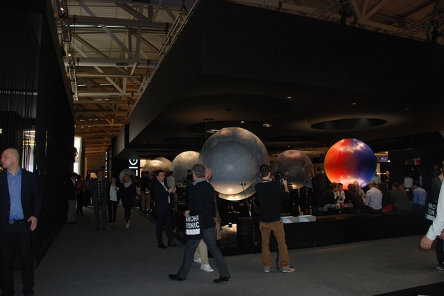
The most dazzling exhibit in Hall 1 was by Munich-based Occhio. Their 400m2 stand contains nine huge planets, which are used to show the different applications of their lighting products, and draw many a fair-goer to their stand. I did wonder, though, how many of them were looking at the products and how many (like me) were just marvelling at these incredible planet structures.
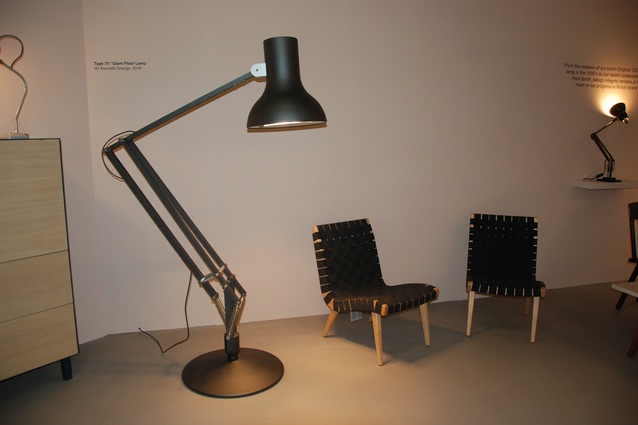
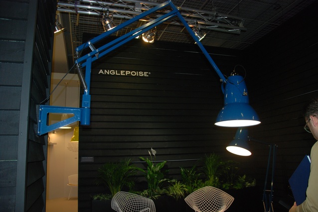
I could not walk past the Anglepoise collection of giant-sized Original 1227 lamps. Despite seeing these online before heading to the fair, I was still struck by the effectiveness of taking a classic product and making it giant. Positioned next to chairs or even attached to the wall, these lamps would look great in a living room or the reception area of an office. I liked the pastel tones available.

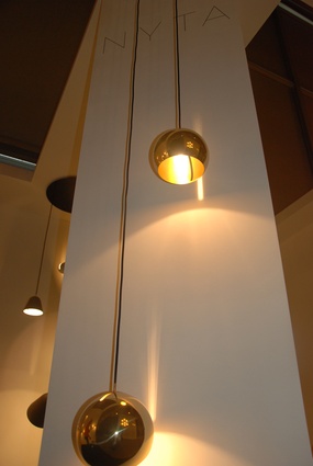
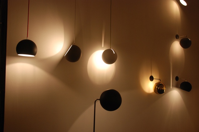
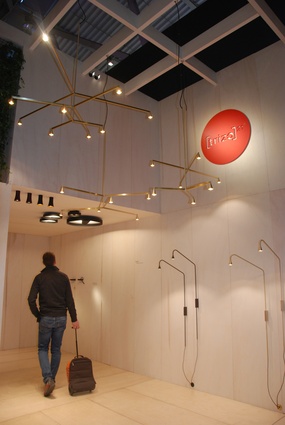
The Trizo21 exhibit was another stand-out for me. Handmade in Belgium, this company uses brass curves and linear shapes to create subtle, timeless designs. Also effective in brass and simple in design was German company Nyta’s tilt lamps. These cupped lamps provide a soft light that can be turned in many directions through an oblong opening. When the lamp is pointed downwards, this opening also creates an interesting illuminated stripe.
Hall 1 is about as far as I got today before the effects of two days spent flying caught up with me, but tomorrow I plan on visiting Hall 3, which contains technical lighting, and checking out a couple of the special exhibitions, including an ‘E-house’. Watch this space!

