Cohaus residents hold their ground
Architects Thom Gill and Helle Westergaard write a response to architect Christopher Kelly’s review of their Cohaus project in Grey Lynn, Auckland. The article was first published in Architecture NZ Nov/Dec 2021 and then online on ArchitectureNow.
We were very pleased that Cohaus was privileged to be on the cover of the November 2021 issue. Christopher Kelly’s article was thorough and thoughtful in describing the complex process of developing the project. He then went on to make a number of specific criticisms of the design and suggested alternative design responses. These are illuminating of the philosophical conventions architects use to frame the design of medium-density housing in New Zealand.
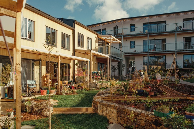
Kelly is concerned about the building’s “commune aesthetic”; the implication being that the design would be improved by individualising the units from the outside. In reality, every unit in Cohaus has a distinct physical identity by a combination of layout, level and orientation. Although the building façades are consistent, everyone knows their home and its signifiers, and we think that is what matters.
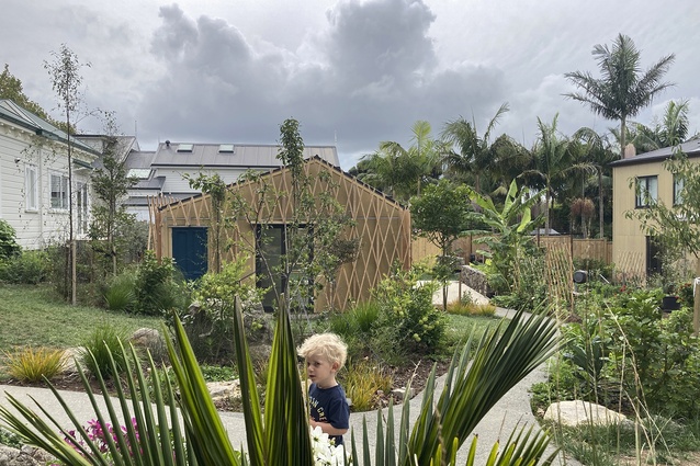
When evaluating the common garden, Kelly would prefer the “park-like luxury” of the gorgeous orchard at Sissinghurst, a vacant space to contemplate from your unit. The Cohaus residents did not want, nor could they afford, a beautiful void at the heart of their community. Having carved the courtyard space out of the uniform suburban mat, they worked through a complex co-design process to programme the landscape to a kaleidoscope of uses, social interactions and plant ecologies. Residents chat and share with each other in the garden spaces, with amenity sensitively placed. Privacy gradients to some of the ground-floor units are being fine-tuned with planting and screens. Things are not fixed and do change, plants appear and are nurtured; toys, beanbags, scooters, hoses, garden offcuts, cats and stray pieces of wood roam restlessly; children see no boundaries.

Kelly likes roof-top common rooms and is disappointed that we did not design one that “offered users elevated north-east views of the Ponsonby ridge line”. The view, or looking out at things, is clearly important. Research has shown that roof-top common spaces on their own are isolated and do not function well. Copenhagen City Council does not support their provision. Our residents wanted the common room to be in the garden, where people naturally go and where our social connections are most strongly imprinted through community and individual celebrations and ritual. Just this weekend in the garden house, there was an impromptu theatrical production by the 3–10 year-olds, a late-night dance party (which would have sorely tested the patience of other residents had it been inside the main building), a judo practice and children playing happily in between.
There was a critique that the deck balustrades provide “too much transparency”, presumably because people will look up at deck occupants in unflattering positions. Kelly states this so confidently that we had to ask the residents what they thought. Out of the eight households with continuous decks, we heard back from six residents (five women and one man) representing five households. All of them liked the transparency of the railings because of the visibility, light and communication they made possible. One mother noted, “our kids have never felt tempted to do something silly like push a chair up against the railings to peer over because they can readily see down below through the railings”.
If we were to search for a theme in all this, we believe it is a conventional preoccupation among architects with the primacy of looking… looking at objects, looking into spaces, looking upon surfaces, looking out to a view, and so on, usually from an external, static, authorial point of view. In medium-density housing, this tendency is exacerbated by the absence of the real clients, the people who will live there.
With Cohaus, we attempted to follow an unorthodox design philosophy of active social architecture. This meant helping a true client group of future residents to form itself, full of complexity and contradiction, and then designing for that group. Every design decision was tested against the needs and wishes of the group and the individuals within it, to consider the social value first. This created a psychological interior to the project, that we could compose and detail around. So, in the end, the most accurate answer to Kelly’s points is the simplest: this really is what the clients wanted. Now that the garden is grown and the buildings truly finished, we warmly invite Kelly to visit again.
Sincerely
Thom Gill and Helle Westergaard
Studio Nord, Cohaus Architects
————————————————————————————————————————————————————————-
Architect Lisa Webb also wrote a letter to Architecture NZ in response to the original review by Christopher Kelly, you can read this here.


