Legal matters
Many in the legal fraternity in New Zealand have been busy revitalising their workplace interiors. From Dunedin to Auckland, the past few years have seen a spate of refits and new builds geared to accommodating the profession.

The similarities? The corner office with the mahogany desk is vanishing. Representation of hierarchy through spatial divisions is no longer the norm, and firms continue to look to their workplaces for increased efficiency and savings. Here is a sample of some memorable, recent legal workplaces and an educational facility for future law makers.
Duncan Cotterill Lawyers
CPRW Fisher
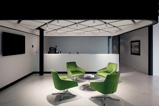
Duncan Cotterill Lawyers has a new Auckland home in the Australis Nathan building in Britomart. CPRW Fisher’s David Morgan, design director for the project, says the firm “wanted to create an office fit-out that challenged their perception of who they are and how they are seen by clients.” The office is largely open with shared workspaces and has visual connection to adjoining Takutai Square. Historical aspects of the base building have been acknowledged and exposed.
Lane Neave Lawyers
Jasmax
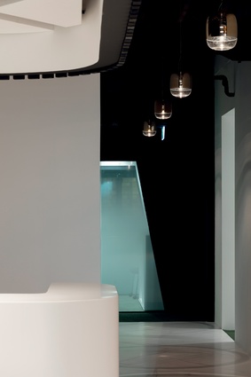
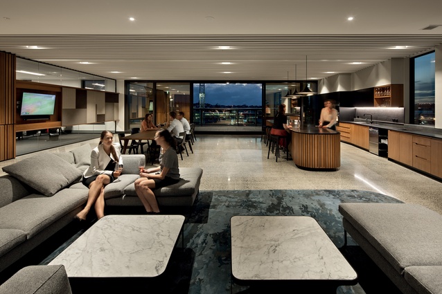
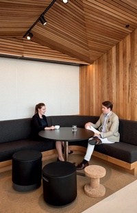
The new Christchurch offices for law firm Lane Neave make useof oiled oak and tinted glass to give a ‘home office’ feel to the space, explains principal architect Alasdair Hood. “We placed a real emphasis on genuineness of materials and ensuring a quality that would last but also patina well. The tinted glass was about exploring other ways of dealing with the extensive areas of glazing required in fit-outs, without it looking commercial or typically workplace.”
University of Waikato Law and Management Facility
Opus Architecture
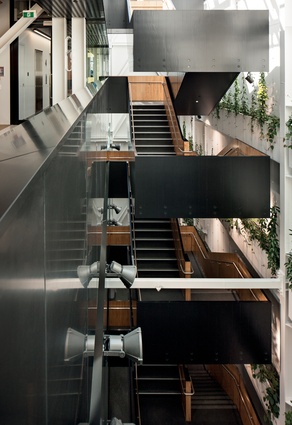
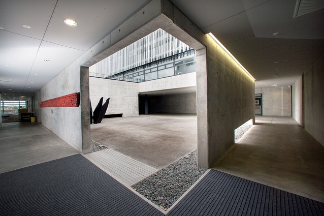
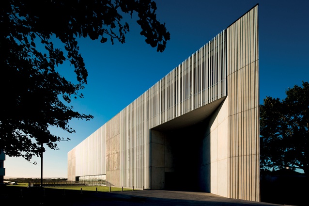
This subterranean courtyard punctuates the podium building in the new University of Waikato Law and Management Facility, designed by Opus Architecture. Flanked by a five-storey tower with vertical sunshade vanes that bring to mind Maori tukutuku panels, the below-ground building links to an existing management building. The sloped nature of the site allowed for glazing on the eastern face, and the courtyard was built further into the floorplate to bring natural light into the western spaces.

A lawn grows over the roof of the building, and students are able to look down into the courtyard from this green space and see the inner workings of the facility. “It helps to orientate you when you are in the underground building,” says Hendrik Vermeulen of Opus. “The materiality of the project reflects the nature of law, which is the cornerstone of any civilised society. There is strength in concrete, openness in glass and timber is a natural connection.”
Mayne Wetherell Lawyers
Creative Spaces

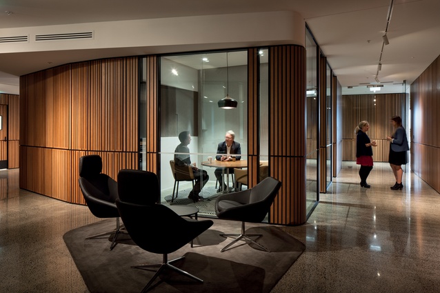
Making the move from its traditional, corporate offices in the CBD to Wynyard Quarter required a shift in style for law firm Mayne Wetherell. The firm wanted their new space to retain a sense of quality and comfort, without being too formal. Senior associate of Creative Spaces, Colette McCartney, says the firm asked for “a refined residential aesthetic rather than a traditional corporate approach.”
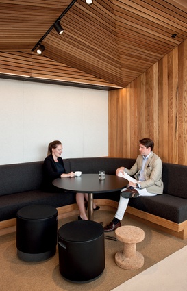
To do so, Creative Spaces used a palette of concrete floors, routed timber panels, black joinery and neutral blue-grey tones in soft furnishings and rugs. Curved edges on walls and furniture provide a soft, yet highly finished aesthetic.

