Law Office
The thrill of the new can be irresistible, but such allure can be spurious. Better and longer lasting, in the right place for the right people, is a design that contributes quiet elegance. As Winston Churchill once said, “Do not let spacious plans for a new world divert your energies from saving what is left of the old.” An element of that thought is instilled in this project. “Not all companies are made for open-plan offices,” says Nat Cheshire, one of the two designers on the project for Cheshire Architects.
“Not all companies need break-out spaces, coffee machines, exposed ductwork or putting greens. Some companies do simple things very well, and wish simply for space that offers them efficiency and quiet dignity. This is one of those companies.”
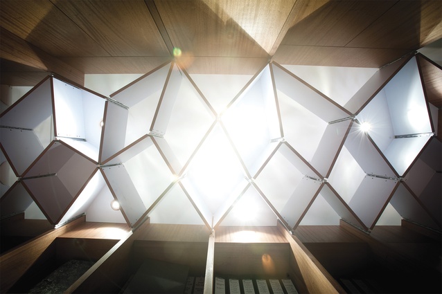
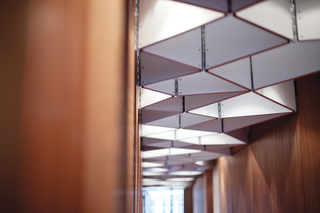
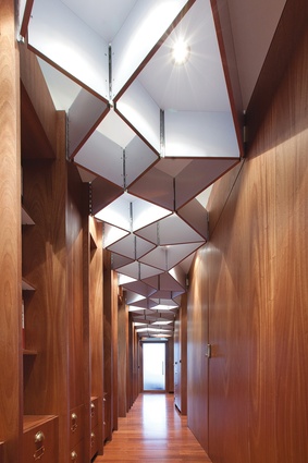
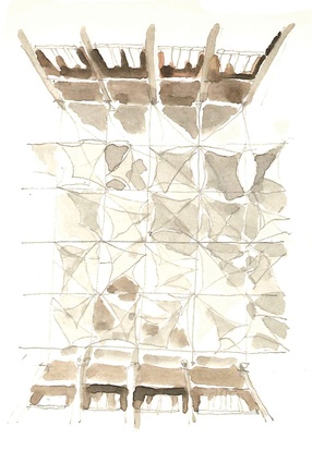
In this workspace, for a law firm, a ceiling form of folded planes is an unexpected and unifying device that modifies the effect of the corridor’s lighting. Angular shadows are cast, and the organisation of space with light, an old-school architectural idea surely, seems appropriate in this setting of wood and brass. The office, says Cheshire, is in many ways old-fashioned. The envelope is a building of heritage stock, “a simple old building, filled with light”. Simple, old buildings are of course rarely simple to work with; the challenges associated with thick concrete walls cannot be underestimated.

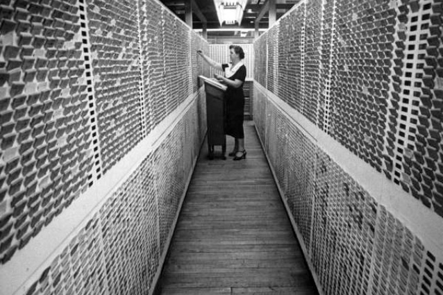
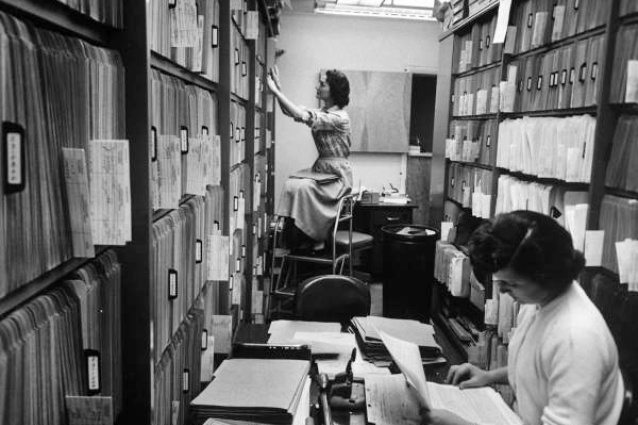
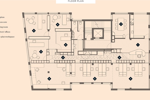
The programmatic challenges, says Cheshire, were threefold. Firstly, to manage massive amounts of hard-copy paper filing; secondly, to create elegant offices for the company’s directors; thirdly, to shape efficient workspace for staff. The grand organisational idea revolves around a “super-dense information core”, a consolidated point for filing, printing, copying and IT. This was placed at the heart of the space, and delineated the spaces either side for directors and staff. A benefit of the layout, says Cheshire, is that this core could be the “sole vehicle for the reticulation of data, power and lighting throughout a building in which every surface is dense, immutable concrete”.
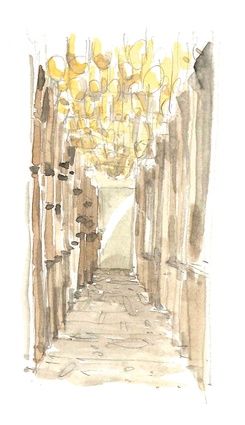
“The information core became fundamental to the office parti, and its expression dramatised the spaces that surround it. Its lattice ceiling is dropped low overhead, fingers of oiled mahogany protrude at staccato intervals and the walls are lined with neat rows of files, drawers and brass label-badges. Entering this space, the flooring changes underfoot, the light softens and space contracts. It’s like a little lane in the middle of the office.”
Cheshire explains that the information core reconciles two worlds: “On one side of the core are stamped anti-hierarchical rows of staff teams, on the other is arranged the irregular and hierarchical spaces of their directors. Within the core, one side is defined by old-world paper, the other by contemporary information systems; one side by standardised A4 folder units, the other by the irregularity of rapidly-evolving technology. A glowing lattice picks up these two orders as they approach the ceiling, and reconciles them with its crystalline geometry.”

