Kohimarama renovation

Click to enlarge
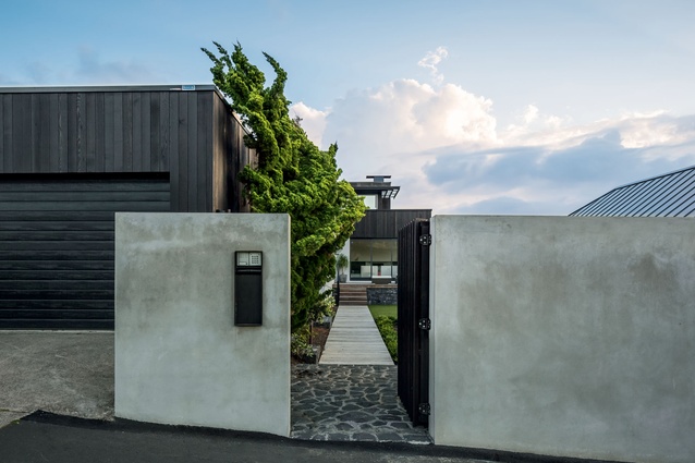
Large concrete fences keep the house and pool area out of the public eye.

Large concrete fences keep the house and pool area out of the public eye. Image: Sam Hartnett

1 of 11
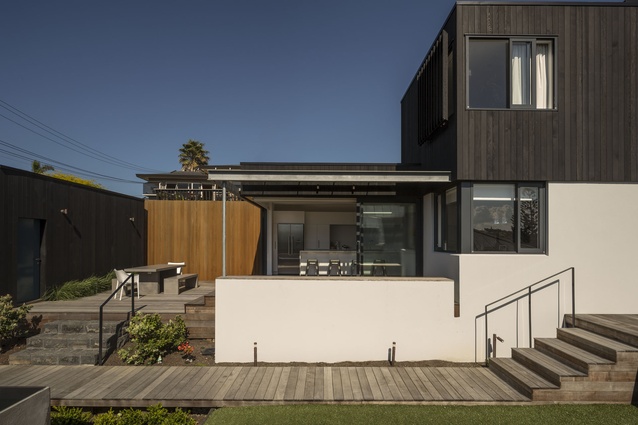
A reconfiguration of casual living areas coupled with the addition of outdoor spaces has given this house an increased sense of amenity.

A reconfiguration of casual living areas coupled with the addition of outdoor spaces has given this house an increased sense of amenity. Image: Sam Hartnett

2 of 11
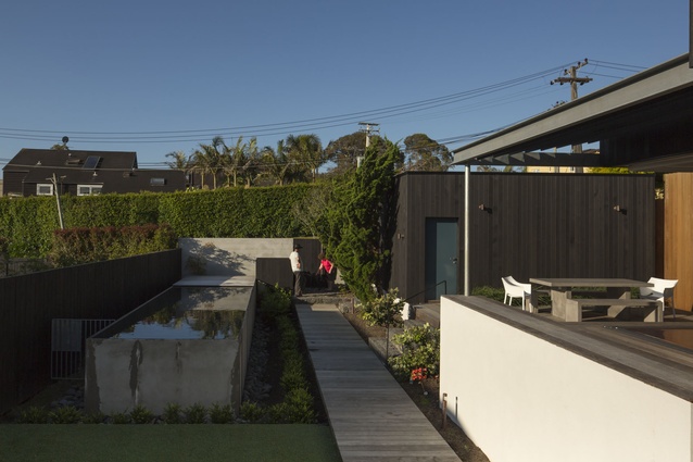
To avoid the use of pool fencing, it is elevated, with a landscaped trench running alongside.

To avoid the use of pool fencing, it is elevated, with a landscaped trench running alongside. Image: Sam Hartnett

3 of 11
A boardwalk-style path leads visitors directly to the front door and past the pool on the right and courtyard on the left.

A boardwalk-style path leads visitors directly to the front door and past the pool on the right and courtyard on the left. Image: Sam Hartnett

4 of 11
The original brief was to just update the kitchen which was eventually amended to include the living areas and outdoors.

The original brief was to just update the kitchen which was eventually amended to include the living areas and outdoors. Image: Sam Hartnett

5 of 11
The colour scheme of the house is mostly minimal, apart from a few bright scattered objects, creating vibrancy.

The colour scheme of the house is mostly minimal, apart from a few bright scattered objects, creating vibrancy. Image: Sam Hartnett

6 of 11
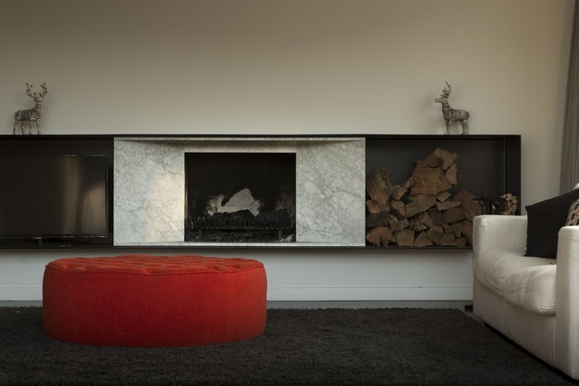
A custom steel and marble fire surround adds impact to the living area.

A custom steel and marble fire surround adds impact to the living area. Image: Sam Hartnett

7 of 11
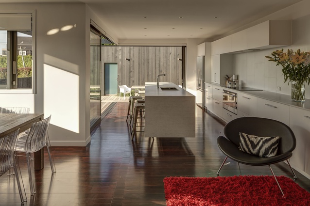
The kitchen has been resited to the former living area, while the existing courtyard has been enlarged to provide generous outdoor living.

The kitchen has been resited to the former living area, while the existing courtyard has been enlarged to provide generous outdoor living. Image: Sam Hartnett

8 of 11
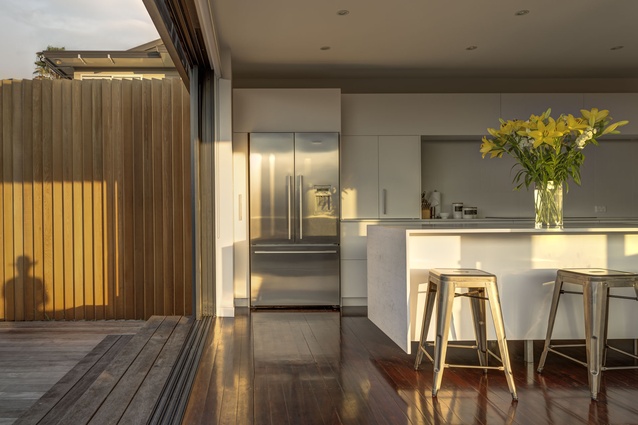
The existing external walls were replaced with stacking doors to create  a space incorporating both indoor and outdoor areas.

The existing external walls were replaced with stacking doors to create a space incorporating both indoor and outdoor areas. Image: Sam Hartnett

9 of 11
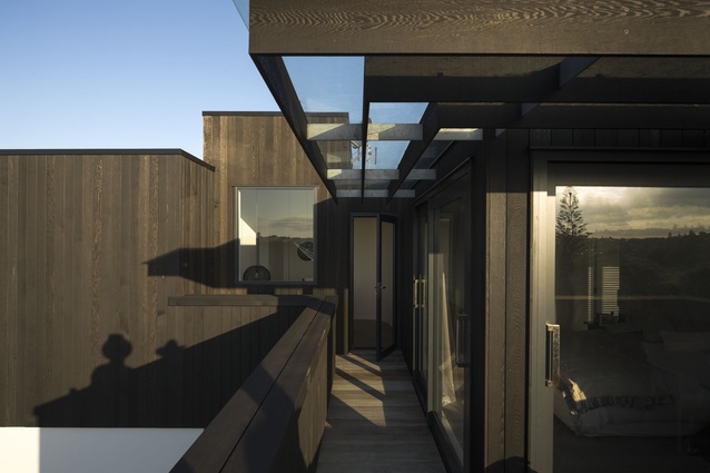
"The louvres you see downstairs are repeated again on the upper deck and create a motif for the house," describes Graeme Cunningham.

“The louvres you see downstairs are repeated again on the upper deck and create a motif for the house,” describes Graeme Cunningham. Image: Sam Hartnett

10 of 11
The top deck has views over Auckland city.

The top deck has views over Auckland city. Image: Sam Hartnett

11 of 11

With its beachside boardwalks and buzzing eateries, the Auckland suburb of Kohimarama is synonymous with outdoor living. Situated close to the beach, the renovation design for this house allows family life to spill outdoors, reflecting the relaxed, yet active vibe of the area.

The client initially came to Graeme Cunningham asking for a kitchen alteration, but the brief eventually expanded to include re-cladding the home, and opening up indoor and outdoor areas.

“The original layout meant the owners dwelt within 8x4 metre, compartmentalised kitchen and lounge spaces, despite having a large house at their disposal. We opened up these family spaces and added four new decks connecting the living areas with the outdoors. These create balance and flow between the different levels in the house,” says Cunningham.

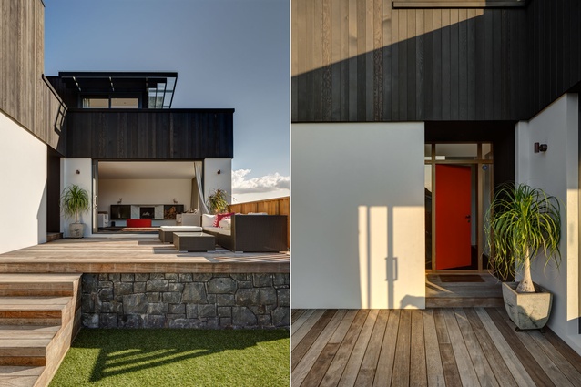
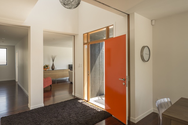
Originally, the kitchen door was often used by guests. A boardwalk from the front gate makes the main entrance intuitive, leading guests past the raised concrete pool to the tangelo-hued front door. Once inside, the entrance landing can be opened up through glass cavity sliders to create a pathway between the lounge and kitchen, or closed to block out noise or keep in warmth.
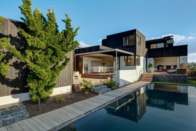
A reconfiguration of casual living areas coupled with the addition of outdoor spaces has given this house an increased sense of amenity.  Image:  Sam Hartnett

The kitchen opens via stacking sliding doors to a coffee deck with built-in bench seating; the positioning of this deck means the clients can easily watch their kids playing in the pool from indoors and out. The coffee deck is covered with fixed louvres and glass, protecting the kitchen from excessive solar gain and westerlies. The solid steel frame of the awning adds a raw aesthetic to the clean lines of the kitchen, and a simple steel column cleverly carries the load of the awning while concealing a downpipe.

“The louvres you see downstairs are repeated again on the upper deck and create a motif for the house. Another textural feature is the stonework. We retained the original stone plinth below the living area and designed the steps that lead to the courtyard deck in the same material. Another set of stone steps part way along the entry deck lead to an outdoor shower, and just inside the front gate, this same stone is used for a section of the pathway as a rough, risque feature,” says Cunningham.

“The louvres you see downstairs are repeated again on the upper deck and create a motif for the house,” describes Graeme Cunningham.  Image:  Sam Hartnett

The pool was a late addition to the brief. To avoid the use of pool fencing, it is elevated, with a landscaped trench running alongside the entry deck. As the pool is a key feature visible from most areas of the home, the water can be set at a higher level allowing it to double as a reflection pool, adding an element of serenity to the clients’ busy family lives.


More projects