Keeping it simple: Tom Locke
As an architect in Warren and Mahoney’s Auckland studio, Tom Locke gets to work on a creative caboodle of residential, commercial and civic projects but, no matter the typology, his philosophy remains: keep it simple.
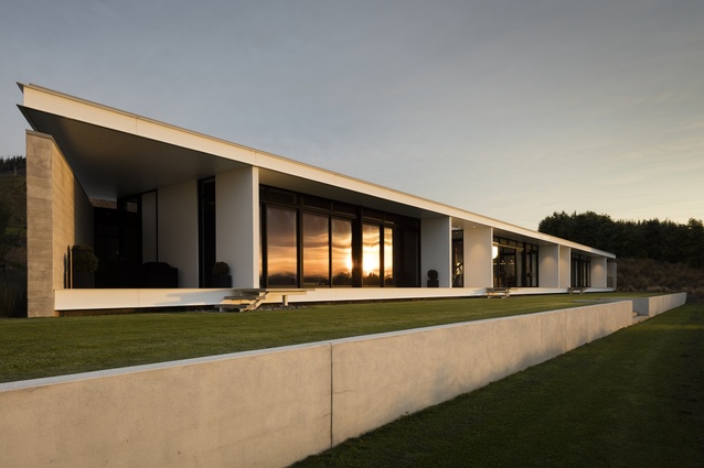
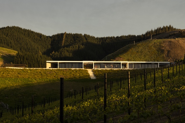
Earlier in 2016, a home he designed in Hope, Nelson received the Supreme Award in the Marlborough/Nelson/West Coast region in the Master Builders House of the Year. Here, he discusses his design philosophy, what it was like to work for Zaha Hadid and why he enjoys smaller, simple homes.
ArchitectureNow: What made you want to be an architect?
Tom Locke: It was probably down to a couple of influential experiences from my childhood. When I was growing up in the far north, up to the age of 12, my father was building a yacht in our backyard. I really enjoyed the process of how it all came together and how the details were resolved.

The second experience from my teenage years was when my parents had a ‘wind-rain’ house designed for them by Nigel Cook at Ahipara. It was basically a collection of buildings around a glass-covered courtyard. Following the process from design, through construction, to living in the house I remember thinking how nice it would be to go to work and draw every day.
ANow: You say the best architecture is ‘drawn up from the ground’. How so?
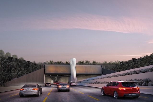
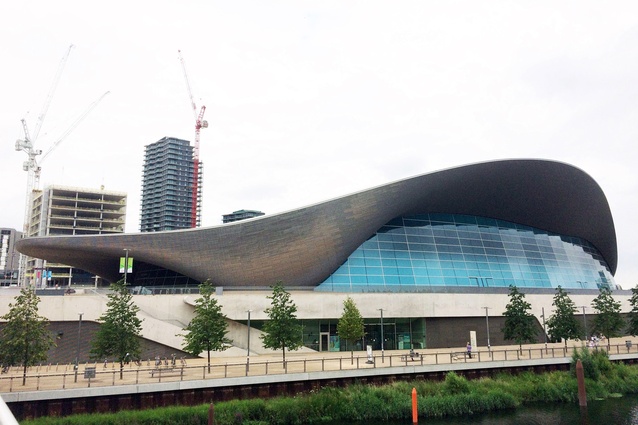
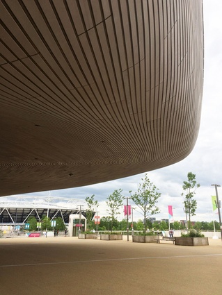
TL: By that I mean it should be deeply embedded in the landscape. I love the idea that you can walk over buildings. This continuous landscape was a key feature of the aquatics centre I worked on when I was with ZHA and is one of the features of the northern ventilation building for the Waterview Connection I have been working on with the Well Connected Alliance.
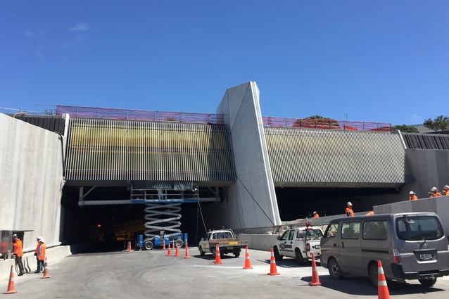
On the ventilation buildings on the north and south ends of the Waterview Connection we tried to ensure the motoring public, many of whom will use the tunnel every day, would see as little built structure as possible. Working in collaboration with the engineers we were able to largely embed the functional areas of the buildings in the ground.
Overlaid on this we developed a few key strong sculptural components. The extruded boxes shifting in and out of the tunnel express traffic movement. They have glazed ends with vertical patterning referencing the striated basalt columns remnant from cooled lava of early volcanic eruptions present across the site.

ANow: Even so, designing ventilation buildings and a maintenance shed for a motorway doesn’t sound very glamorous?
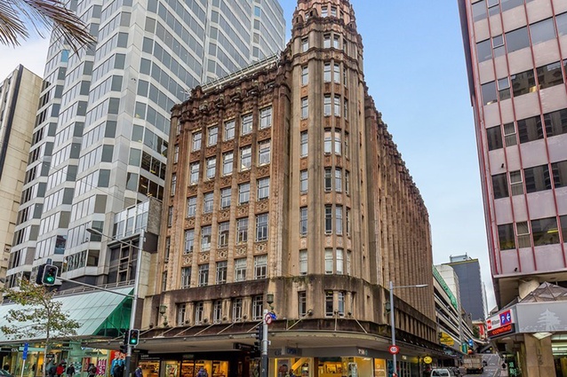
TL: I’ve never liked buildings which have deliberately elaborate elements merely so people can’t mistake that an architect was involved. It’s adding complexity for ego’s sake. For me the challenge is to make the design look as though it were simple and effortless. Of course, that is easier said than done. Infrastructure projects, if well designed, can add to the fabric of a city quite nicely. For instance, I’m a fan of the Auckland Electric Power Board buildings, many of which were designed in the Art Deco style of the time.
ANow: How did you end up in the London office of Zaha Hadid?
TL: Following a stint in New York, where I worked on some heritage apartment renovations, I got a job in London working for a very commercially driven firm. After two years there I was looking for a more challenging and design focused role. Turns out I was in the right place at the right time.
I applied for an advertised job and was lucky enough to join the team working on the London Aquatics Centre in Stratford which was designed for the Olympics. My role included responsibility for that undulating roof and the landscaping which, if you know Zaha’s work, are really the best bits. I went for a swim there earlier this year during a visit and it was a very special experience.
ANow: Tell us about working with Zaha.

TL: As the first woman to win the Pritzker Prize, she must have been a phenomenal force. To be honest, I only met her face to face once. Because she travelled a lot, she delegated the running of the office – which grew to around 400 people when I was there in 2010 – to a trusted team of ‘lieutenants’. She was a hero of mine when I was a student so it was a real privilege and there’s a definite influence in the way I design today, not so much stylistically but in the sense of the process.
ANow: How did she influence the way you think about architecture?
TL: Zaha’s work is free-form and fluid because she believed in having no pre-conceived notions about the design outcome of a project and that the design got better the more options you looked at. She was always exploring the benefit in alternatives. That was sometimes a frustrating way to work, because the culture was to put off making decisions until the last minute. Still, it taught me to be sceptical of the idea that some higher force allows an architect, in a divine flash of inspiration, to come up with the ‘right’ design that simply flows out of the pencil.
ANow: You say you’re a minimalist at heart. How did that gel with working for the ‘Queen of the Curves’?
TL: For Zaha, the importance was in the ‘story’, the overall metaphor of the design. While her buildings are always formally complex there is a simplicity with the way they are put together. Her classic projects keep the detailing very minimal and use a restricted palette, usually concrete combined with two or three other materials.
There was nothing extraneous in the way her buildings were put together. She’d always choose a way of detailing that did not draw attention to the junction as a technical exercise but more as an opportunity to express two materials or geometries coming together. I take inspiration from that. It is a version of minimalism I can relate to.

ANow: The London Aquatic Centre is a strong architectural landmark and a modern day icon. Is it your dream to design something that leaves its mark?
TL: Every architect wants to sell the client a landmark building but sometimes that is simply too loud. We end up with a city that ‘shouts’ with precious few moments of silence. Of course there is place for those buildings with architectural impact, but not every single project warrants it.
ANow: How did working and living in New York and London (apartment-based cultures) influence the way you think about residential design?
TL: Basically I’m a fan of smaller, better quality homes.
ANow: You’re an advocate for smaller, energy-efficient homes too.
TL: One of my first jobs when I graduated was to design a home for my parents who retired to Northland. It’s pretty simple, small and functional but strongly connected to the garden. They were going to add on and extend when funds allowed but they’ve lived there many years now and wouldn’t change a thing. Instead, they’ve built a boat shed, a garden wall, a potting shed and we’re working on the design of an outdoor room where they can sit with a glass of wine and look at the view. I like the idea of lots of really good outdoor spaces.
ANow: How did you create that crucial indoor-outdoor connection in your design for the Hope house?
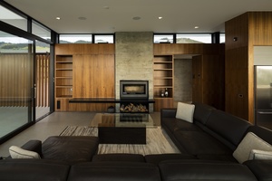
TL: At the Hope house, we designed covered outdoor courtyards that were extensions of the bedroom living and dining areas. We brought these outdoor rooms into the house by running the same flooring from outside to in as a continuous ground plane. The creation of these outdoor rooms, in turn, allowed us to compress the living and bedroom areas.
My wife and I, and our two young children, live in a tiny (60 square metre) cottage in Arch Hill. With space at such a premium indoors, we try and make the most of the outdoor areas we do have and we do feel very connected to the garden.
You certainly don’t need a mega mansion to enjoy what the New Zealand climate and landscape has to offer and a smaller footprint means less to maintain, less to heat or cool, less to light and less to clean.

