Kaleidoscope in motion: LA house
American designer Kelly Wearstler is at the top of her game and, in this bombastic Los Angeles home, she lets colour and pattern fall, shift and splatter with gusto.

When interior designer Kelly Wearstler first set eyes on this house in the West Hollywood district of Los Angeles, she was anything but impressed. “It didn’t have anything exciting,” she recalls. “I remember walking in and thinking, ‘Oh my God! I’m really going to have to roll up my sleeves here’.” Previously, the house had a Spanish architectural vernacular, and an interior dominated by brown ceiling beams and all-white walls.
Kelly’s goal was to give it both a “voice” and a personality. She certainly did that by infusing it with her signature high-voltage style and originality, which she, herself, has difficulty describing. “I don’t like the words ‘fun’ and ‘playful’,” she says. “I would say maybe it’s a little punk or avant-garde.”
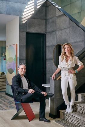
Whatever the term, the aesthetic suits her clients, Lana Gomez and Sebastian Maniscalco, whose family expanded during the project (Lana gave birth to their first child, Serafina, last April). Sebastian is a stand-up comedian who has appeared on both The Late Show and The Tonight Show but had little experience with decoration.
“My wife is the artist,” he insists. “I come from a family where you went to the furniture store, you bought a set of furniture, you brought it home and everything matched. This project was primarily Kelly and my wife working together, and I was more the guy who was asking, ‘How much is it?’”
Lana is a painter, who hails from Memphis and initially met Kelly in 2008 when she went to do an internship in her office. She worked there, primarily, on patterns for wallpaper and china, as well as on custom art pieces. “Lana’s colour sensibility is really fresh,” enthuses Kelly. Since, the two have become close friends and regularly go shopping together for vintage clothing. “Working on the house with her felt supernatural,” recounts Kelly. “From day one, I had a major understanding of what she wanted.”

The house itself was built in 2008 and, in spite of its rather bland appearance, offered a number of advantages. It had a garage, which could be transformed into a painting studio for Lana, whose inspirations include artists Helen Frankenthaler and Robert Rauschenberg, and the fashion label Libertine. “They’re really wild and use a lot of colour and texture,” she says of the clothing design firm, “and that’s the way I paint.”
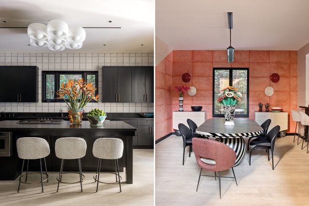
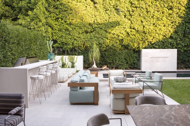
There was also a sizeable backyard and a large kitchen, which was perfect for Sebastian, a keen cook. “I don’t care how much square footage you’ve got, the whole house should be a kitchen,” he quips. “Nobody goes anywhere else. Every time I go to a house, everyone hangs out in the kitchen”.
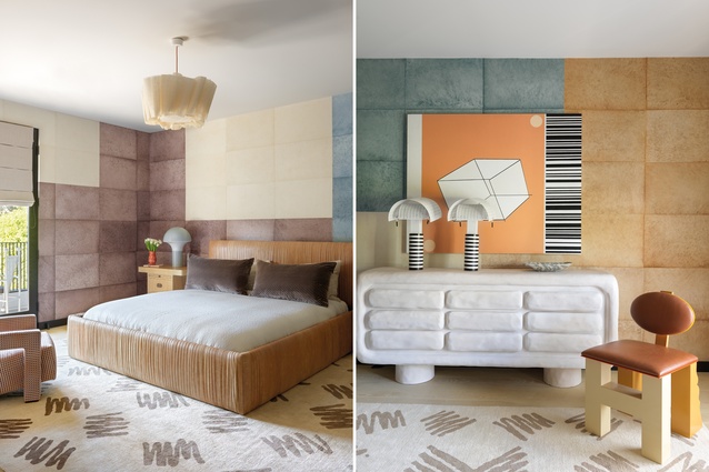
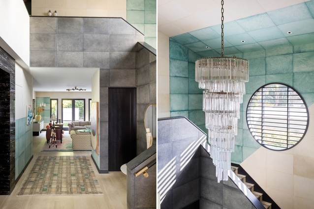
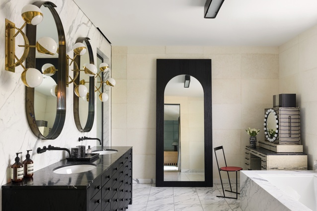
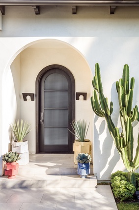
Little structural work was required. Among the rare changes Kelly made were the creation of an arch for the front door, a new banister and a round window for the stairwell, and the widening of the openings into the dining room and kitchen, which she cased in marble. She also raised the height of the master bedroom ceiling by about 75cm.
Lana and Sebastian’s brief for the interior was dominated by words beginning with the letter C. They wanted it to be contemporary, colourful and comfortable. “We were sort of like the comfort police,” laughs Lana. “We tested out everything before we committed.” They even had a chair for the backyard delivered on a trial basis before they ordered the full set.

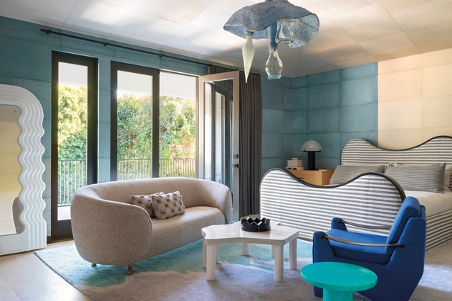
Kelly’s big idea for the interiors, meanwhile, was to use the same handmade Cannon/Bullock wallpaper throughout. “It’s a very broken-up space and somewhat choppy,” she explains, “and I wanted to create a tight dialogue between all the rooms.” It comes in custom-dyed square sheets, each of which is in a slightly different hue. It was also hung to create distinct patterns in each space. One of the most dramatic is the diagonal arrangement in the dining room. “I was blown away by it,” enthuses Sebastian. “It’s really deceptive. People think it’s stone.”
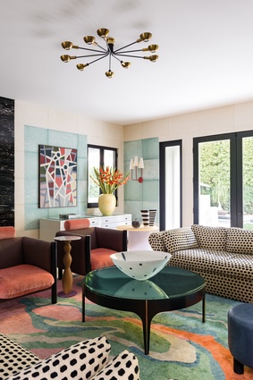
Kelly was also keen to integrate some of Lana’s artwork but preferred for it not to be simply in the form of paintings. “I didn’t want it to start looking like a gallery,” she states. Instead, she turned a couple of Lana’s canvases into rug designs for the living room and master bedroom.
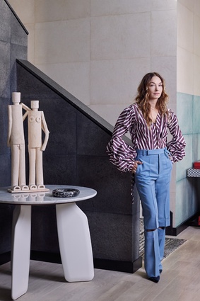
The rest of the house is filled with a wonderfully quirky selection of furnishings, carefully sourced over time. “Kelly doesn’t just bang out the design in a week,” notes Lana. “She does so much digging to find all the little gems. It’s like a true labour of love.” The Ettore Sottsass console table in the entry hall was chosen in response to Lana’s love of the late Italian maestro’s work.
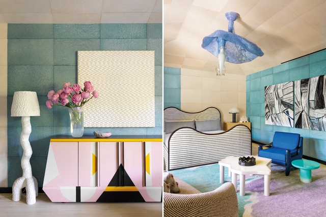
Other statement pieces include the black-and-white-striped dining table, the Misha Kahn chandelier in the master bedroom and the Anton Alvarez floor lamp in the living room. Kelly also commissioned artists Peter Shire and Katie Stout to create custom items for the project.
The mix is both visually dramatic and intoxicating, and the secret to achieving it a fine art. “It’s really a gut feeling,” she affirms. “But, you do need pieces that totally contradict one another. That’s what makes things work.” Lana and Sebastian certainly seem happy with the result. “Every day, I walk around and see something else that makes me think, ‘Hey, that looks fantastic too!’”

