Island life
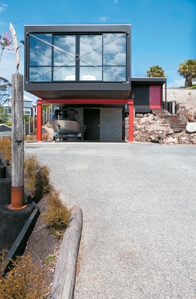
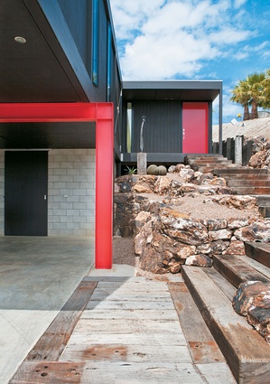
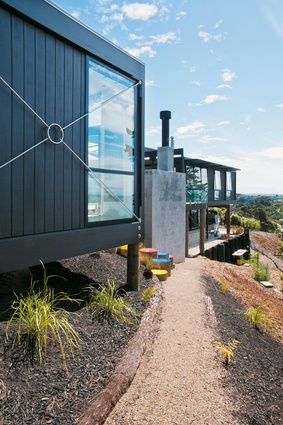
Peer up the driveway of Christine James’ and Susie Flegg’s Waiheke Island section and there’s not a lot of colour to be seen. Yes, there’s a house with a red front door and a matching iron brace, but the rest of the façade is resolutely, monochromatically charcoal.
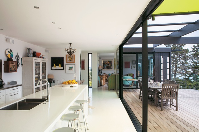
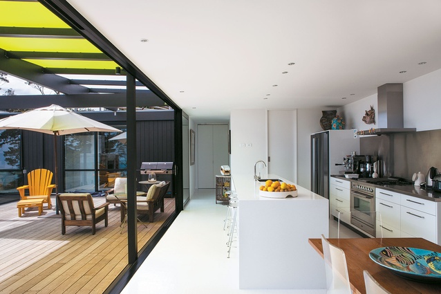
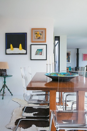
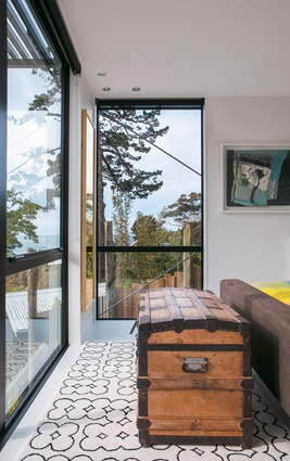
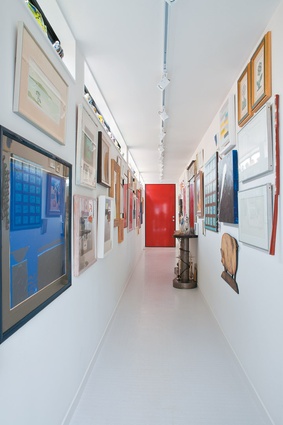
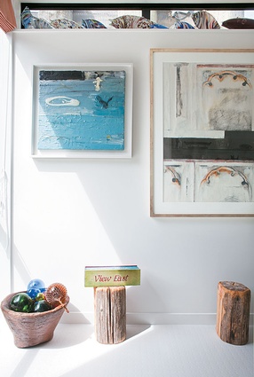
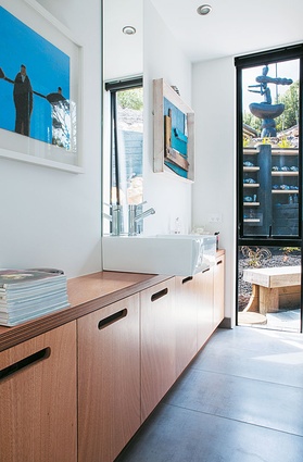
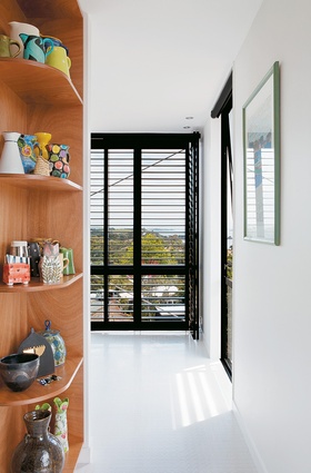
Throw that front door open, though, and colour bursts forth from every surface. In the entranceway, known as the gallery by its owners, bright paintings, sculptures and objets d’art jostle for space. To the left, in the living room, duck-egg-blue armchairs, a pink chair, a purple sofa and more artworks reside. In the kitchen, with ts white walls and floor, ceramics colour the space along with more paintings.
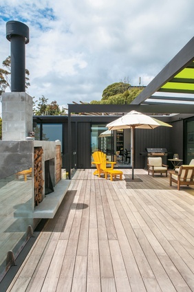
Beyond the kitchen, on the expansive deck that enjoys panoramic views of Enclosure Bay, colour has been added to the hard architecture in the form of almost-iridescent limegreen polycarbonate panels that shelter the outdoor sitting area from the sun. Below, stepping stones that lead into the garden, and were hand-painted by Flegg, are painted primary colours: blue, red and yellow.
The 120m² house, which was completed in June 2012, is a reflection of its owners’ belief that colours should be thrown together, rather than worried about and overly curated. “Colour is part of the essence of life, so it was quite natural to add colour to the permanent structure, not just the parts we can move about, like the art and furniture,” says James, 59.
“Colour allows you to breathe and gives a sense of life and liveliness. Without it we are plunged into a potential monochrome, which is not how I see my life.”
James, who worked in media management, and Flegg, who had her own bookkeeping business before retiring, spent decades living in London and collecting British art and Murano glass. On a holiday in New Zealand a few years ago, they rented a house not far from their current home – and realised they might be ready to return to New Zealand.
The site they bought had its limitations. It was steep on two sides and covered in scrub (a landscaper worked for eight months clearing the land), but it had fabulous views and plans for a Box Living home (the modular abodes created by architect Tim Dorrington and three partners) already commissioned by the previous owners. The design wasn’t quite right – the women needed a gallery for their art that didn’t get too much sun and wanted to move the bedrooms around – but it was pretty close. And the idea that the first tailor-made home the couple had commissioned would be done on time and on budget, as Box Living projects are thanks to their modular concept and systematic build, appealed.
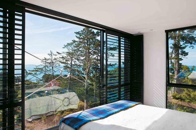
“It necessitated a fairly large degree of excavation and retaining to create workable building platforms,” says Dorrington of the project. “This was difficult but the result is better for it as the house is, on the one hand, nestled nicely into the site and, on the other hand, cantilevering dramatically from it, so kind of the best of both worlds.”
Dorrington’s partner Dan Heyworth concedes that the house contains more colour than do some Box Living commissions: “Most clients are pretty happy to go for coloured doors. It’s quite a contained splurge of colour and they tend to go for red or green. The shades [above the deck] are definitely Christine and Susie’s touch. We’d love to do posts and beams in other colours too, but everyone seems to like the black.”
“We loved the idea of a black house but felt colour added a new and different drama without taking away the sleek lines of the build,” says Flegg, 68. “We take risks. We do things and people think we’re mad.”
“We always shocked our friends in London with our use of colour and the way we put it together,” adds James. “Because of the way we live, the colour all fits because it fits our lifestyle rather than the space.”
In the gallery, artworks by British and New Zealand artists share wall space. There are works by Joe Tilson, Elizabeth Blackadder and Archibald Dunbar McIntosh. James’ favourite is a Terence Clarke still life. Flegg loves three works by Mark Surridge, a Cornish painter.“I’ve never bought a piece of art to go with our décor. I buy it because I love it and it makes me feel good,” she says. “I love mixing colours because just about every colour does go with every other.”
“Their objects and paintings add another layer of richness to the structure and finish off the house,” says Heyworth. In the end, the architecture of the house succeeds because it’s functional and fresh. The things inside the house work not because they are colour-coordinated or of the same era but because they are loved and enjoyed by their owners – and given unabashed pride of place.
“It’s a modern, modular home that reflects our lifestyle and is nestled into the landscape perfectly,” says James. “It has a solidity but at the same time seems to float.” Flegg agrees: “We’ve ended up with a simple house that works fantastically for us.”

