Inward gaze: Heartland
A central spine with dynamic details draws focus into the core of this Newmarket office.
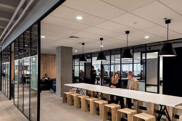
Take the lift one floor up from the bustle of Westfield Newmarket and you arrive here, at the new corporate offices of Heartland Bank. There is concurrently a feeling of calm and a sense of buzzing activity in these offices, which can be attributed to the semi-industrial design style and also the open-plan, inward-facing layout of the space.
Warren and Mahoney designed the new offices to a brief from Heartland that focused on creating a practical, comfortable working environment, with opportunities to collaborate and meet informally throughout, and a layout that encouraged interaction between teams and team members. Heartland wanted to express its position as an alternative bank, different from the traditional big banks in its outlook, style and culture, says Heartland’s chief executive Jeff Greenslade.
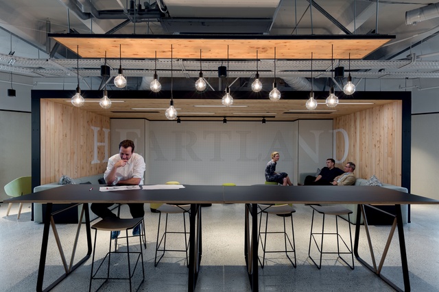
“We didn’t want this to be Auckland corporate style, all glass and mirrors and high-end stone, because that’s not who we are. The inspiration for the industrial aesthetic comes in part from technology start-up companies in the USA and Europe, working from converted warehouses and industrial buildings. It has the feel and energy of a real working space.”
Before Heartland moved in, the site contained several separate offices. The design team, which was headed by senior interior designers Kate Henderson and Gier Jong, firstly created plans to open these up, remove the carpet and polish the concrete underneath. The space offered little in the way of views, with mostly retail rooftops surrounding it.
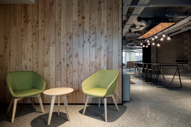
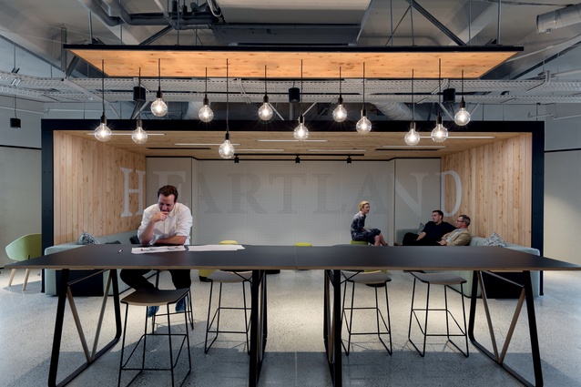
Rather than designing the workstations along the windows, the designers had to find a way to bring the gaze into the centre instead. They created a sleek central spine of meeting rooms with aluminium joinery and glazing, some of which is laminated so it can be used as a whiteboard on both sides. A suspended macrocarpa ceiling motions the beginning of this central space, and some comfortable and visually dynamic soft furnishings from Harrows Contract Furniture and Tim Webber Design are arranged below.
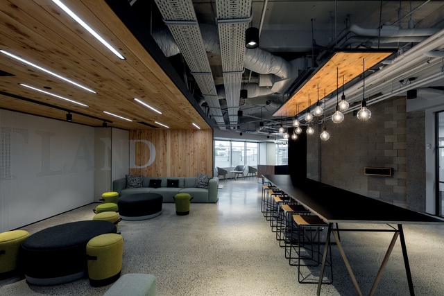
“The workstations are away from the perimeter to allow circular flow around the office and to draw people back to the centre. There are laminated panels alongside the workstations, which can be used as whiteboards on both sides, and can slide across to create privacy for team meetings,” says Henderson.
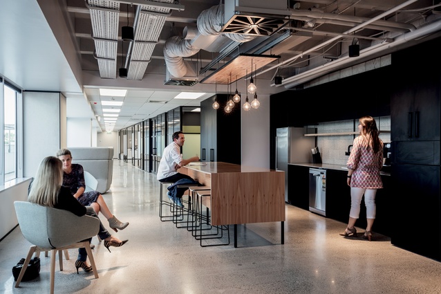
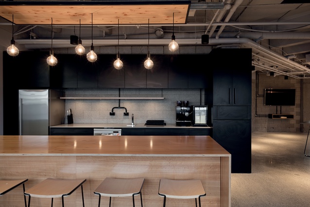
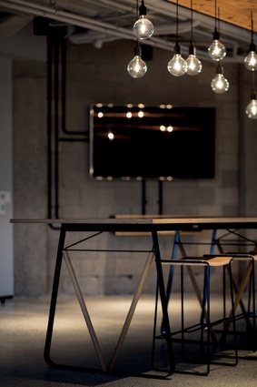
At the end of the central spine is a staff kitchen, with a lengthy, contemporary IMO-designed dining suite, and an outdoor area with an interesting concrete-based table from Harrows Contract Furniture. Cut-through access is provided wherever possible, such as in the utilities room part-way down the central spine, indicating that every room in the office is usable. Concrete pillars have been exposed and polished to reveal the aggregate, says Jong.
“We went about removing the ceiling tiles too, to really obtain that industrial look, but during construction it proved too costly because of all the wiring underneath. Instead, we just removed the tiles in the central walkway, which gives it a higher ceiling than the workspaces. We painted the open ceiling a concrete colour to make it look tidier.”
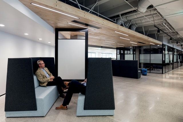
In Heartland’s previous offices, teams were arranged in separate areas in generic cubicles. In the new offices, the different departments are arranged adjacent to one another with no visual separation. This has been advantageous for Heartland, which has reported problems being solved within the company simply by staff members overhearing another team’s discussions. There is also an increased awareness among staff as to what goes on in the company and what other teams do. Henderson says there were initial concerns that the noise levels would be too high with the open-plan layout and the concrete floor.

“Instead there is a sense of energy and buzz, which is better than having a quiet room where any small sound is noticeable. People moderate their behaviour depending on their environment. When they can see each other, they moderate the volume of their voices. The undertone of creating a high-energy, high-performance aesthetic is that things can be flexible and movable; you don’t need all those layers of separation.”
There is no formal reception desk, but in the foyer another macrocarpa box faces the front doors, containing the company name written in a large font across a pegboard back wall, similar to the kind you would find in a tool shed.
Aside from creating an inward gaze, Henderson and Jong also faced the challenge of how to incentivise staff members to move between these offices and Heartland’s other head office down the road on Teed Street, which has more of a public front. The comfortable seating nooks and break-out spaces throughout the 277 offices, and fully equipped meeting rooms, have helped to draw Teed Street staff members over.
In terms of budget, Henderson says it was evenly spread. “We wanted everything to have the right presence, rather than making the desks cheap as chips so we could have an amazing kitchen. We used existing services instead of having to change the plumbing. This is not a place for a bubble meeting room that is themed within an inch of its life. It has to have a purpose, a function – not just make a statement. It’s a highly efficient space.”

