Innovation driven: Adam Taylor
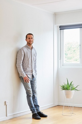
In the world of architecture, Adam Taylor is a relatively new player. However, his designs are garnering awards and, with it, a loyal following of clients and proponents. Justin Foote catches up with the Tauranga-based architectural designer to find out what makes him tick.
How did you get drawn towards architectural design as a career?
As cheesy as it sounds, it was an idea from when I was as young as 12. I have primary school projects of floor plans drawn to scale – in crayola vivids! I guess what was a childhood and boyhood hobby has actually turned into something much more.
What do you see as the cornerstone of your design ethos?
It’s really two pronged. Firstly, we aim to create a sensory experience. For us, the space and aesthetic is there to shape user and viewer emotions. Design decisions are always referenced against the emotion we are creating. Secondly, innovation, that is, blending tech and science into architecture. It can be as complex as hybrid structural systems through to basics around managing moisture. We love product, we love tech and we love integrating these into the design process with our clients.
Is there a design element or particular material that you try to incorporate into each design?
No; that said, we often get repetition coming through as clients have liked earlier works, but in a perfect world, we like to break new ground each time. Obviously, we trumpet performance housing, in particular passive design principles but for us this isn’t unique, it’s just good practice.
Turning to your Papamoa project, what was the client’s brief?
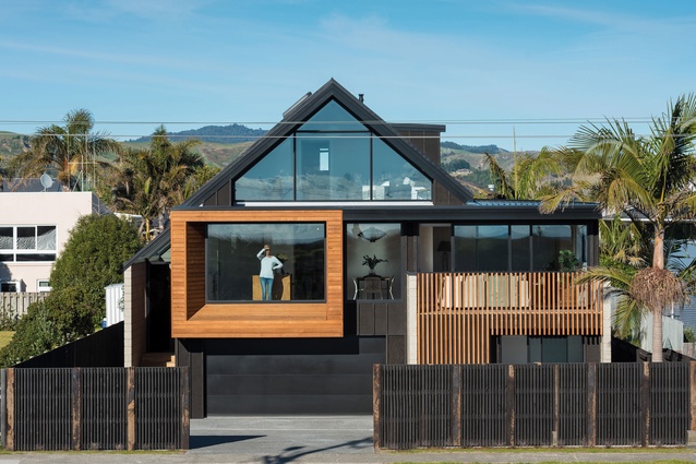
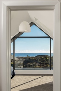
Multi-faceted, but there were two major drivers that started the process with which everything else fell into line. The first being provision for a third-level bedroom, as at height, the site enjoys huge ocean views toward Mount Maunganui. We stood on the roof of the original dwelling and knew we had to work out how to create space up here in what was very tough planning requirements (we are approximately 50mm within overshadowing and height restrictions for this site).

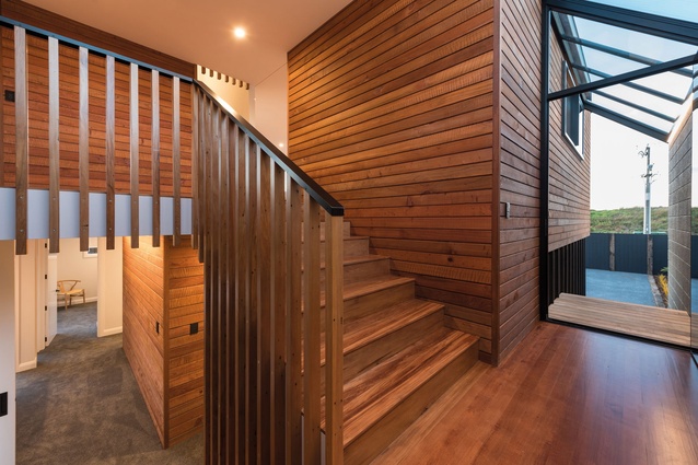
The next consideration was to create the entrance at first-floor level. The client isn’t a fan of ground-level entryways, as with driveway proximity, they tend to have an industrial touch to them. We wanted users to instantly engage with the view on this level and so, after a number of iterations, we resolved a split-level access off the side with an atrium arrangement. This met the brief and allowed a more intrinsic connection between living spaces off each level.
Describe your thought process behind the material palette and why you chose this particular mix of products?
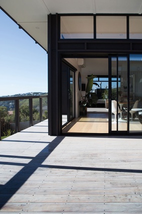
Coastal environments are notoriously tough, so within budget we wanted something robust and not too onerous for maintenance. Black, Colorsteel and Redwood speak for themselves. With the black plywood, we were selective at which elevations we used it to ensure longevity between routine restains. We wanted a bold form and the black allows key features such as the cantilevered roof to be highlighted. The sandblasted block and Redwood, which will silver and patina with time, impart a warm and natural tone and texture, which help the house sit well in its coastal environment.
What is the stand-out design feature of this project?
The entry atrium – it’s such a perfect link and grand intermediate space, as well as a real concentration of detail, texture and light.

Another coastal site, yet miles away from Papamoa geographically, is your Sumner project. Tell us about some of the challenges around this site?
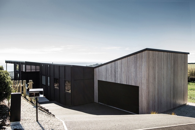
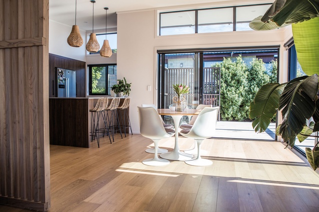
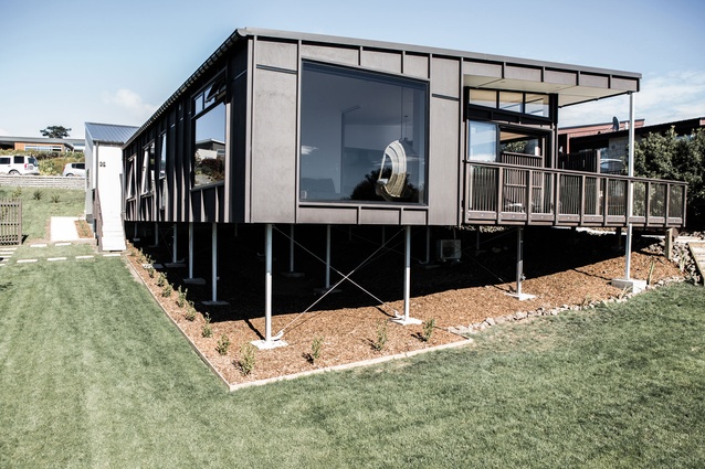
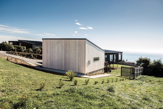
Christchurch is tough in general as there are huge geotechnical drivers. We had a great client, who was part of our team on the ground. With topographics, drones, site photos and videos, we managed to design without needing to fly down. But the bigger challenge was keeping single level with a good floor height – again to accommodate wide-reaching views – and to come up with cost-effective structural solutions.
For you, what is the stand-out feature of this project?
Aside from the floor [which uses steel sub-floor and XLam floor panels], we like the quirk in the roof pitch of the garage and also that it’s highlighted with New Zealand Larch timber weatherboard. I appreciate Cedar but personally we like knots and texture.
As a profession, what could architecture be doing better in New Zealand?
More collaboration and innovation in the mass-produced space. Architecturally designed homes are becoming niche as the gap between earning and building costs widens. I think as an industry, we have a duty to ensure the quality of life that great design brings is available to entire communities.

What would you wish for your architectural legacy to be?
We would love to be known as an experimental studio. I don’t want people to think they are guinea pigs, though. Everything we design, especially when it is the first time it’s been done, has been rigorously researched and tested. If we don’t have people challenging convention, then convention never changes.

