In a pear tree
A 100-year-old tree in a former orchard in London gives this house clear design directions.
Architect Jake Edgley found the perfect setting for his family home when he purchased a wildly overgrown piece of land in the heart of south-east London’s Dulwich. The long site sits behind a line of Victorian terraces and was originally a fruit orchard when the area was used as market gardens.
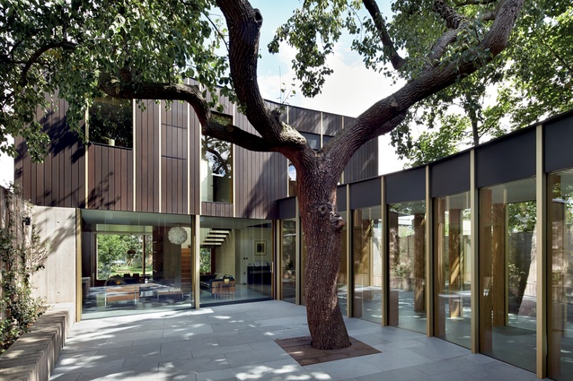
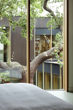
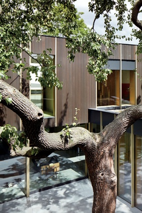
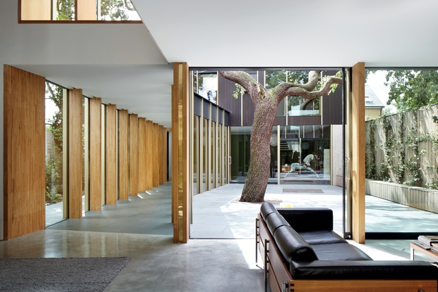
Edgley spent a year negotiating with local council to determine which trees he could remove and which had to stay. The select remaining few are mature and healthy, including a 100-year-old pear tree that essentially defined the new home’s overall design concept.
As the director of Edgley Design explains, “The pear tree basically sits smack-bang in the middle of the most logical place to build a house, so we had to work around it.” With no choice but to split his new abode in two, the resulting plan positions one two-storey volume at either short end of the site.
The uncomplicated design creates a courtyard that respectfully accommodates the pear tree, giving it due prominence. This open space also allows much-needed light and ventilation to filter into the internal rooms, which feature full-height glazing on their courtyard-facing side.

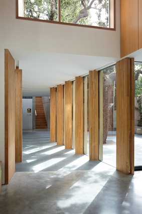
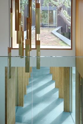
It’s a house that literally looks in on itself and consequently elicits a sense of cosiness completely unexpected in a home measuring over 400m2. A glazed walkway connects the two volumes and this cloister-like structure also serves to heighten the intimate quality of the overall scheme. But the walkway’s most compelling expression is a series of timber columns that emphasise the architecture’s striking verticality.
These slender roof supports are an appealingly abstracted reference to the history of the site. “The idea is to reflect the home’s woodlands context,” says Edgley. “And they do this by echoing the experience of looking through trees in providing framed views of the courtyard as you walk from one end to the other.”

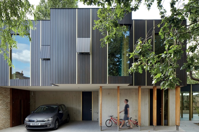
His material palette is appropriately robust and while timber offers a warm accent, the predominant concrete is equal parts modern statement and neutral backdrop. Edgley took inspiration for his use of boardmarked concrete on the ground floor’s external walls from London’s National Theatre – a Brutalist building he’s long admired. But while the South Bank landmark is imposing in form, Edgley was determined his boardmarked surfaces appear delicate. Surprisingly, they do, and the elegant textural finish serves as yet another nod to the historic orchard.
The home’s timber-frame upper level is dark, blending into its surrounds, while standing in bold contrast to the base. However, Edgley minimises any chance of complete disconnect by continuing the handcrafted aesthetic of the boardmarked concrete upward. As he further explains, “I got rid of horizontal lines in the detailing and also used custom-made anodised gold trims to form the window reveals, which break up the first floor’s mass.”
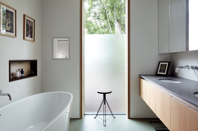
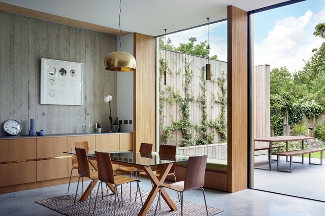
This careful attention to detail is repeated indoors where an emphasis on quality craftsmanship is what instantly appeals. The stylish, contemporary interior is generous in its proportions and the layout is logical, despite the split. One volume boasts four bedrooms and a playroom, while the other includes a study, two bedrooms and the main living spaces – kitchen and dining areas that open out onto the rear garden and the sitting room, which faces the courtyard.

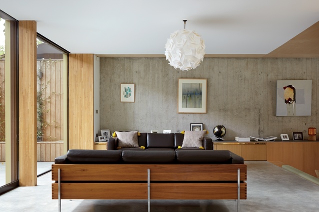
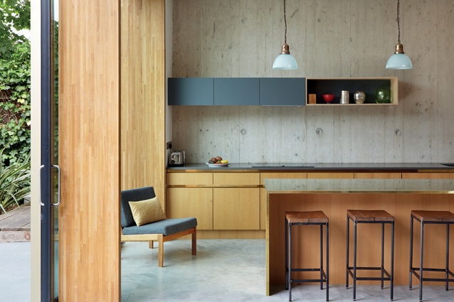
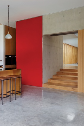
Edgley also extends the timber and concrete palette inside, with exposed concrete forming the walls. Coupled with the polished concrete flooring, they seemingly envelop these spaces and create an ambience that’s light and breezy rather than austere. “It was important to me to avoid the ‘white box syndrome’ and try to create a sense of atmosphere and rich materiality,” he says.
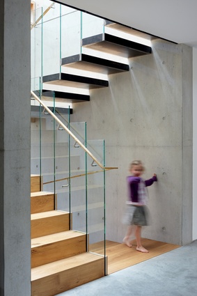
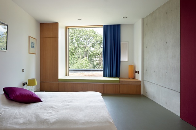
This is most successfully articulated through the use of custom-made oak-veneered plywood joinery, which includes in-built kitchen and sitting room cabinets, shelving, stairs and banquette bases.
The joiner took six months to complete the interior’s most resounding design feature, working his way from one end of the house to the other and making every component on site. It not only lends the interior’s scheme refinement and artisanal prowess, but also ensures cohesion throughout, making for a lively visual flow.
Edgley intersperses the restrained material palette with a judicious use of colour – an orange curtain in the main bedroom, green banquette seating in the living areas and guest bedroom – that also serves to create interest.

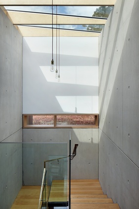
His furniture choices are classic and the minimal arrangement (an advantage with three small children) ensures nothing detracts from the built form. Brass detailing is an unexpected finish; it wraps the kitchen island’s benchtop and is used as a thin handrail on the main staircase’s glass balustrade. This sky-lit double-height sculptural feature very nicely echoes the dynamism of the pear tree, a welcome gesture that furthers the inside/outside synergy.
Edgley has countered the site’s challenging conditions with a thoughtful resolution of aesthetic, plan and function. His highly responsive design proves it’s possible to create a quiet place of retreat in one of the world’s densest urban centres.

