Houses Revisited: U with view
Robin O’Donnell balances prospect and protection on an Auckland clifftop site in this home from the 2008 archives.
There is more traffic in the Tamaki River, it seems, than on the streets of Glendowie – ferries, boats, yachts, kids setting out from the sailing club. The prospect here is certainly more interesting than that sullen old still life, Rangitoto, and this long, narrow house lines up on the view like a telescope. Its cliff-top site is pretty tight and the Robin O’Donnell Architects have had a job to balance all the requirements of view, sun and family life but they have done it in a way that makes you conscious of your perch overlooking the harbour nearly all the time.
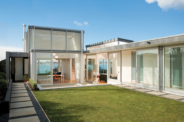
As you make your way down the long right-of-way, you are confronted with a two-storey wall of garage and office above. If nothing else, this builds a sense of anticipation of what lies ahead. Once through the gate you arrive in a courtyard, with a broad horizontal sweep of gallery forming one side, and at the end, a transparent pavilion with the harbour beyond.
Essentially the house is a broad U-shape, turning its back on the prevailing south-westerly weather with the courtyard opening north. Nearly every room opens onto this outdoor space and during the summer the owners open everything up to exploit the sea breeze through the house. The fourth side of the courtyard is a protected tupelo tree and a planted screen of foliage which, when it grows up along the boundary, will provide privacy between the neighbours.

The pavilion houses the dining and living areas but also provides some protection from any seaward weather. Because of its transparency you can sit in the courtyard terrace, a little suntrap out of the breeze, but still feel involved in the harbour view. The pavilion looks to be a simple double-height space but conceals a first floor bedroom.
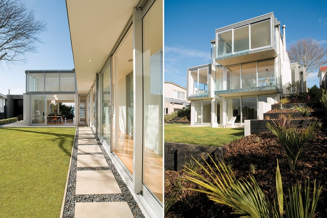
On the seaward side we find a little basement space under all this, too, so the house seems three storeys high: a stack of glassy containers, each cantilevered over the other and jutting out, the whole pile leaning out to sea like the bridge of a ship. This little basement isn’t just useful for an exercise area or rumpus room – if we still call them that. These days, kids don’t want to leave home, and when they finally do, you find your elderly mum is ready to take their place. It makes sense in a house, if you can, to have a little storey or wing that can be sectioned off to create an attached but private living area.
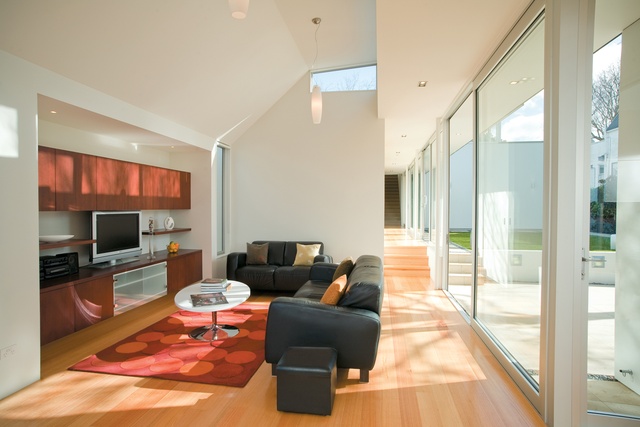
This whole house is laid out very well. As it stretches around the courtyard, the plan is broken down into several zones, separating kids, adults, office and so on. The family room that connects them is like a hinge, just off the kitchen. This is a long site, but it’s not that wide, so along the south side of the house the Council’s height-to-boundary control, which aims to preserve sunlight to your southern neighbour, gets a bit tight. Consequently, the roof slices down at a 45-degree angle, but there is a corresponding pop-up of roof that acts as a light scoop.
This isn’t a skylight, but a clerestory, and I don’t know why we don’t make more use of them in this country. They keep sunlight out when the sun is high in summer and let light in when it’s lower in winter. A skylight achieves the opposite: hot in summer, cold in winter. This all works well to create the sense of the family living area as a snug cave, since the rest of the house is so light and airy. And, of course, rooms like this are all about the big screen TV, and the angled ceiling ensures we are focused on that.

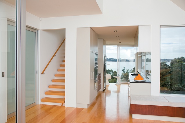
The long gallery on this side of the house stretches between family room and garage/laundry. It’s a long, light-filled space finished in Victorian ash with wide sliding doors that allow the whole space to be opened up to the courtyard. The gallery also gives you a glimpse of water from everywhere but with subtle little changes in the view. Nearly every internal door in the house is a sliding door as well – cavity sliders that are concealed in the wall when open.
Again these contribute to a sense that the house is a series of pavilions rather than a bunch of rooms. The great advantage of the cavity sliders is they don’t take up any space and they’re not flapping in the breeze. The opaque glass finish on them gives a sense of light-filled space, and is just as acoustically effective as a traditional door.

The two kids’ bedrooms are separated by a bathroom area and both open onto the gallery space and then the courtyard. There is a good simplicity to most of these rooms and the way they are spread around the house gives the place a flexibility that’s actually quite rare in contemporary architecture. With the basement being downstairs and the office and parents’ bedroom being two retreats to the west and east, and then these two rooms, I can imagine the house being occupied in all sorts of ways by many permutations of extended or blended family units.
At 330m2 this is a surprisingly big house but it doesn’t dominate its site. Rather it uses the land to make two complementary spaces, the courtyard and the long string of internal spaces that define it. Yin and yang, rather than a box on a site surrounded by leftover ground. Even without the bonus of a great view, this is a house that makes great use of its site and suggests we should give more consideration to the courtyard as a solution to the tight urban site.
Click here to see more Houses Revisited. And sign up to our email newsletters to receive Houses Revisited straight to your inbox.


