Houses Revisited: Twist top
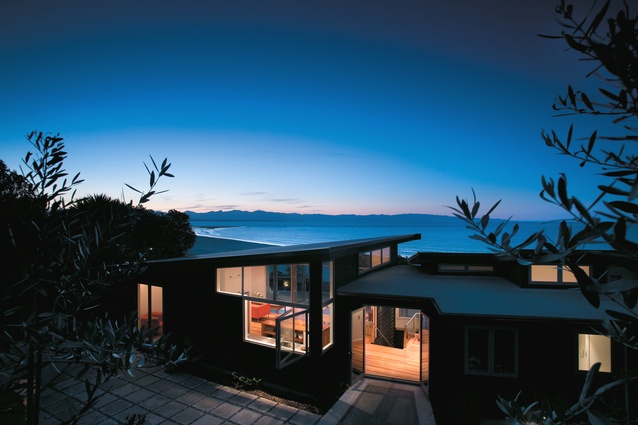
This 2006 home from Arthouse Architecture sits above a Nelson beach and demonstrates a relaxed form of maritime modernism.
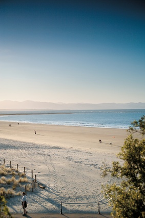
Straight off the sand, where the curve of Tahunanui beach meets Nelson city, the cedar-black beach house of architect David Wallace and interior designer Caroline Marshall eases back against the coastal cliffs. The couple, who work together at Nelson practice Arthouse Architecture, debated for years whether to buy a bach. They arrived at a best-of-both worlds solution when they bought a property perched just above the waterfront road connecting the city with the beachside suburb of Tahunanui.
For a year they lived in the original 1940s bungalow, but quickly decided against renovation. They knew what they wanted: a relaxed, just-up-from-the-beach house that would give them a seaside lifestyle 10 minutes from the city centre and work. The bungalow went, to be replaced by this light-filled house that climbs up the hillside and opens its arms out at the top. “I liked the idea of clambering up through rocks to a viewing platform above,” David Wallace says.
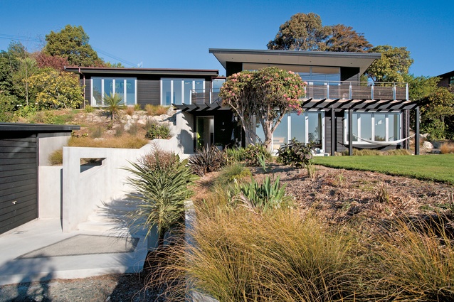
Wanting the new house to sit well in its surroundings and provide screening from the road, architect and designer worked on a layering effect: the garage is located at the bottom of the site, and the house is set further up and back. Established trees and new bands of planting help to shelter it from sea breezes. The dark Hackett Black stain, reminiscent of the creosote slapped over old baches, helps pull the house back into the hillside. Materials, including polished concrete and timber flooring, are also consistent with the pragmatic bach tradition. The house is oriented to capture solar warmth, concrete acts as a heat sink and solar roof panels provide water heating.
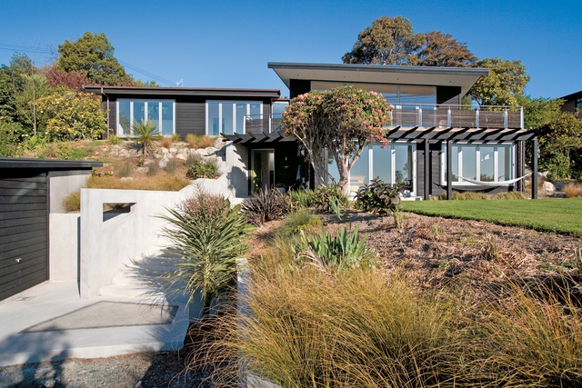
Each room of the house, which is stretched out across the wide section, opens to the sea. Interior colours are neutral (why compete with nature’s brilliant blues and greens?), and successfully deployed – the project won a Colour Award in the 2005 Resene NZIA Nelson/Marlborough local architecture awards.
Central to the design is the twist at the top which turns the living area through a dozen degrees to face directly north. This twist serves as a fulcrum for the house, accommodating the kink in a plan comprising three separate rectangular elements: a lower level self-contained space for older children and guests; an open plan living area opening on to a large deck above the lower level; and a bedroom wing. The twist in the programme imparts a sense of movement and a suggestion of surprise as the structure suddenly rearranges itself halfway up the central linking stairway.
The journey to the top of the house begins just off the beach, proceeding via three flights of exterior steps, complete with inlaid granite and aggregate mock-rock pools, and past an outside shower set into the concrete wall that climbs alongside the steps. The lime green door of the downstairs entranceway opens onto the cool polished concrete floor. To the right, a sliding glass door disappears into the wall, opening up a games room and bedroom with long bi-fold doors that lead to the lawn. Behind the bedroom is a small bathroom; its ceramic floor and sea-green glass tiles echo the beach just left behind. The lower level provides a self-contained space for visitors or a teenage retreat. (The owners/designers have one teenager still at home, and two older children often return for holidays.)
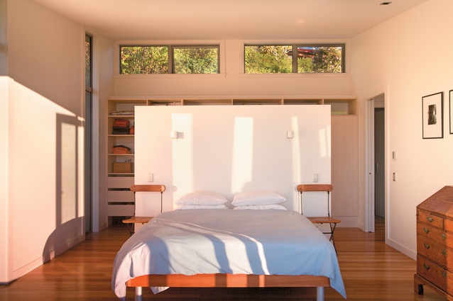
The central saligna stairway delivers you out onto the pivotal upper landing. To the left, two bedrooms share a larger version of the downstairs bathroom, with windows looking out over the bath onto a small courtyard between the house and the cliff to the rear. The back wall of the main bedroom is fitted out as a wardrobe, and a high partition separates it from the bed and the view straight through long bifolds out over Tasman Bay. High up at the rear, small electric windows provide ventilation.
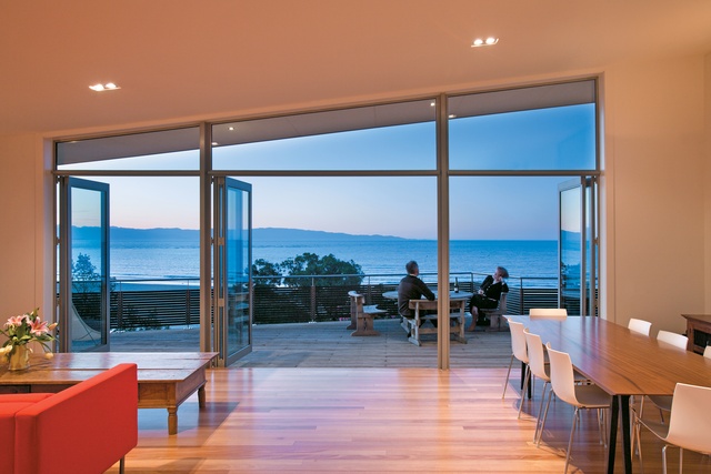
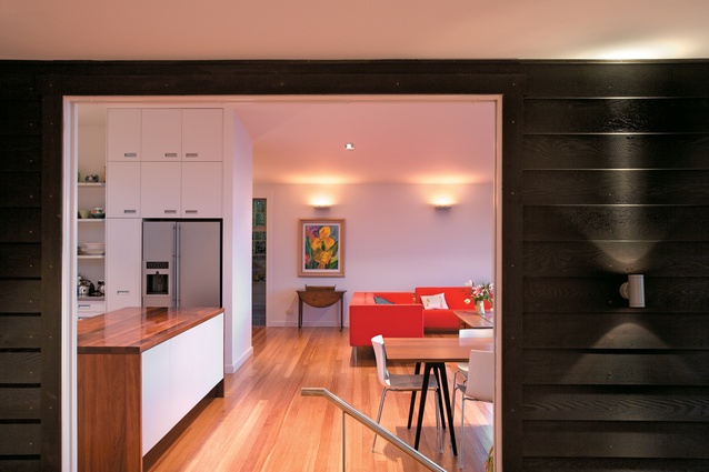
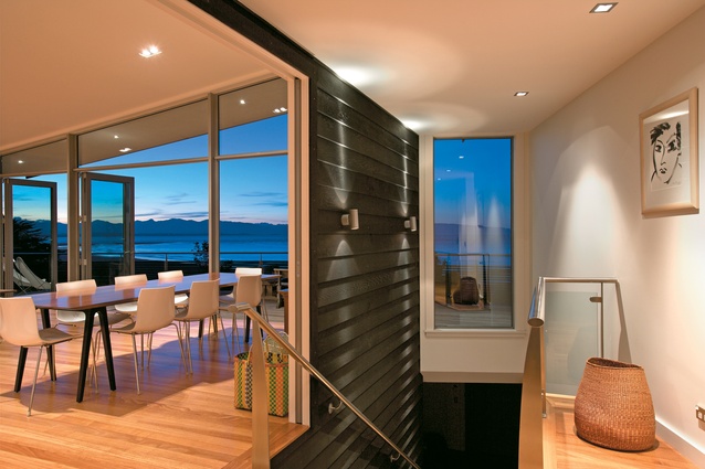
Back at the landing, a right turn leads to another glass door which slides back past the top of the stairs, revealing the wide-open space of the living area. Caroline Marshall wanted the living area to have a tent-like feel; in this spirit, the slope of the roof, wall-to-wall bi-fold doors and big windows over the stainless kitchen strip along the rear all contribute to opening the living area from the seaside right through to the courtyard.
In the kitchen a long bench of Tasmanian blackwood is used for preparation and serving, cupboards are low so as not to intrude on the living space and the table is a simple stretch of teak-like iroko resting on trestles. A TV and bookshelves are tucked into an alcove, keeping the living area free and full of light. There’s no presence of work, rather a sense of having left it all behind. “It’s that whole power of architecture,” David Wallace says. “We’re sitting almost where the living room in the old house was, but to live in it now is such a different experience.”
Outside, cedar-batten strips on the balustrade – a Pasifika touch – give privacy from the road. Inside or out, the view floats straight out to the beach and over the sea; parkland obscures suburbia to the west. A deep overhang on the deck keeps the sun out in the summer but allows the doors to be kept open if it rains. Double-glazing, underfloor insulation and radiant ceiling panels provide warmth in winter.
The Wallace Marshall house, which won a 2005 NZIA Nelson/Marlborough local award, encapsulates the approach of Arthouse Architecture. “We’re not absolute modernists,” David Wallace says, “and we work really hard to make houses with a warmth and texture and livability to them. We’re not in there to make some big statement.” Caroline Marshall confesses to being the restless type, hankering for change every few years. “But that feeling’s totally gone,” she says. “We’ve done it. I’m where I’m supposed to be.”
Click here to see more Houses Revisited. And sign up to our email newsletters to receive Houses Revisited straight to your inbox.
Note: These are stories from our archives and, since the time of writing, some details may have changed including names, personnel of specific firms, registration status, etc.

