Houses Revisited: Tree house
Look back at this home from 2006: Xsite Architecture’s wooden ark is tailor made for the slightly alternative, somewhat post-hippy Laingholm site. The area relaxes in dense bush on the Manukau Harbour in one of the farther reaches of West Auckland.
Up on one of the small settlement’s highest ridges is perched the Tree House, designed by Malcolm Taylor of Xsite Architecture. Taylor’s clients had lived up the road in Titirangi for a few years and knew all about the area’s attractions, and its challenges. For instance, what many would regard as a pretty major hike to town doesn’t bother them: they work in the film industry so there are no rush hour commutes. With a picturesque, if awkward, piece of land in hand, the clients didn’t agonize over a choice of architect or an intricate brief. “We gave Malcolm a rough brief and basically let him go for it,” one of the clients says.
Dream clients? Well, they trusted Taylor: the father of one of the clients had built six projects with the architect and was lined up to construct the Tree House. They were also familiar with Taylor’s other projects (including the Piha Beach House that won a 2005 New Zealand Institute of Architects Supreme Award). This familiarity with Taylor’s work gave the clients confidence that he would be sympathetic to their ideas. For example, they like the feel of boats and the materials used in their construction, and they asked for both visible and concealed storage for their collections of art, books and records.
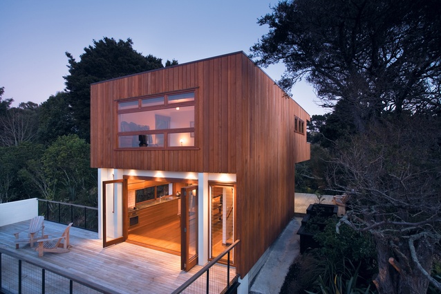
The Tree House is a box stacked three stories high to stand tall among the trees and gain views. Its site is shaped like an hourglass split vertically down the middle. The house is located at the waist of this half-hourglass, on the narrowest point of the site. Why place it on the trickiest part of the section? Because that’s the highest point. The site had to be excavated to allow the garage floor to be tucked beneath the living area floor; the excavation determined the extent of the two lower stories.

The front door to the house is in the carport – a real ‘no thanks’ to three-story vestibules. The west wall of the house can be seen from the driveway, but the forbidding steepness prevents a proper look. By the time you’re in the carport the bulk of the house is out of view and only the garage and front doors are visible. The front door is a modest affair next to an opaque single garage door made of corrugated polycarbonate; with the lights on at night the garage has a lantern-like quality.
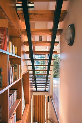
Inside, the stairs rise up immediately, the two flights stacked one on top of the other. If you look up from the entry you can see through the open stairs above to the highest floor of the house. At the top of the stairs louvered floor-to-ceiling windows look straight into the surrounding bush. Beside the stairs a windowless, wood-panelled wall is used to display books and collectables on asymmetrical recessed shelves. This ‘precious wall’ also screens out the adjacent house. On the opposite stairwell wall a cut-out panel is strung with vertical wires held taut by nautical hardware.
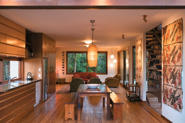
At the top of the first flight of stairs a long rectangular room runs the length of the house. This long room functions as an all-in-one dining, kitchen and living room. At the north end the kitchen lines one wall; it’s a scullery, really, but with a good deal more storage. The clients like to cook for their guests, and they had envisaged a more traditional kitchen with the obligatory island bench. Taylor suggested that a kitchen along one wall, without an island, would allow for greater flexibility of space in the kitchen and dining area. A large wooden table with pew seats serves just as well as extra preparation space, and has the advantage of being mobile.

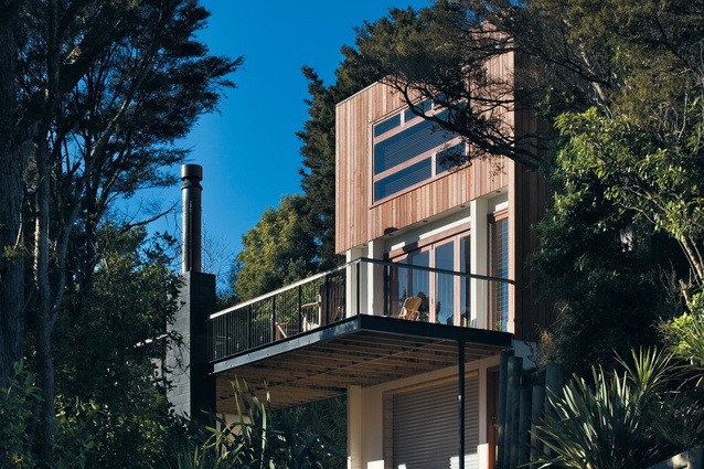
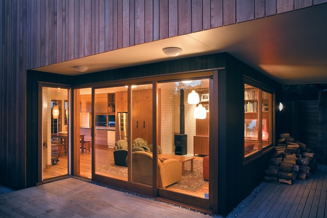
Bi-fold doors open onto a timber and steel deck cantilevered over the carport and supported by the base of the outdoor fireplace at the deck’s edge. From the deck you can look out through the bush and glimpse the sea. You can also look back at the house with rather more leisure than on the driveway ascent. In keeping with the interior the house is clad with lengths of timber of irregular width, consistent, Taylor says, with an overall scheme allowing for quirks and textural warmth. On the northeast corner white cement sheet cladding creates a visual cut-out from the timber above; this detail, designed to float the top floor, is repeated on the south deck, but in black stain.
The south end of the living floor is a lounge area, heated with a small log burner in a corner lined with the same white tiles used on the entry stairs. The tiles were sourced by the client, as was the recycled timber used on the floors throughout the house. The wall next to the burner is lined with built-in cabinets continuing the ‘precious wall’ theme: exposed sections for the good stuff and panels to conceal the things that need not be displayed (TV is not a decorating tool here).
The lounge has another deck that wraps around the west side of the house. The bedroom level is cantilevered, providing a roof over the deck offering peep views of the sea and wide-eyed views of the bush. This upper deck anchors the back of the house onto the ridge. Greater views of the water could be obtained from the lower and upper decks, but this would require cutting away some of the trees that the clients are now too fond of. The existing landscape and the significant additional planting creates privacy and shelter for the deck and living spaces.
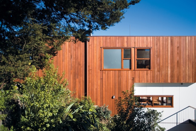
On the third level of the house two bedrooms sit on either side of the bathroom. The master bedroom is on the south end of the house, hanging above the lower deck. Doors open out onto the top deck, this deck more enclosed than the others but with a section cut out so the clients can see the view from bed. The room, large enough to comfortably fit two desks in lieu of an office, was designed to give the clients the option of dividing it into a medium-sized room with a single room or separate study.
The green paint in the bathroom is the only decorative colour used in the house. Black stain, natural oiled timbers, white cement sheet cladding, red bricks, white tiles and copper laminate make up a palette of tones sufficiently rich to preclude much decorative painting. One coat of pearl lustre has been painted as an interim measure – it fits so well it will probably stay the distance.
The Tree House is a comfortable home. Only one year old, it already feels established and settled, a good fit for its owners’ lives and for its landscape. It is clear that architect and clients worked carefully together to maximize the possibilities of the site and brief. The result is a thoughtful, considered building, one that deals in clever details rather than grand gestures.
Click here to see more Houses Revisited. And sign up to our email newsletters to receive Houses Revisited straight to your inbox.
Note: These are stories from our archives and, since the time of writing, some details may have changed including names, personnel of specific firms, registration status, etc.

