Houses Revisited: Tough love
In this home on Wellington’s south coast, first published in 2009, Athfield Architects meets the challenge of Cook Strait head on.
You can’t beat Wellington on a good day, or so the song goes. On the other 364 days of any year, it can be a place of extremes. This is no better experienced than at the extremities – the edges and ridges where the bowl of the city meets Cook Strait. It’s on one of these ridges that John Hardwick-Smith of Athfield Architects has designed a house for a Wellington couple.
Hungerford Road drops like an oesophagus from the back of Melrose into the lee of Lyall Bay. Houses line the gullet on either side, facing in and down. Elizabeth and John Harding already owned one of the houses on the southern side when a landlocked site on the ridge behind them came up for tender.
The section, previously owned by Wellington City Council, was virtually inaccessible except across the Hardings’ land. The Hardings’ tender was successful and they started working with Athfield Architects on designs for a new house. (John’s nephew, Jon Rennie, was the initial contact at Athfield Architects; shortly after, he moved to London, from where he discussed with John Hardwick-Smith and the Hardings some of the initial design phases and maintained a critical interest in the progress of the project.)
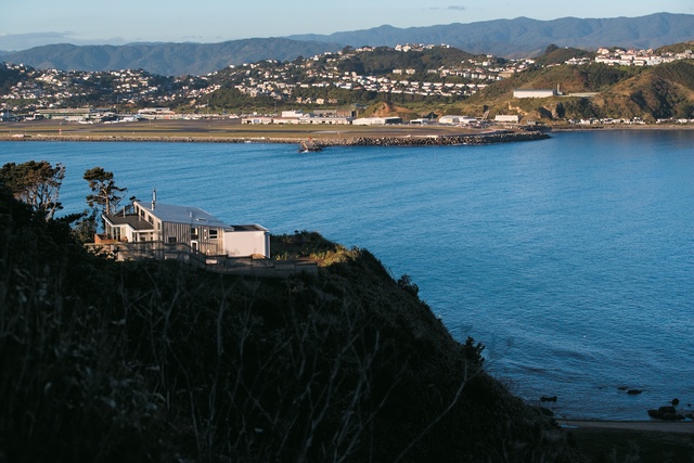
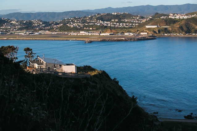
The ridge was lined with rugged pines, with a sheer drop to the south over the disused Arthur’s Nose Quarry. The wind from the south hits the cliff wall and rises over the top of the ridge; from the north it funnels down from Melrose and blasts across the ridge, which is so narrow that a natural wind-plane occurs several metres above the site.
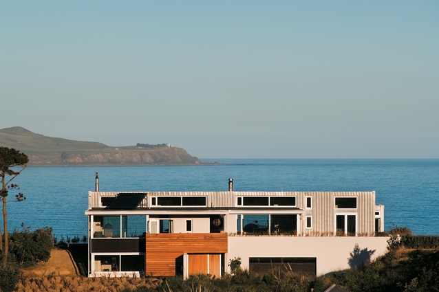
It was beneath this wind-plane that the house was sited, running along the ridgeline. When the weather hits from either side, the pines thrum like a jet engine and yet the house can be eerily calm in its own microclimate. But when the wind hits obliquely, as it did the day I visited, then hold on to your hat. Southerly gales were howling, and the surf was pounding into Lyall Bay. It was a day to view the house from the inside out.
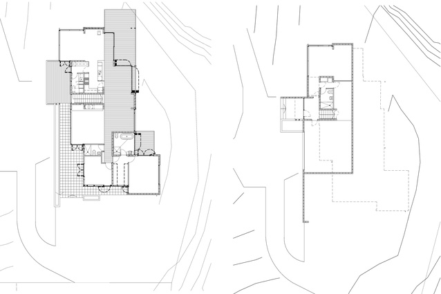
The design response took account of the site’s vulnerabilities and the house is established with concrete block boxes that are embedded into the site. Around these boxes space flows freely with an invisible spine the predominant organising principle. The house is approached from the northwest where there is a garage and entranceway. Also at this level is a studio apartment that can be rented out or used as temporary accommodation for the Hardings’ adult children and their families.
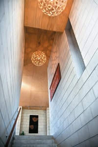
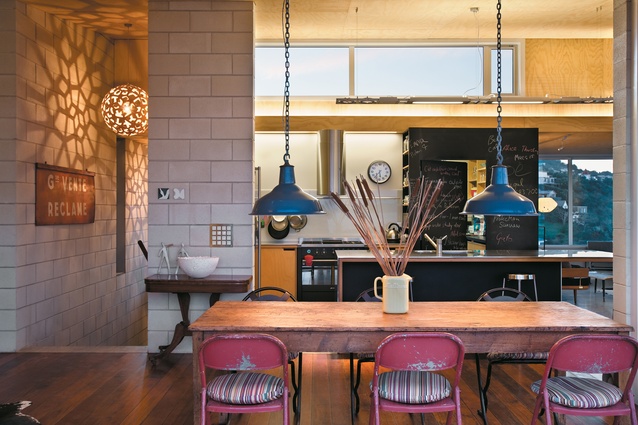
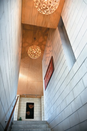
A set of concrete stairs rises between two concrete boxes and arrives in the centre of the house. The stair bisects the house dividing it functionally: to the left are the kitchen, dining room and family room; to the right are the piano room, living room and a short hallway to the bedrooms. This hallway is one end of the spine that divides the house longitudinally; the division is demarcated by the flooring – concrete to the north, timber to the south.
A simple monopitch roof slopes south with a clerestory to the north over a lower flat roof. These windows let in light that washes over the sloping ceiling of rough-sawn plywood. The dining room opens to the east onto a deck with the “good honest overhang” requested by the client. The walls of windows can disappear (on that good day) to make a seamless connection to the outside.
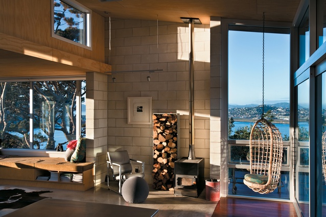
The house pivots at the kitchen, generating a family room to the north that sneaks under the flat roof and opens onto a deck to the north. Here, a long window seat sited to soak up the sun house shelves and cupboards. At the back of the kitchen a door opens in a blackboard wall onto the pantry and access to the northern deck past the laundry.
In plan it seems odd that the kitchen is landlocked and the laundry has windows to the north, but this layout is surprisingly effective: the kitchen with its views to the south has no need of direct north light, which is skillfully managed into the centre of the house through the clerestory.
The living room is a generous space with a poured concrete hearth and a slot window through to the entrance stairs. To the west is the study with access outside and a mezzanine sleeping loft. The main bedroom is in another concrete box to the south separated from the rest of the house by the wardrobe and its own bathroom.
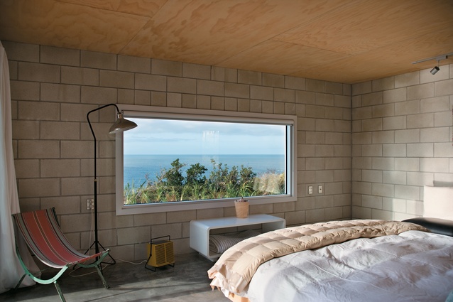
The owners see the bedroom as the prow of a ship forging its way into the weather. The concrete block insulates against the weather and a low picture window privileges the view of Cook Strait from the bed. Doors open to a deck to the east and to the patio to the north, which draws in the afternoon sun. It is a simple but clever arrangement that makes this the quietest room of the house. The doors fold back on the bathroom wall to create a bathing space that is at one with the elements yet retains a sense of privacy.

The house makes the most of the thermal mass of the concrete block and poured concrete floor. Elsewhere, the materials used are warm: sustainable kwila flooring and the plywood ceiling. Outside, the house is clad mostly in marine-grade natural finish aluminium tray section sheeting. This cladding rises up the north wall, folds over to become the roof and folds again to become the south wall. Other areas are clad in stained ecopanel or Sto render over the concrete blockwork.
This a house built for its extreme site, one that hunkers down for the wind but is not afraid to open itself up when the wind drops. It is remarkably transparent – particularly from the opposite side of the gully, from where views can be had right through the house to the sea and sky beyond – and yet it achieves enclosure against the elements. It is a remarkably relaxed house for such a violent location. Together, the architects and their clients have made the inhospitable hospitable.
This article first appeared in Houses magazine


