Houses revisited: St Marys Bay house
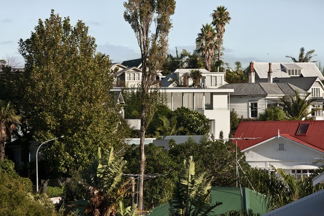
Three storeys above the street, a discrete loft is inserted into a heritage suburb. First published in 2014.
Inserting a modern house into a largely historic context can bring with it a number of responsibilities for the architect. Not least because the project must walk a fine line between answering the client’s brief, preserving the integrity of the streetscape and fulfilling any local government statutes.
Oh, and then there are the usual, often disparaging, comparisons with what went before. For architect Andrew Patterson, this last factor wasn’t an issue as the site he was presented with was a greenfield one.

“Unusually for an inner-city location, this was a vacant site, a parcel of land subdivided from a much larger estate that fronts onto another street,” says Patterson. “That said, it was still bound by the Residential 1 - Historic Overlay zoning of the rest of the street, which dictated materials used, the amount of glazing, a fixed setback and roof pitch, amongst others.”
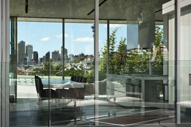
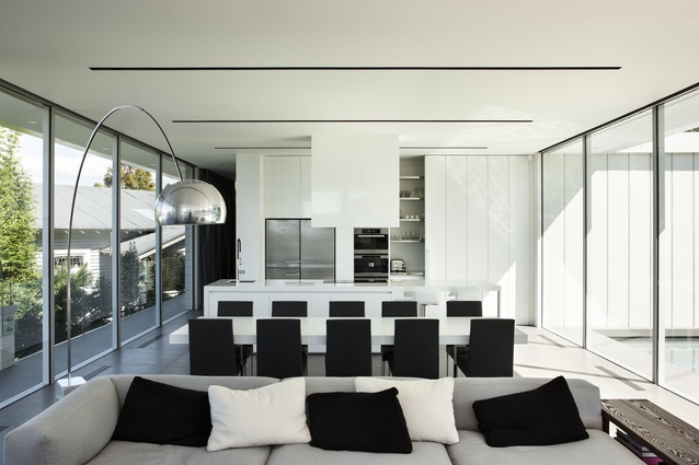
For the clients, the aim was to create an open, spacious home that was light-filled, included generous guest accommodation, maximised the views, offered the all-important off-street parking and incorporated a small plunge pool into one of the outdoor areas.
“Like most older suburbs situated on Auckland’s slopes, this is a fairly dense neighbourhood but the 580m2 site gave us some room to move. A basement level was excavated and a further two floors built on top, which brings the building in line with its immediate neighbours, maintaining the massing of the surrounding structures.

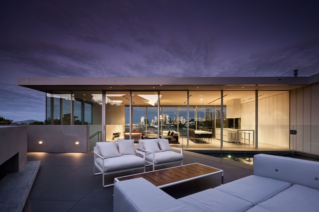
From the ground up, the house comprises garaging on the lower level, guest accommodation on the first floor and, perched on top, what is for all intents and purposes, a penthouse apartment-style dwelling, which is the primary living space for the owners.
The first two levels front onto the street, while the topmost level pivots 40° to better align with the north-south axis, allowing for outdoor living to be positioned on both the east and west boundaries.
“As well as orienting this level to the sun, what the angling of the floor plan allowed us to do was create a further setback, essentially rendering the top floor invisible from the street. This meant that we were able to increase the volume of glazing on this level to give the clients the open-plan feel they were after, while the lower two levels adhere to council dictates in terms of materials — white weatherboards — and number of windows.”
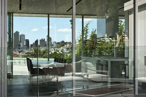
Patterson was also able to work within the council’s height to boundary guidelines regarding the pitched roof. As the section had been subdivided and the existing property at the head of the site had building covenants to ensure the view remained unobstructed, a flat roof was permissible. Coupled with the skewed floor plan, this made it possible to design the pavilion-style upper level.
“The result is a contemporary home that is settling comfortably into an older suburb and not an inferior pastiche that contributes little to the overall amenity.”
Click here to see more Houses Revisited. And sign up to our email newsletters to receive Houses Revisited straight to your inbox.
Note: These are stories from our archives and, since the time of writing, some details may have changed including names, personnel of specific firms, registration status, etc.

