Houses Revisited: Smart fit
From our 2007 archives: An Auckland house is tailored to suit a tight suburban site, with a balance of connection and separation.
Most architects could do a good house on a great site but the real test for designers is what they make of a difficult site. Peter Sargisson of Cook Sargisson Tarrant & Pirie has designed a family house on a tight L-shaped section in an inner Auckland suburb that successfully accommodates the needs of the clients and integrates the house with the garden in spite of some very restrictive Council planning controls.
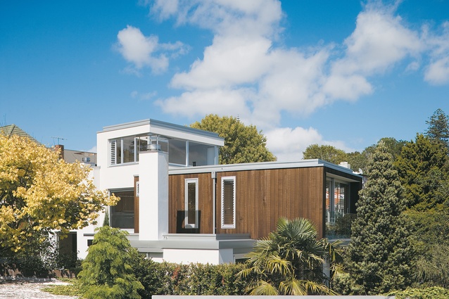
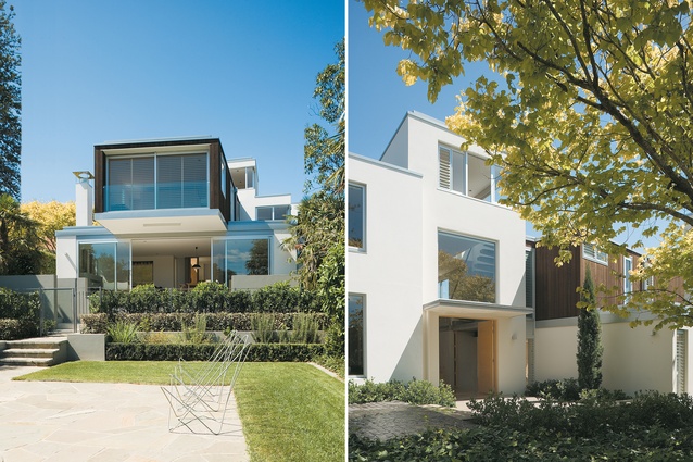
Reached down a long narrow driveway, the house at first appears to be a compact and tall structure of plastered block, but this first impression belies its recumbent layout and interior grace. The idea was to create a more urban house than the clients’ previous home. In accordance with this strategy, a series of courtyard spaces have been sited around the house, protected from the prevailing weather and opening onto the garden, and the garage has been hidden around the back. Rather than the large landing pad that serves most households’ cars, this house has an entry located off a little courtyard shaded by a large deciduous tree.
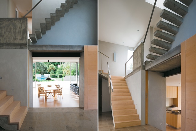
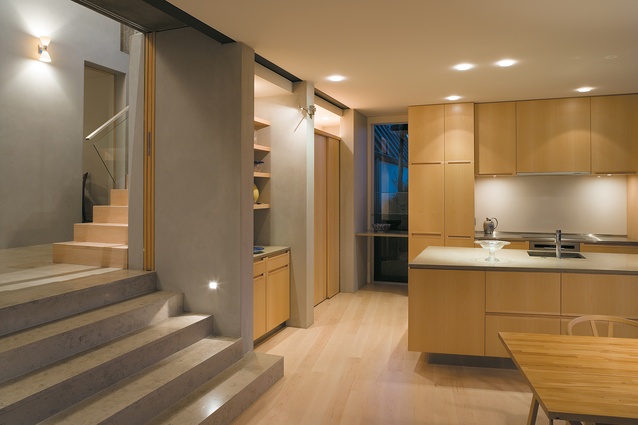
Inside, the entry hall is like a little village street; everything opens off it and stairs wind up to the top storey. This planning works very well: it divides the house into zones for partying kids and adults, allowing some moderation of decibels with cavity sliding doors that can open up or close off spaces, yet also maintains some visual connections between all areas.
To the right of the lobby and down a few steps is the main living area and kitchen with a terrace and garden beyond; to the left is a smaller living area with fireplace. From this point it’s apparent that the house’s communal spaces are all lined up on a loose axis. This runs at right angles to the entry and off along one arm of the L-shaped site, out to garden, pool and a distant view of the city beyond. The section falls this way as well, to the north, and the house follows the topography, stepping down hill. This is good old-fashioned planning that makes the most of the site, rather than the common approach today of wedging a vision from some magazine’s pages on to a chunk of land.
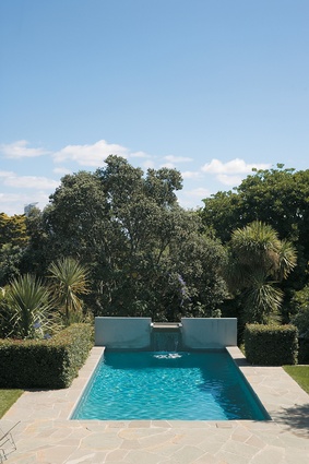
Down a few steps from the hall, the main living and dining area is a large rectangular pavilion with a kitchen at one end and fireplace at the other. The lightness of the maple flooring and the beautifully crafted kitchen joinery has a Scandinavian simplicity. The living pavilion opens out on to a covered terrace and then more steps down to the garden and a pool at the far end of the section. This pool contributes much of the garden’s character; being set away from the house it draws the eye out to the end of the garden and induces a sense of tranquillity.
The planting has been done with sensitivity to the neighbourhood character and preserves a sense of the vernacular landscape. It’s a collection of lemon trees, olives, fan palms and shrubs that picks up on and repeats species from neighbours’ gardens, blurring the boundaries and giving the impression that the garden is much bigger than it actually is. Even a large pohutukawa that visually forms a backdrop to the pool is ‘borrowed’ from a neighbour.
The house is built from plastered block and some poured concrete in the entry hall, which contrasts nicely with the maple timber flooring and doors. The blockwork has the thermal mass to keep the place cool in summer and warm in winter and the architect hasn’t gone overboard on the glass. Windows are carefully placed to pick up on particular views or to let in suffused light through the sides of rooms. As a result of smart planning, the place feels private and nestled into its setting, when the awkwardness of its site could have made it feel uncomfortably surrounded by neighbours.
The central entry hall is lit largely by a high window that captures the canopy of the deciduous tree otuside; as the seasons change so the light and ambience of this double height space varies. And while the main living area is a light and airy garden pavilion, the smaller living room, with its dark fireplace, sisal flooring and filtered light, is more of a retreat: warm in winter, cool in summer. Even this room, however, has sliding timber panels that can open it up to the entry hall and allow a view down through the heart of the house and out to the garden.
Upstairs, the volume of the hall splits the upper storey into two halves, with two bedrooms to the south, oriented east and west, separated by a bathroom, and to the north the parents’ area, a long rectangle cantilevered above the terrace and overlooking the garden. Peter Sargisson was keen to gain a third storey, and a small loft over the central circulation space caps the house. This is reached by a set of concrete steps cantilevered out of the walls giving the space the remote and rather precarious feel of a tower or tree hut, culminating in a panorama of the city and harbour (for a client who is a keen sailor, it’s a nice spot for a study).

This house is laid out like a tree – rooms seem to branch out in all directions from the central core of circulation – but it retains a balance between connecting and separating spaces, between the communal and the discreet. It is a house that responds subtly but effectively to the demands of the family home and although it is actually quite a large house, it doesn’t feel big, it feels accommodating. This is a house design that has responded to a difficult and narrow site with good planning, turning possible disadvantages into virtues. In a city that is intensifying its density with lots of crude infill housing, there is plenty to learn here from a firm that has been producing consistently good houses for decades now.
Click here to see more Houses Revisited. And sign up to our email newsletters to receive Houses Revisited straight to your inbox.
Note: These are stories from our archives and, since the time of writing, some details may have changed including names, personnel of specific firms, registration status, etc.

