Houses Revisited: Simply Sumner
Out on Christchurch’s coast Andrew Watson stacks up his boxes against a steep site in this house, originally published in 2009.
Sumner is one of the country’s architectural hot spots. Once it was a relaxed summer retreat, but now it seems that half of Fendalton is decamping there. New architecture is much in evidence on the hills that rise Wellington-steep above the coast. You can see why, even as you wonder why this migration did not happen earlier: from up on Scarborough Hill you can see all the way to the Kaikouras.
There can’t be many places in the world where you can raise your gaze from surfers in the foreground to snow-capped mountains in the distance. (Winter surfing in the South Island: I’m not sure if that’s a testament to the intrepid character of the locals, or a sign of the lengths to which people have to go to have a good time in Christchurch.)
In 2009, Andy Watson was a young architecture graduate working for the Christchurch practice Modern Architecture Partners (now known as MAP Architects); he is a keen participant in coastal pursuits. He and his wife lived for several years in a small house at Taylor’s Mistake, the surf beach to the south of the Scarborough Bluffs. He bought the section for his new house in 2007 – it was possible for him to do so because the plot, part of a parcel of land subdivided for development, was a daunting prospect for any would-be builder.

The section stretches down a steep slope that looks none-too-sound. Scarborough Bluff looms above the site; when you look up your eye is inevitably drawn to a big boulder standing out in relief against the blue sky. What comes to mind is the opening scene of the movie Sexy Beast: the huge rock tumbling down the hill and crashing into the exiled wide-boy’s Costa del Sol swimming pool.
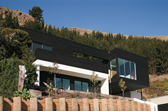
On this challenging site, Andy Watson has managed to wrest enough of a building platform from the slope to accommodate a two-storey house of around 230m2. He did think of designing a pole house, before he discovered that he couldn’t access his section from above. So, he had to dig in.
“There was quite a lot of excavating,” he acknowledges. “You could say we didn’t touch the earth lightly.” The architect waged a campaign of attrition against the cliff: “Every time we pushed the house back a bit [on the site], we had to build another retaining wall.” Sufficient flat space was won to provide for a small lawn at the front, and a smaller sheltered terrace at the rear.
At the time of publoshing, the site is still raw, but planting will eventually camouflage some of the evidence of all the gouging out and shoring up. Not all of it, though, which is nothing to regret: there’s nothing un-New Zealand about a big, grunty retaining wall.

For all his site works, the designer-surfer could not position his house to capture a substantial view of the coast. Such an orientation might have been possible, but the contorted plan that would have been required in order to see more of the sea would have been a programmatic nightmare. Instead, the architect has gone with the topography: “The house was designed by its site,” he says.
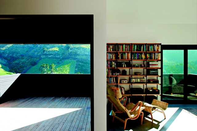
It faces across a valley to the eastern slope of Richmond Hill. This might be a little too much of a landlubber’s prospect for Andy Watson – although some of the sea can still be seen to the north – but it’s an impressive sight. It has also been the prompt for a design move that an architect could perhaps only make on his own house. Rather than grab all the view of Richmond Hill, the architect has restricted that view from the deck, and from the dining area that gives out to the deck. More accurately, he has framed the view, so that the void above the deck reads like a cut-out in the black exterior wall. (The balcony ‘frame’ also serves a pragmatic purpose, supporting a hammock that can be stretched above the deck.)
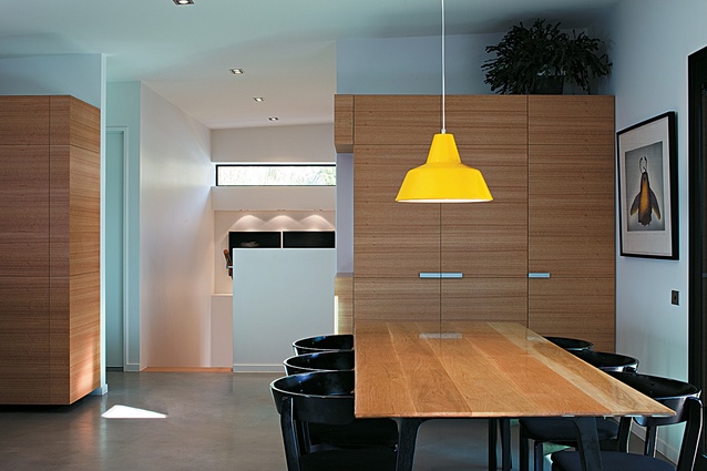
In programme, Watson approached the house as if it were an open-plan apartment with modulated or dedicated spaces: kitchen; dining; living; sunroom; bedrooms; bathroom. That’s the upper level; downstairs is guest accommodation. “Initially, all the spaces were to be designed to the same sheet size,” the architect says. “But it didn’t quite work out like that.”

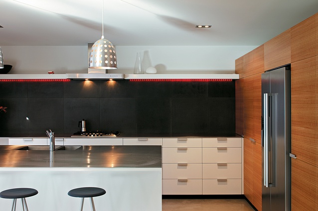
As you’d expect in an architect’s own house, there are bespoke solutions for fittings and cabinetry and the occasional design splurge, for example, the rather festive lighting track on the kitchen wall. The colours of the house – the black box on top, the white box beneath – are from the declarative modernist palette, with a particular Kiwi resonance. “Well, the house next door was in creosote,” Andy Watson says, “ and I really do like The Group.” The roof, too, with its 3 degree slope, has a modernist pitch.
This is a nice, relatively simple home for a young family (Andy Watson and his wife have, so far, one child), well put together, on a tight budget, by builder Avon Dickie, a school-friend of the architect. At the outset, the architect says he thought of the house as “a five-year home” for a particular stage of his family’s life. Now, he says, “we look at it as a ten-year home”. (The process of building, especially on a tough site, does tend to alter one’s temporal perspective).
Quite a lot of amenity has been fitted into a building that is modestly proportioned but sufficiently generous to house a growing, or expanding family. There’s plenty of evidence of thought – a strong, simple idea is the ‘slice’ though the building centred on the entry axis – but no sign of fuss. Specifically, there is no garage, only a carport formed by the cantilever of the bedroom box. “Why do you need a garage?” Andy Watson asks. “It’ll only get full of stuff, and then you’ve got to put the car outside the garage anyway.” Now, that’s the spirit of the old relaxed Sumner.
Want to be the first to see Houses Revisited, received straight to your inbox? Click here to subscribe to the ArchitectureNow newsletter.


