Houses Revisited: Right neighbourly
From the 2008 archives: Ken Crosson has designed a pair of townhouses in St Heliers that reject rampant individualism.
Do you remember how Auckland suburbs used to look? Weatherboard villas all neatly placed on a decent plot of land. As you walked down residential roads you could see houses that were subtly different but which sort of adhered to a theme. Then people went subdivision crazy, carved up their sections, allowed anything to be built in the garden and often replaced their own, quaint house with something more modern.
Suddenly it seemed important to have a building that spoke about the owner and not the nieghbourhood. Individuality was trumpeted as the Kiwi way and was the reigning impulse when choosing the design of a house. This predilection has resulted in many suburbs looking as if someone or thing – the housing deity of Godzone? – has randomly dropped a load of mismatched buildings from on high and just left them where they fell. No thought, no planning and no respect for privacy or aesthetics has left the city with houses that don’t complement each other but instead fight for attention.
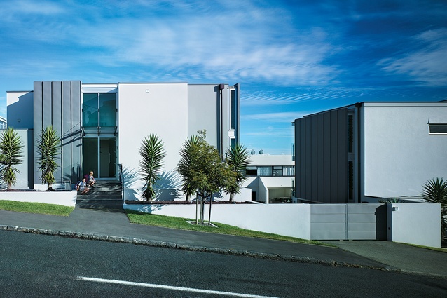
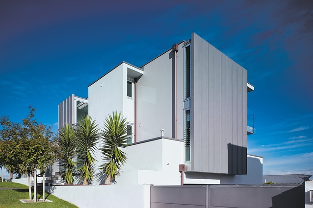
Subdivisions don’t have to be ugly and nor do they need to carve up a neighbourhood. Ken Crosson of Crosson Clarke Carnachan Architects has designed two houses that blend with and complement their surrounding buildings on St Heliers Bay Road. He has managed to emphasise the bolt of the larger buildings in the loom of the street but has done so in a contemporary way.

It works, as well: the two homes are described as townhouses and both sit on a plot of land that used to house one dwelling, but you would never know. They relate to the area but retain a certain amount of their own character.
Crosson is still as enthusiastic about these houses as he was when he first secured the commission to design them. He shares a similar view to mine about the direction in which Auckland suburbs have headed. “I picked up on the context, I am really interested in context,” Crosson says.
“My view is the New Zealand suburb is an aggressive place – everything is fighting each other. I think you can be different but sympathetic and empathetic. The New Zealand suburb doesn’t do that at all. There is no architectural unity, and it is not well understood. We wanted something that spoke to the context but was suitably different. That is my big issue in terms of urban design. I think the contributions that occur a lot around the suburbs are poor contributions. They don’t add they just make a noise.”
Kip and Lizzie Marks, who owned the original house before deciding they wanted something different, undertook the project. The two houses are adjacent to each other with their own street entrances and they share a driveway. They have been designed to maximise light, space and, as you would expect in the maritime suburb of St Heliers, the view.
From the road, the houses look fairly standard. Crosson explains, “We wanted to present something that was relatively sculptural to the back here, there is no view out here and no sun. There are windows to give some sort of light and some relation to the street.”

The Marks’ own house is on the left hand side and it’s when you step up to the front door that you notice this dwelling is a little different. Along the front of the outside wall runs a moat filled with goldfish. Is this the whim of a fish-loving owner? Not at all. The house steps down, so the front of the lower level is below street level, while the back opens up into a garden.
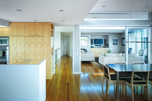
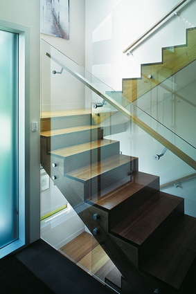
The walls of the moat are transparent, allowing light to filter through the water and into areas of the house that are below the street. This not only cleverly adds light but you can see the fish swimming along. Inside, the house makes good use of natural light which cascades down from the open plan living areas on the top floor. The floors have been switched so the bedrooms are on the ground floor and the living areas are upstairs.
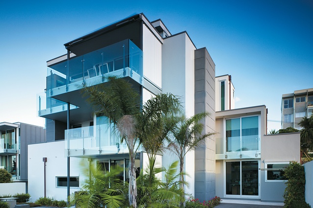
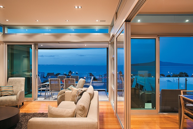
There are many houses in St Heliers that can boast of good views of Rangitoto and the Hauraki Gulf but, even so, the view from the top of this house is spectacular. Crosson designed the house to have a flat roof, which reaches as high as it is permitted. This meant he could raise the upper floor a metre higher than it was in the old house and so allow for uninterrupted views. The flat roof floats in parts and there are windows in the alcove that let in more light.
The living areas can be closed off to form separate spaces or opened up to form one large, light-filled, kitchen/dining/living area. As you look around the room there are interesting features. In the bay of a window sits a built-in window seat. Crosson admits to being “a bit retro” when it comes to designing nook-type spaces. “You get these little pockets of space that add different dimensions,” he says. “We manipulate the space, our architecture is all about playing with space. There are double-height spaces and an interpretation of space.”

The house has also been designed to create pockets of view. Instead of each room having the same window shape and outlook Crosson has designed the house so that in certain rooms you need to work to get the view by stepping up to the window. Windows have been placed to take advantage of gaps between houses in front, and even the lower floor allows glimpses of the water.
The view and the natural light hit you immediately as you enter the Marks House; what takes a little longer to appreciate is the use of space. Set across three floors, the house is deceptively generous. There is more formal living at the top, bedrooms and bathrooms in the middle and an office, family/additional bedroom and three-car garage at the bottom. There is enough space for a modern-sized family, but not too much for a couple.
These two townhouses show what can be done with a suburban infill site. They make good use of the available land, are designed to maximise light and vista but, through clever design, still retain a sense of privacy. At a glance the two houses look similar but closer inspection reveals unique touches. Internally they have more space than you would imagine possible. Most importantly, the townhouses fit in with the surrounding buildings; more than that, they complement them – a welcome phenomenon in contemporary, middle-class Auckland suburbia.
Click here to see more Houses Revisited. And sign up to our email newsletters to receive Houses Revisited straight to your inbox.
[Note: Since the time of writing, the design practice featured may have changed name, personnel or both.]

