Houses Revisited: Prop forward
Revisit a bold and brassy house by Guy Tarrant, first published in 2006, which seems eager to grapple with its suburban Auckland street.
This is a real Auckland house, big, bold and glassy, front row and in your face. But although it may seem a brash newcomer to its street (Rawene Avenue) and its neighbourhood (Westmere) it is also a house with some social and architectural subtleties, engaging with the street in a way that we don’t see much anymore in the new era of the walled community and the firmly secured front door. Westmere is one of Auckland’s old littoral suburbs, newly discovered by those pursuing the last of the city’s waterfront sites or a decent harbour view. Its big, empty streets offer a more relaxed and quieter environment than the Eastern Bays and this design aims to be part of that.
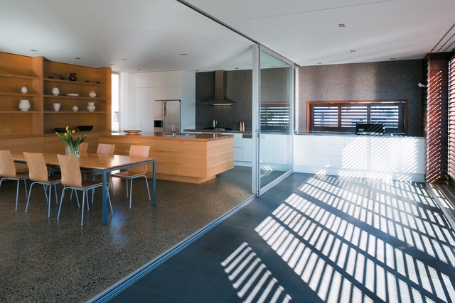
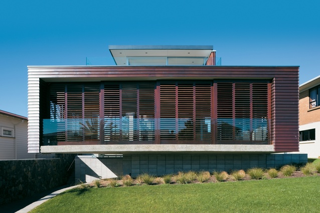
Architect Guy Tarrant of Cook Sargisson & Pirie was briefed by his client to design a family house that had street presence and a little drama, and was as far forward on its long narrow site as possible – the latter requirement intended mainly to achieve views and reduce the chance of being built out by future developments. Consequently the living and kitchen areas are housed in a great hovering box that cantilevers out towards sun, street and view.
The client likes post-war American Modern houses and this house has the same blend of crisp geometry and easy-going flow between generous spaces. Many of Auckland’s little neighbourhoods are being transformed by apartment blocks or cross-lease developments that seem quite alien to the style of the streets they land in, but this place, although bigger in scale than its neighbours, seems tied in to the same suburban tradition of the timber and block house. Although on a much larger scale, the house’s cedar loggia is not dissimilar to the bungalow porches or elevated decks and ranch-sliders of its two-storey neighbours.

Sites on the south side of streets can be difficult to handle as opening the living areas up to sun and view can also diminish privacy. Most solutions involve walling off the site with a corresponding anti-social effect on the street. Other recent developments along Rawene Avenue have seen the waterfront side of the street fenced off from pedestrians by a parade of blank walls and big garages, with landing pads for cars being the only umbilical to the street. Tarrant and his client wanted to avoid the gormless garage so have buried it in the basement under the house. This stratagem is reminiscent of the seventies split-level and there is a kind of retro informality to this house, once you get over the initial impact of its size and spectacular cantilever.
Instead of elaborate landscaping or high walls and fences, this place just has good old Kiwi lawn out the front (any place where kids can still let a ball escape onto the street must be upholding our traditional values). Despite its size the design preserves a sense of a relaxed waterfront neighbourhood characterised by decks and verandahs. The loggia, with its built-in barbecue, is a good spot for a large outdoor table; adjustable cedar shutters allow the owners to have some control over sun and privacy.
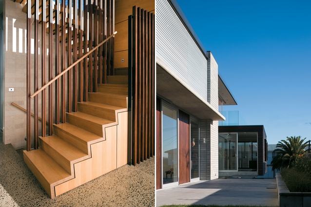
The entrance to the house shows some subtlety as well. Rather than presenting the usual blank face of grandiose porch and front door to the street, here the entrance is down the driveway, up a path to the side of the house, then through a little informal courtyard off the living area, which gets you into the middle of the house. A two-storeyed, sunny entrance atrium separates the bedroom wing to the south from the northern living room. Exterior materials – blockwork, ply and shiplap weatherboard – reappear on the interior, creating a sense of natural, intricate, interlocked spaces, which you don’t get from the usual acres of gib walling. The entrance hall and stairs are crafted from cedar and ply; vertical fins rise up the staircase to a small study area on a ledge-like mezzanine. The stairwell seems airy and open: it even manages to comply with the Building Code without turning into the playpen the authorities would wish to wrap us up in.

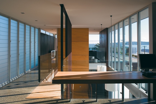
The kids’ rooms, bathroom and laundry run away in a wing to the south. The three bedrooms all face east, opening onto a sunny patio and an area for a future swimming pool. The clients had owned this site for a few years so had worked out the relationship between orientation and sun and views. Upstairs, the atrium space is overlooked by a little desk and study space that looks out through a glassy private living area to the north. This is a nice little retreat although a bit of a fishbowl, too. I like the big timber cave downstairs and while the little lounge upstairs has a great view, from the street it does give the house a little too much of the bland Jafa Mod look – you know: flat roof, lots of glazing, glass balconies, and so on. The parents’ bedroom is upstairs to the south of the atrium with ensuite beyond a dressing area. This whole storey is only one room wide so picks up all day sun and views all round. Protected from neighbours’ eyes by frosted louvres and cedar slats, it’s a nice little eyrie.
Even in Auckland, where most of us come from someplace else, we’re a bit suspicious of new neighbours and the pace and scale of change. At first glance this house seems a rather large and assertive newcomer to the neighbourhood, but really it fits into the street much better than a lot of contemporary architecture that’s sprouting in the same area. It’s a generous stage for family living, with a bit of drama, and a relationship with the street: not too fussy, pretty simple, relaxed, and getting on with the neighbours fine.
Click here to see more Houses Revisited. And sign up to our email newsletters to receive Houses Revisited straight to your inbox.
Note: These are stories from our archives and, since the time of writing, some details may have changed including names, personnel of specific firms, registration status, etc.


