Houses revisited: Pauatahanui house
A house for the ages takes root in the fertile lands north of the capital. First published in 2014.
Whether you’re ambivalent toward it or loathe the very thought, urban sprawl is very much our reality, a holdover from a time when the quarter-acre dream was a right rather than a privilege. Settlements that were once deemed ‘out in the wops’ are now desirable as ‘commuter suburbs’.

One such settlement is the tiny village of Pauatahanui, lying 30km northeast of Wellington and situated on Porirua Harbour. Architect Simon Novak was approached to design a contemporary family home that could function as a private haven on a day-to-day basis and also accommodate visiting children and grandchildren.
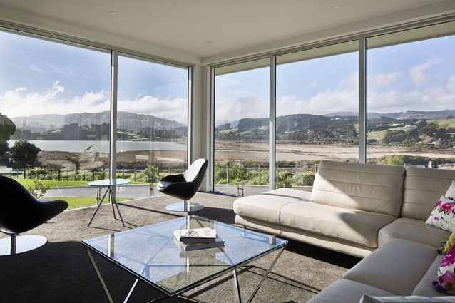
“Our clients already owned a very special and prominent site overlooking Pauatahanui Inlet and wanted a comfortable home that would maximise the estuarine views and offer a level of insulation from the steady encroachment of the capital city to the south,” says Novak.
“Other than that, the brief was fairly open. At Novak+Middleton, we’re very interested in our architectural history and continually strive to create architecture that will stand the test of time.
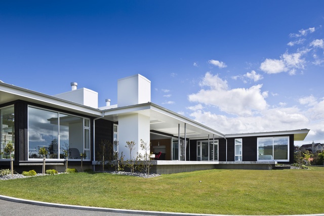
“The nature of this site meant we were able to build long and low within the landscape and, in discussion with the client, we drew inspiration from the post-war Modernists, whose works display a clear intent and were very much precise and efficient.”
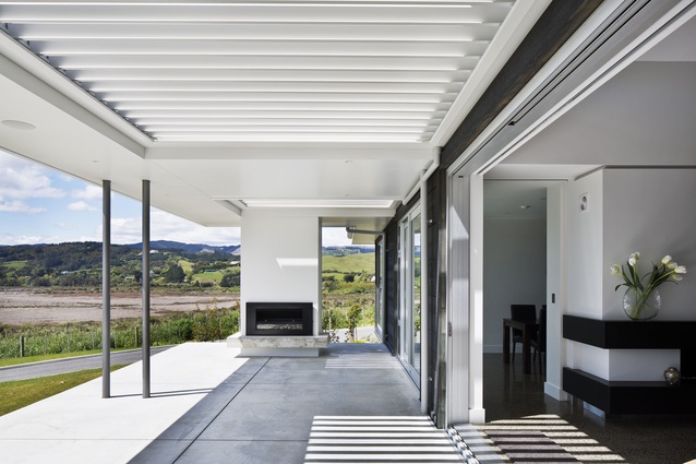
Situated on a slight rise, the structure cantilevers along its axes, creating an impression of the whole sitting lightly on the land. Coupled with an intentionally understated aesthetic, the result is a house that works in harmony with its environment.

“The house has an extended linear plan that makes the most of the view and the sun,” says Novak. “A polished concrete floor and spine wall are important contributors to the passive solar performance of the house and work in unison with clerestory windows and operable louvres to moderate light and ventilation.
Such considerations are augmented by the pared-back material and colour palettes. Externally, creosote-stained cedar weatherboards are contrasted with white soffits and low-profile roof planes, which place a strong emphasis on the horizontal. These lines are punctuated by bold vertical forms in the shape of three chimneys, which visually serve to anchor the building to the site, so that the house appears to be hunkered into the land.
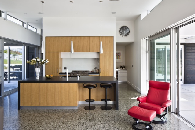
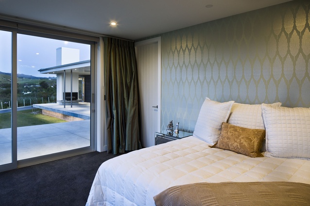
Internally, dark-toned polished concrete and granite predominate echoing the exterior scheme. These materials have been softened through the introduction of timber joinery in the open plan kitchen, as well as carpeting. Similarly, the strong linearity of the architecture is somewhat toned down by the use of curvilinear furniture and lighting accessories.
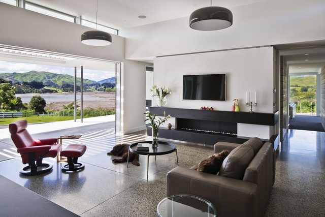
“Simple in form and materials, this house has been built with the precision and craft normally associated with the construction of a fine piece of furniture. The design and this intense attention to detail may just fulfil our ambition to create a work of architecture that embodies that elusive characteristic of timelessness.”
Click here to see more Houses Revisited. And sign up to our email newsletters to receive Houses Revisited straight to your inbox.
Note: These are stories from our archives and, since the time of writing, some details may have changed including names, personnel of specific firms, registration status, etc.

