Houses Revisited: Ode to Auckland
An enduring design even at the time of publishing in 2007, Jack Manning’s Stanley Point house is testament to a gentler place and time.
All of Auckland should be like this; all of Auckland was once like this, I would like to imagine. Golden evenings, tangles of pohutukawa above the mud of the harbour, a simple, unpretentious but elegant house crafted out of wood, a big deck and, down in the tide, the sound of kids playing. The problem with Auckland is we are filling it up like a Monopoly board rather than designing it with any real sensitivity, and our little soft-fringed isthmus with lots of wild places is becoming a dense and manicured shoreline.
The Manning House was built in 1960 and has been recognised [in 2007] by the New Zealand Institute of Architects with an Enduring Architecture award. It is a house that I know well and, every time I go there, it’s like being on holiday. It’s hard to believe that no one really wanted the site when Jack Manning and his wife Prue bought it 50 years ago. Then, it was an overgrown section, cut from the garden of the big house next door.
Ivan Juriss of the Group architects and Jack each bought a little triangle of land on this cape at Stanley Point overlooking the glistening Waitemata. It’s now a house that the family has lived in forever. I like it because it is a house that has grown and matured with additions but you can still see the young architect’s achievements and mistakes. It’s like a family album, it wears its history in a way that we don’t see much of in Auckland.

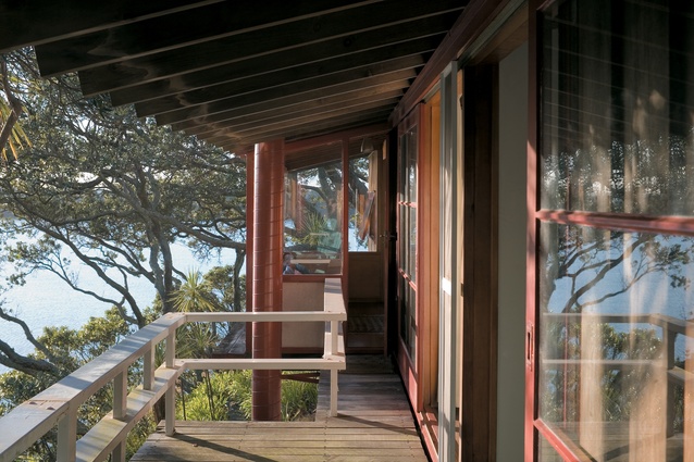
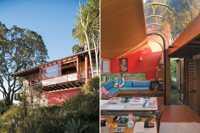
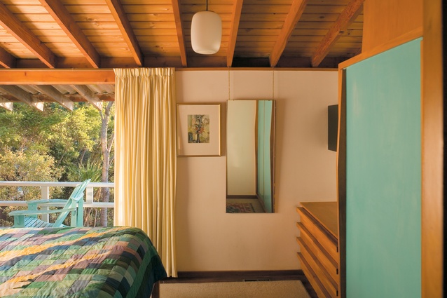
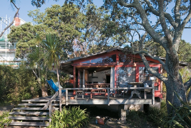
It’s the timber that really gives the place its warmth when the late afternoon sun kindles a golden, glowing light throughout the house. The original house is pretty much all timber, ranging from vertical redwood cladding to Oregon beams and rafters, and pine sarking with big, red painted sliding doors. This crafted wood nature of the house derives from both the New Zealand tradition of building and an interest in the aesthetic of traditional Japanese architecture that was a big influence on Jack and other architects of the time.
This can be seen in the big sliding doors that open up whole sides of the house and long, low windows that crop the view into a series of compositions rather than one big panorama. Sometimes, you can’t even see the view unless you take a seat. Some windows look down to the mossy ground, others catch a snatch of the harbour bridge, others are stuffed with a tangle of pohutukawa bough. This, and the big sheltering roof with low eaves, give the house a sense of intimacy that contrasts with the vulnerability of an exposed site and the immensity of the view.
Although this house might look like it luxuriates in space, it is actually rather tightly constrained by neighbours, not to mention the trees that were there well before the houses were. The design was fitted in between the pohutukawas and, since the old homestead next door precludes much morning sun, the plan of this house is oriented towards the view, with a row of bedrooms to the west, for instance. The kitchen was pretty radical for the time, a part of the living room rather than hidden away. Cost dictated a lot of the design but this efficiency meant the house, like others of the time, could explore new ways of living for the New Zealand family.
In its varied additions and changes over time, the house reflects developments in post war New Zealand domestic architecture. The open plan was fine with a young family of three kids but, as they got older, Jack designed and added a family room to the south-east in 1975. This let the young folk slip in and out, host a few parties and make a bit more noise. An arc of acrylic, like a long wave, forms a clerestory window which draws in midday and afternoon light that is filtered by the tall pohutukawas. In its funky form and strong colours, it is clearly of the Seventies, looser and groovier than the rest of the house, like experimenting with flared pants and tie dying, but that is the charm of this house. The family room opens out at each end and creates more of a courtyard area around the entry. The living room has had a bay added too, and the fireplace was rebuilt on the south wall in the late 80s with some exuberant and slightly post-modern zig-zagging tile work.
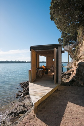
Down on the rocks, a slip in the mid-Nineties created the opportunity to reclaim a smidgeon of land and build a boathouse, although it took years to get permission from the regional council. Like all of this place, every piece of architecture comes with a family story, in this case, how the Mannings managed to fit 18 people in there for a celebratory dinner. Councils aren’t keen on these sorts of structures now, preferring a more human-free and “natural” shoreline, but they are part of the old Auckland when people lived in close engagement with the coast and it was a place for fishing, launching the dinghy, swinging from trees and lighting fires in the evening.
Back up top with the doors all slid back, Jack says he likes to be able to open all the doors and windows and get a summer sea breeze going through the house. With the late sun reflecting off the harbour and dappling the ceiling of the house, it’s apparent this whole place is like a campsite, a series of spaces loosely arranged around the trees and over the hilltop, composed and comfortable and warm.
Good architecture is, in the end, a background to human activity. You find here what James K. Baxter was looking for, in his otherwise excoriating Ode to Auckland: a place where you can recall “the sound of the wind among the green volcanoes and the whisper of the human heart”.
Click here to see more Houses Revisited. And sign up to our email newsletters to receive Houses Revisited straight to your inbox.


