Houses Revisited: Modern manners
A Remuera house by Godward Guthrie Architecture is respectful but not too formal, first published in 2006.
The street is a quiet cul-de-sac descending the northern slopes of Remuera, layered with weatherboard bungalows and villas sharing distant views over Auckland’s Waitemata Harbour. The owners of one of the 80-year old villas seized an opportunity to substantially demolish the house and rebuild on the site. Although the old house had not met their needs, the owners wanted to allude to its character and also desired that their new house blend into the street. The latter requirement was fundamental to the brief they gave Julian Guthrie of Godward Guthrie Architecture.
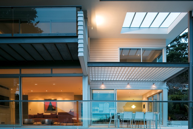
“We designed a contemporary interpretation of traditional features common to the area,” Guthrie says, “including the white painted weatherboards, cantilevered balconies and eaves.” Looking up from the street, this interpretation looks far from traditional, and it’s not until you compare the façade details with those of its neighbours that you begin to appreciate the symmetries. The most striking element of this street elevation is the middle section that cantilevers over a three-door garage covered in interlinking zinc panels evocative of the cedar-shingled bay windows of early 20th century bungalows. On the northern side, the angled roof extends out with generous eaves overhanging upper-level balcony spaces. Large shugg windows are reminiscent of the ubiquitous double-hung sash windows of old villas.

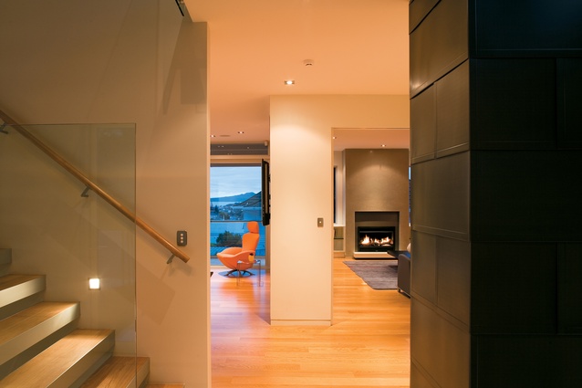
The floor and main living level of the original home was retained to take advantage of the view shaft to the harbour; the family bedrooms are on the first floor and the garage and laundry/storage area on the lower level. A path of porcelain grey tiles, broken up by landings and plantings of sago palms, leads to the entrance. Once through the large pivoting front door, you step into the lobby level of the spacious gallery that runs through the centre of the house. From this lobby, a visitor can take in an expansive view that ends with a waterfall feature looking back from the rear section. Washed with natural light, the gallery space, which has supplanted the hallway that would have run the length of the old home, is central to the rest of the house.
The gallery also introduces a strong contemporary indoor/outdoor theme with its zinc tile cladding and porcelain tiling continued from the outside. Gallery walls are of polished plaster by Interplast: the effect is so silky that it invites touch. The grey tint is sympathetic to the tiling and masonry finish, and even to the white ceilings. Colour splashes are reserved for artworks and furnishings.
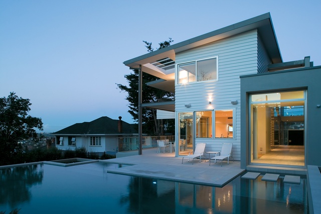
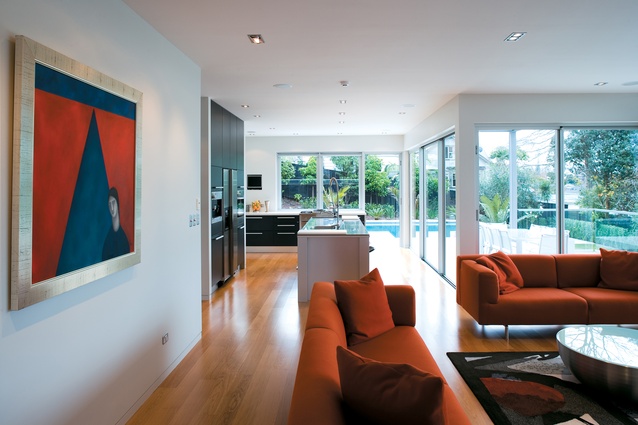
All living areas connect to the gallery, and changes in use are defined by flooring and ceiling heights rather than doors. Large windows and sliding doors allow the outside to pour in. “While open to the aesthetics of the design, our brief required a strong visual and physical connection from the interior living spaces to the exterior terrace incorporating a pool,” Guthrie says. “The plan also provides no layering of formality. Instead, there are several connecting spaces that suit a relaxed New Zealand manner of entertaining.” One such space is the generous kitchen area, sited in a prime spot overlooking the pool. A working bench with a hob directly faces the pool through a shugg window, its pop-up range flush with the benchtop so that it doesn’t obstruct the view. A small but full working scullery next to the dining area can be closed off to hide culinary work from public view. “This was the first time we’ve designed a detached scullery and we are now creating versions for other clients,” Guthrie says.
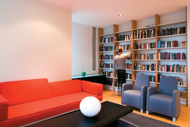
Also on the ground floor, a lounge with a fireplace and glass sliding cavity door provides a retreat for the owners from their teenage children. Aluminium-framed cavity sliding doors, disappearing flush into the wall or closing to varying degrees of separation, feature in all of the house’s private rooms. In an arrangement typical of traditional villa layouts, there’s a bedroom on the southern side of the gallery as you enter the front door, its entrance so integrated into the plaster wall that you would easily miss it. Designed for guests, the bedroom has an ensuite with its own entrance to a courtyard garden, planted with standard Bay trees, and its own access to the pool at the rear.
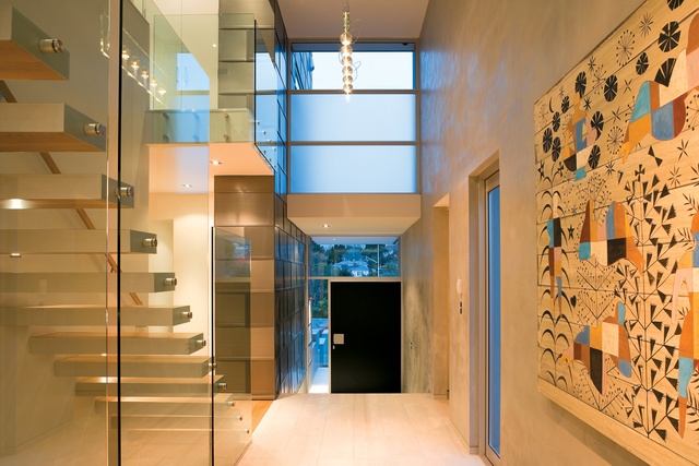
Stairs linking all three levels cantilever from the wall, connected to the gallery by glass slabs that reach up in sculptural form and function as balustrades. Clerestory glazing, separating two roof levels on the southern side, saturates the first-floor landing in natural light, while a wall curved to contrast to the square geometrics of the house, provides extra floor space and a corner-less flow to the bedrooms. Three of the four bedrooms face north to harbour views. The brief specified a verandah leading from the master bedroom. A modern touch to this extension is its perforated mesh flooring which allows light to filter to the terrace below, and issues a see-through, ‘stand on me if you dare’ challenge. While the ceiling height of the downstairs area is a lofty 2.8m (doors are 2.4m), the bedroom areas are differentiated by the raking ceiling inclining up from the low northern eave, lending a more intimate and sheltering feeling to the rooms.
From the pool area, you can really appreciate the traditional elements of this racking roof design, as it extends well out over the lower northern side to form the eave protecting the large verandah leading off the master bedroom. It makes you wonder why this sensible weather protection is not a more common feature (as it used to be) in a city with such high rainfall. The total design also demonstrates what we can learn and incorporate from our residential heritage, and what can be reinterpreted using modern materials to satisfy a contemporary aesthetic and achieve a greater level of comfort. This residence may be a new kid on its block, but picking up the threads of the past, it sits comfortably with its elders.
Click here to see more Houses Revisited. And sign up to our email newsletters to receive Houses Revisited straight to your inbox.
Note: These are stories from our archives and, since the time of writing, some details may have changed including names, personnel of specific firms, registration status, etc.


