Houses Revisited: Model work
Revisit this home from our 2007 archives: Padma Naidu’s own house on a small Auckland section offers a lesson in modern suburban design.
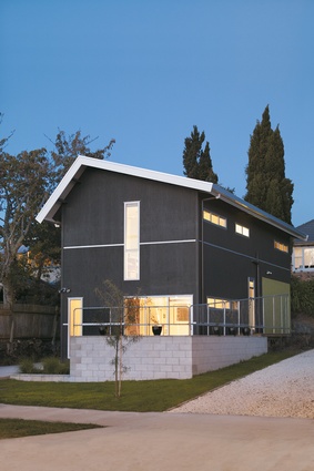
Auckland will always get bigger and if we don’t want to see it sprawling even further over our once-lovely isthmus then we need to increase the density of the city. In the suburbs this means learning how to do infill houses better because most of them are just generic builders’ boxes wedged onto sections. This house in Sandringham is a box but it is an unpretentious and, dare I say it, inexpensive house that is sensitively planned to fit its cross-leased situation. And while it may look like a simple box on the outside, it contains surprises inside.
Architect Padma Naidu has owned the whole site for years, living in the brick house at the back, so she knows the place well and has had the opportunity to give the project a lot of thought. The new dwelling is located on the front of the section but Naidu has preserved a good view to and from the old house behind, as well as leaving enough open space to make the two houses seem quite separate and the section still quite spacious.
This is also an issue in terms of city planning rules, as cross-lease developments are often tight in terms of building coverage and permeable surface. Quite apart from a bit of space for kids to run around on (if they still do that these days) we need to leave enough of a permeable surface such as grass or gravel to soak up rainwater; otherwise it all ends up in the city’s overloaded sewers.

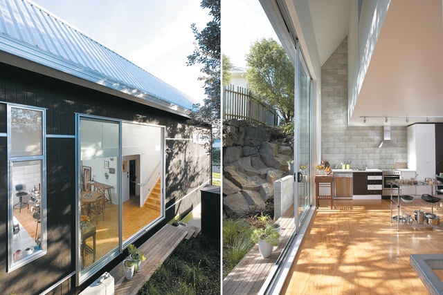
Naidu wanted a tall and narrow house but this hasn’t resulted in a tight couple of storeys. The long north side opens up to a narrow strip of rocky volcanic outcrop and a row of trees; the upper floor is a mezzanine that also opens onto this space. Sunlight is splashed around the interior of the house for most of the day. There isn’t much of a deck on this north side – if there was you’d be quite exposed to neighbours – but the effect is of a large, sunny, private cave that is secluded and quiet, yet airy and open to the trees and light. This end of the house is dug slightly into the ground and built of concrete block on two sides. This massive wall helps maintain a constant temperature; the house is warm in winter and cool in summer.
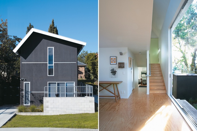
The house steps down a gentle slope and the front room, currently used as a home office, could also be a separate living area or even a bedroom. I admire flexibility in a house: there is nothing more boring than having to spend the rest of your life in the same bedroom, even if it is architecturally designed. (For this reason, I’ve always liked the villa; rooms can be swapped around with the seasons or as the family grows.)
The front room opens onto a little deck that picks up afternoon sun and engages with the street. This prompts me to wonder whatever happened to the porch or verandah on the street front, a nice little social gesture that we’ve replaced with the garage door and the perpetually closed front door. To the street, this house offers discrete little slits of windows to maintain privacy and reduce late afternoon summer sun. The cocked roof is a nice gesture to the suburban house – it may also reflect the invisible envelope of the Council’s height-to-boundary controls. Whatever prompted it, a steeper pitch and eave to the north reduce the encroachment of sun at the height of summer. The materials are plain and honest – blockwork, galvanised steel and plywood – but the black finish and artful deployment of windows and flashings give the place a crafty elegance.
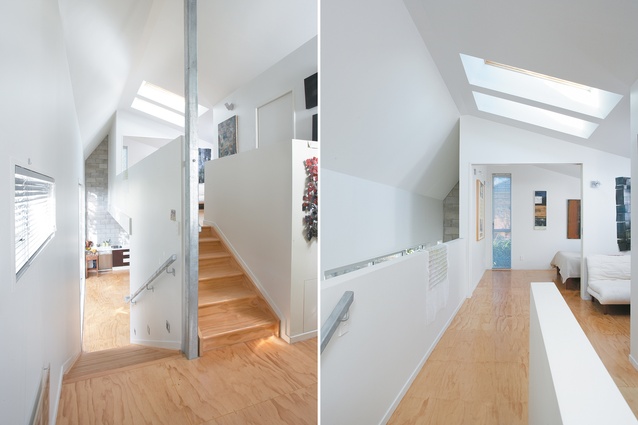
Upstairs, the gentle slope of the roof to a low point in the south again creates a sense of one big snug space, a large sunny, open area on the mezzanine with a couple of rooms off it. The bedrooms are at the two extremes of the mezzanine which gives them good acoustic separation and makes a small house seem big. Windows are nicely placed to accentuate the spatial dimensions of the house: long, low windows across the back that don’t compromise privacy, and tall narrow windows at the ends of halls, which emphasise height and allow views that appear to extend the length of the house. A couple of skylights over the mezzanine also allow light into the back of the house, which is welcome in winter, although I don’t know if these are really necessary – skylights tend to let in lots of sun in summer, just when you don’t want it.

From North Cape to the Catlins you won’t see much variation in the typical Kiwi house. We have always relied on the fireplace and three-bar heater to keep our houses warm, but the day is nigh when we will have to rely more on sustainable methods of climate control. Soon double-glazing will be compulsory from Taupo south, and even though Aucklanders seem to believe it never rains or gets chilly, in our fair city we do have the odd coolish night.
We are going to have to look at house construction materials more in the light of their contribution to temperature control than just aesthetics and cost. The key thing is orientation and Padma Naidu has designed this house to soak up daylight and turn its back to the prevailing weather. What we call a passively warmed and cooled house can take two forms: “light and tight”, or “mass and glass”. Here, both approaches are combined with a concrete block wall, that stores up heat during the day, radiating warmth as temperatures drop at night, and efficiently insulated timber construction, with few windows to the south so as to reduce heat loss.
This is a house of disarming simplicity that can teach us all something about medium density housing. It is efficient but very pleasant, flexible but economical (not too big, not too small), private but acknowledging the street and neighbours. Just right for the new model of Auckland suburban house.
Click here to see more Houses Revisited. And sign up to our email newsletters to receive Houses Revisited straight to your inbox.
Note: These are stories from our archives and, since the time of writing, some details may have changed including names, personnel of specific firms, registration status, legislation, etc.


