Houses Revisited: Material boys
Bevin + Slessor’s 2009 Peka Peka house stand the test of time as a smart, contemporary take on Kiwi modernism.
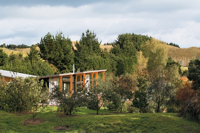
Scarcely five kilometres from a modern bach designed by Parsonson Architects (also seen in our Houses Revisted series) another holiday house sits on the Peka Peka dunes. However, this house, designed by the Wellington practice Bevin + Slessor Architects (now known as Slessor Architects), occupies a very different site. While the Parsonson house looks over a strip of flat land out to the sea and Kapiti Island, the house designed by Ric Slessor occupies a site that’s landlocked, or more accurately, tree-locked.
The two properties are just as close to the beach – the Bevin + Slessor house is probably even closer – but their character is miles apart. Gerald Parsonson was dealing with an obviously coastal location; Ric Slessor was faced with a rural environment.
Slessor, moreover, had to work with not only the topography of the site – this lifestyle block is a high-country run in miniature – but he also inherited a landscape work-in-progress. The clients, who are enthusiastic gardeners, had made a quite a start on planting an orchard by the time they engaged their architect, and had turned a piece of boggy flatland into a pond. So, there were some givens the architect had to accommodate – they probably did not affect the architect’s siting decisions, but they did influence his design strategies.
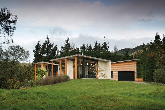
The house, with its large garage, is deceptively large – well over twice the size of the Parsonson place down the road, and its size suggests a different sort of occupation. One gets the impression that the clients’ visits are working holidays: the property is a project, not just a crash-pad.
There’s a solidity about the house, and it has been designed in depth, not width. Overtly, it has an interior – the bedroom/garage wing that set on the house’s north-south axis – but even the front, north-facing pavilion, goes deep. The sense of shelter is enhanced by the slope of the light- and warmth-admitting butterfly roof: you progress from the look-out front to the look-in rear. As Ric Slessor says, the house was designed as “a retreat”.
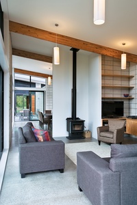
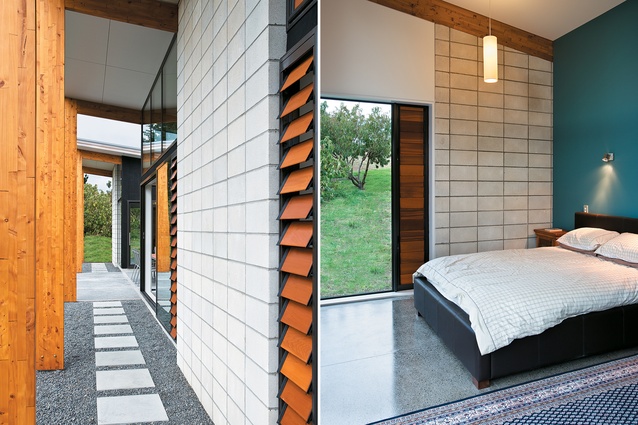
The shelter trope is supported by the choice of materials. Ric Slessor and Nick Bevin, happily, are good old modernists (I mean that in an appreciative, not an ageist way). They have a preference – well demonstrated in projects such as Seatoun Primary School and Spy Valley and Matahiwi wineries – for basic materials and legible construction. The Peka Peka house has a concrete floor and double-skin concrete block interior and exterior walls for thermal efficiency, and the garage is clad with macrocarpa battens. It’s a simple palette of complementary materials, but one that allows for considerable expression.
And for tactile enjoyment: the honed concrete blocks are eminently strokeable. The blocks are made in Hawkes Bay, with a limestone mix that imparts a soft, warm texture. John Scott used the same sort of blocks in his Hawkes Bay houses, such as the one he designed for the potters Bruce and Estelle Martin near Hastings. The blocks might not beloved of blocklayers – they’re easy to chip or break – but you can see why they might be specified. They make other blocks seem hard and coarse; it’s like comparing an Armani tie to something you’d pick up in some sock and tie place in a mall.
The other dominant and familiar Bevin + Slessor element in this house is the portal frame. This is carried though to the exterior where it is expressed as the colonnade of six laminated macrocarpa columns on the north face, which looks across the pond (and, a little unfortunately, to the neighbouring unlovely house – with a bit of luck and few seasons’ growth, this view might be masked).
This is the bravura gesture here, and its deployment is a little reminiscent, in effect but not in scale, of the wooden-sheathed columns Studio Pacific Architects put in front of a flash apartment block in the Auckland Viaduct. Bevin + Slessor’s row of columns, though, do perform the function of supporting the roof overhang over the walkway running along the house’s north side. It’s just me, but I see a colonnade and my mind wanders to those antebellum mansions of the old slave states. The portals, to me, suggest a move in the direction of grandeur, but Ric Slessor disagrees; he doesn’t deny they were designed to provide an “experience”, but sees them also as elements that anchor the front edge of the house on the lip of the slope that leads quickly down to the pond.
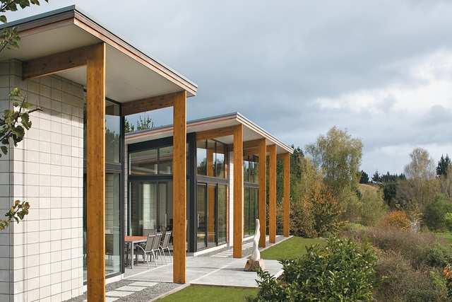
I think my maunderings were encouraged by the approach to the house, up the drive that serves up a side-on view of the house. In a way, I wanted to be greeted by the colonnade front on: let’s be having you. But, of course, the house is positioned as it is to track the path of the sun, and although the sweeping drive up to house might lead one to expect a greeting from the main elevation, the house is a private dwelling, not a public building.
Also, the clients did not want to gaze at parked cars. Visitors taking the western approach to the house do get a clear appreciation of the bi-partite nature of the house – the block-and-glass front, and battened backside. The house does appear, from this perspective, to perch above the rim of the pond; ever suggestible, I think of an arachnid, basking in the sun, ready to pounce.
Ric Slessor and Nick Bevin have a nice and easy way abut them. They’re very aware of Kiwi traditions – are they country boys at heart? – and take obvious delight in turning “ordinary” materials into practical, user-friendly buildings. This is a thoughtful and well-detailed house, the product of decisions made to meet their clients’ needs and the site’s demands.
Want to be the first to see Houses Revisited, received straight to your inbox? Click here to subscribe to the ArchitectureNow newsletter.

